Facebook Iterates Their Design. So Should You.
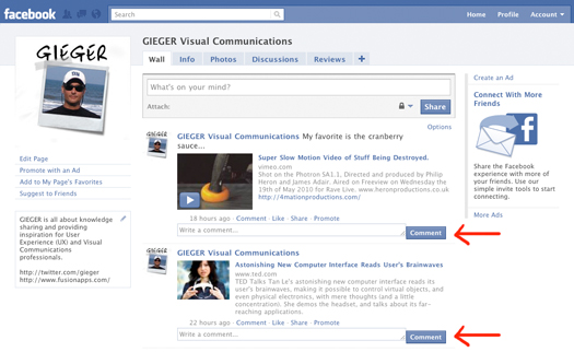
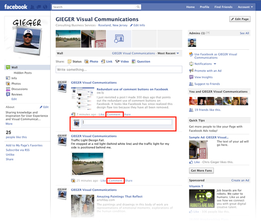
I just revisited a tweet I posted 300+ days ago, about Facebook’s redundant use of comment buttons, which I felt should be removed because the buttons cluttered the screen and carried too much visual weight.
Facebook has since corrected this design flaw, which demonstrates the importance of constantly learning, iterating and improving your design.
Too often businesses still consider or treat their websites and applications as “done” when they are launched. This approach is more appropriate for a printed brochure than a website. When a brochure comes off the press, it is done – if you want to change it, you have to go back to the original files, make your changes, and print all new ones. Treating your website like a brochure is often harmful and unnecessary — except in cases where the current, live design is so painfully awful that a complete overhaul is warranted.
If you treat a website more like a software application, it is easier to see how your website should evolve through constant iterations or versions – rather than a complete redesign launched every 6 months to a year. If you start off with a solid, tested design, consider it version 1.0. As you evolve the design, make your next release v1.1. If you have a quick patch or bug fix to make, consider it v1.1.1. This approach will train you and your colleagues to think of your site more as a software product that is in a constant state of improvement – rather than a one-off, large effort project. It will also help you get smaller updates done more quickly without needing to wait for the next big redesign.

