How We’d Make It Better: Microsoft Outlook
Microsoft Outlook is easily one of the most used software products by businesses — yet it is also one of the most flawed products on the market. The latest version of Outlook for Mac attempts to make a big leap forward with its updated User Experience and we will say that it appears to be heading in the right direction. However, there are several obvious flaws that we’ve pointed out below that can and should be addressed.
Hover Icons on Messages
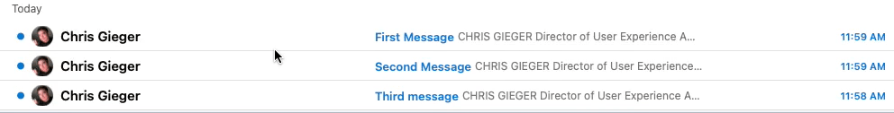
Each message listed in the Inbox displays action icons (delete, archive, flag, or pin) that appear when the user hovers over the message. These icons not only take up a lot of valuable screen real estate but they can (and often are) accidentally clicked when the user is attempting to simply open the email message. In addition, the attachment clip icon and the reply arrow icons appear to be clickable but they are not.

How we’d make it better:
- Since opening and reading the email messages is the primary user action, these icons really represent secondary or even tertiary actions. Based on this, we would place all the icons into an ellipsis menu on the far right of the message rows (see screenshot on the right). This will:
- Make better use of valuable screen real estate
- Remove the possibility of accidentally clicking an action button.
- Provide plenty of space to label each icon so the users know what each icon does.
Multi-selecting Email Messages
Currently, the only way to select multiple email messages in the inbox is to hold down the shift key as you click each message. The problem is, this requires all users to know about this key command “trick” and a good UX should not rely solely on the users knowing tricks or hidden shortcuts. Personally, I have to re-teach my own mother and brother this key command every time they ask me how they can select multiple items.
How we’d make it better:
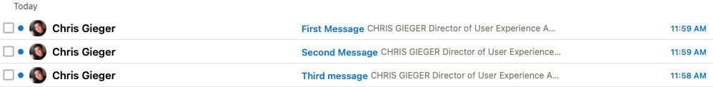
Include checkboxes at the beginning of each email message (see screenshot below). This will be a much clearer way for users to know how to select multiple emails without needing to know the key command. Plus, Outlook already uses checkboxes in other places in its UI so there’s even less of a reason for not including them here.
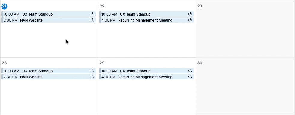
Creating a New Event (Bug?)
When attempting to create a new event by double-clicking on a day from the Calendar screen, the Reminder pop-up displays before the user even finishes saving the new event. This appears to be a bug because it only seems to happen when trying to create a new event on the current day or certain future days within the current month.
How we’d make it better:
Fix the bug so that the Reminder pop-up never displays before the new event is created.
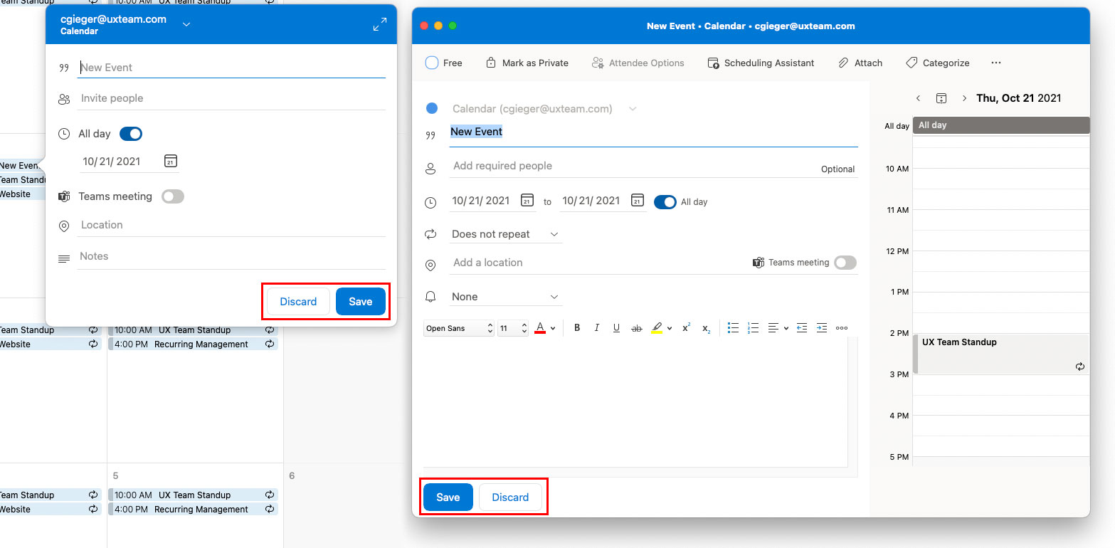
Inconsistent Location of the Exact Same Buttons
This one doesn’t seem to make any sense and makes us wonder if different people worked on the different versions of the same screen. When you click a day on the Calender, you get the short-form modal window for creating a new event with the Discard and Save buttons located on the bottom right of the modal. When you expand open the modal to view the long-form version of the screen, the Discard and Save buttons are not only flopped but they are moved to the left side of the screen.
Here we see two different locations for the Send button. When creating a new message, the Send button is located in the top left of the screen. When creating a new Calendar Event with attendees, the Send button is located in the bottom left of the screen.
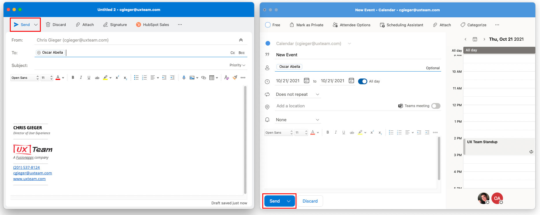
A big part of creating a great user experience is consistency throughout the application and there appears to be no good reason why these buttons display differently in the two different versions of the same screen.
How we’d make it better:
Make sure the same or similar buttons are placed consistently in the same location throughout the application.


