E-commerce shopping cart usability research findings
Your shopping cart is one of the most important steps in the customer journey. Optimizing its usability ensures a smoother experience, higher conversions, and fewer abandoned carts. Based on recent research and usability testing, here are actionable strategies grouped by key experience categories.
Before users ever reach the checkout, small friction points can lead to big losses. Here are key elements you can optimize—not just in your shopping cart, but across supporting pages—to improve the overall user experience and drive more conversions in your store.
Key features your shopping cart should utilize
1. Responsiveness
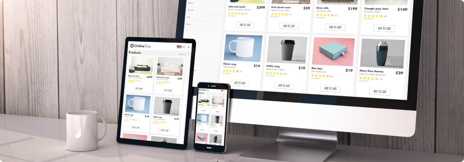
Mobile optimization is no longer optional
With mobile shopping dominating e-commerce, poor responsiveness remains a major barrier to conversions. Over 70% of online shoppers browse and buy via mobile, yet mobile cart abandonment rates remain the highest. Users often struggle with cramped interfaces, hidden buttons, or confusing inputs.
What you can do:
- Use a responsive layout that adapts to all devices
- Ensure tap targets (like “Checkout”) are large and thumb-friendly
- Auto-focus on input fields and enable mobile-friendly input types
2. Cart Interface
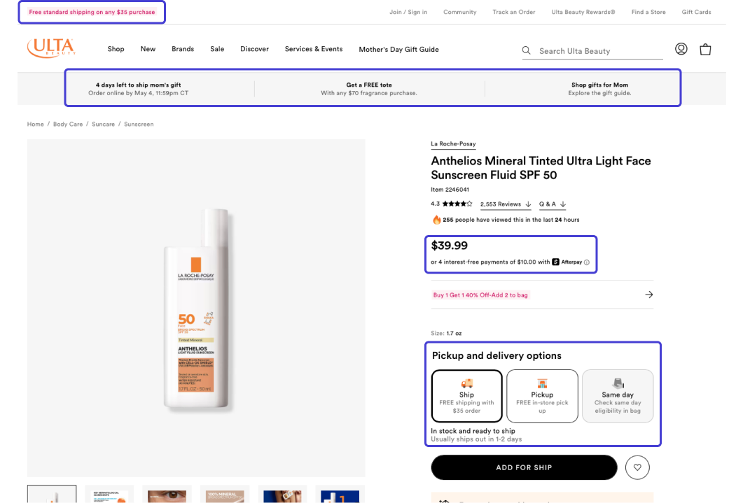
Show clear product details and thumbnails
Users often revisit the cart to review their selections. Missing thumbnails or incomplete product information can increase doubt and lead to drop-offs.
What you can do:
- Include image thumbnails for each item
- Clearly display color, size, quantity, and price
- Allow easy access to product details without leaving the cart
Support persistent and cross-device carts
Many users add items on mobile but finish purchases later on desktop—or vice versa.
What you can do:
- Use persistent carts tied to user sessions or accounts
- Sync carts across devices
- Send reminder emails about abandoned carts
3. Checkout process
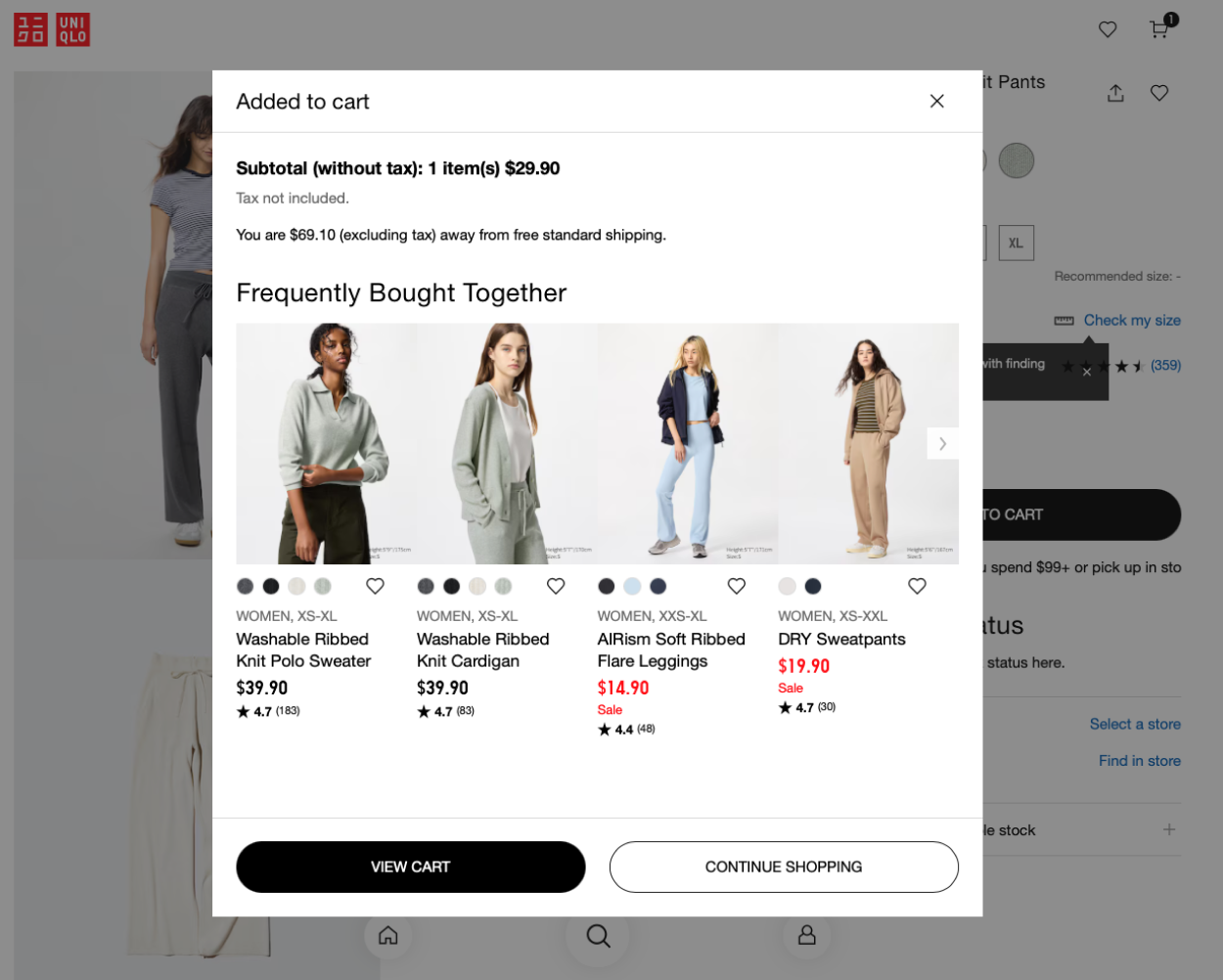
Transparent pricing and no surprises
Unexpected shipping fees or taxes are among the top reasons for cart abandonment.
What you can do:
- Display estimated taxes and shipping upfront
- Show any applied discounts or promo codes clearly
- Let users calculate shipping early in the checkout flow
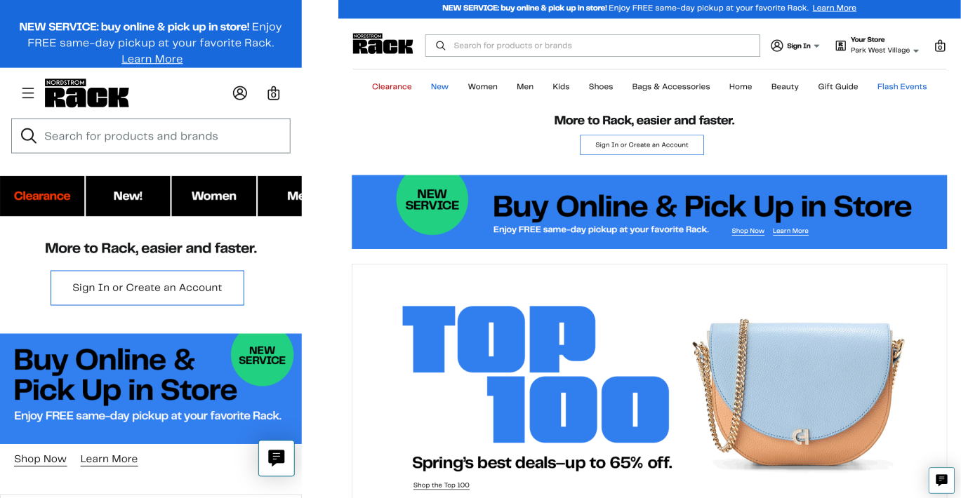
Prominent & clear call-to-actions (CTAs)
Users should never have to search for the “Checkout” button.
What you can do:
- Use high-contrast buttons with consistent placement
- Include secondary CTAs like “Continue Shopping”
- Avoid using passive phrases like “Next” or “Proceed”
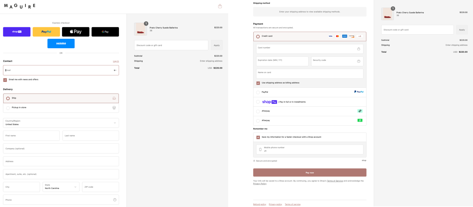
Streamline the checkout process
Every extra step adds friction. Users expect a fast, linear experience with minimal distractions.
What you can do:
- Consider one-page checkouts for faster conversions
- Use progress indicators for multi-step checkouts
- Allow auto-fill and saved information for return customers
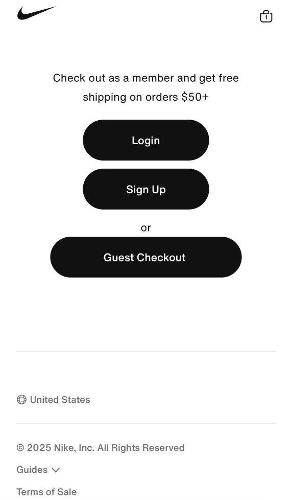
Enable guest checkout
Forcing users to create an account before purchasing can break the flow, especially for first-time visitors.
What you can do:
- Offer guest checkout with optional account creation
- Use social logins to simplify sign-in
- Highlight benefits of account creation after purchase
4. Payment & flexibility
Offer flexible payment options
More choices at checkout lead to higher satisfaction and fewer drop-offs.
What you can do:
- Offer digital wallets (Apple Pay, Google Pay)
- Include installment options (Afterpay, Klarna)
- Display secure payment icons and certifications
5. Trust & support
Reinforce security and trust
Many users abandon carts due to concerns about privacy or payment safety.
What you can do:
- Display trust badges and SSL certification logos
- Reassure customers with secure messaging (“Your information is protected”)
- Avoid redirecting users to third-party payment pages unless necessary
Include easy access to support & return info
Last-minute doubts can be resolved with quick access to helpful information.
What you can do:
- Include live chat or a “Need Help?” link
- Provide links to return/exchange policy within the cart
- Add FAQs related to delivery and returns
So keep in mind
The Nielsen Norman Group’s study called “Decision Making in the E-Commerce Shopping Cart: 4 Tips for Supporting Users” discusses how many shoppers use the shopping cart to make final purchase decisions. Therefore, you should provide features to accommodate this behavior in order to increase conversion rates and reduce bounce rates.
- Provide access to a full shopping cart
Some sites utilize a mini-shopping cart page, which drops down from a Cart button near the header. Clicking the Checkout button from this drop down skips a full Shopping Cart Page and jumps the user into the checkout process. These “minicarts” prevent a user from doing the types of decision making they want to do on a full Shopping Cart Page, such as comparison shop, adjust quantities and review product details.
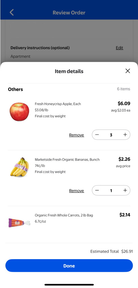
- List product details
Many sites list products on the Shopping Cart Page without providing any details such as the size and color of the product that the user selected on the Product Detail Page (PDP). This can frustrate the user and prevent them from making a purchase decision.
- The product image is essential
Not only is it essential to display the product image, it is equally as important to display the product image large enough so that the user can see the details about the product they added to the cart.
- Link users to full product details
It is important to link both the product name and image back to the PDP so users can easily access more details about the product that will help them make their purchase decisions.
- Let users easily remove items
Because so many users use the cart to help them make a final purchase decision, it is essential to provide them with a quick and easy way to remove items from their cart.
Many sites fall into the trap of fighting with typical user behavior by believing they can force users to follow a certain flow and restrict them from having access to certain features. Instead of fighting with your users, you should help make their final purchase decision experience as easy and as accommodating as possible.