Tool for documenting rationale behind insurance underwriting decisions.
Project overview
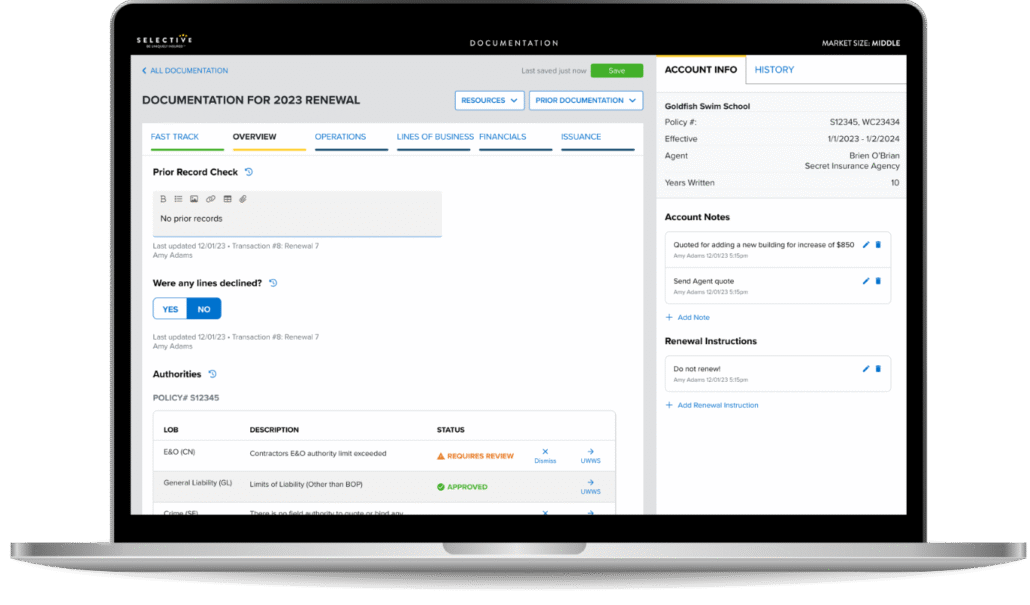
When making underwriting decisions, it’s important that the reasoning and justification is documented accurately and consistently. Prior to our redesign, Selective handled underwriting documentation using Microsoft Word documents.
With the new web-based form, underwriters and their assistants can easily collaborate, working on the same documentation simultaneously. Sharing is a snap, since it’s accessible from a link within the quote. Clearly defined questions and helpful insights help make the documentation more consistent across quotes and underwriters.
Activities and deliverables User research, Prototyping, Usability testing, Developer handoff, Design system, Development
Steer underwriters to document the reasons for their decisions rather than duplicate the content already in the quote.
Encourage documentation while quoting
Structure the process in such a way that it mimics the quote flow to make it easy to document and quote at the same time.
Better collaboration
Simplify collaboration efforts and the year-over-year handoff process.
Evidencegathering
Purpose of our research
Discover the decision-making that goes into the underwriting process
Explore the daily tasks and challenges each persona experiences while documenting underwriting decisions
Understand business rules and needs as they pertain to underwriting documentation
Learn how users logically group documentation topics together to organize the screens and information
Studies
Teamwork sessions with stakeholders
UX audit
Competitive analysis
Card sort study
Usability testing
Key insights
Inline References and Guidance
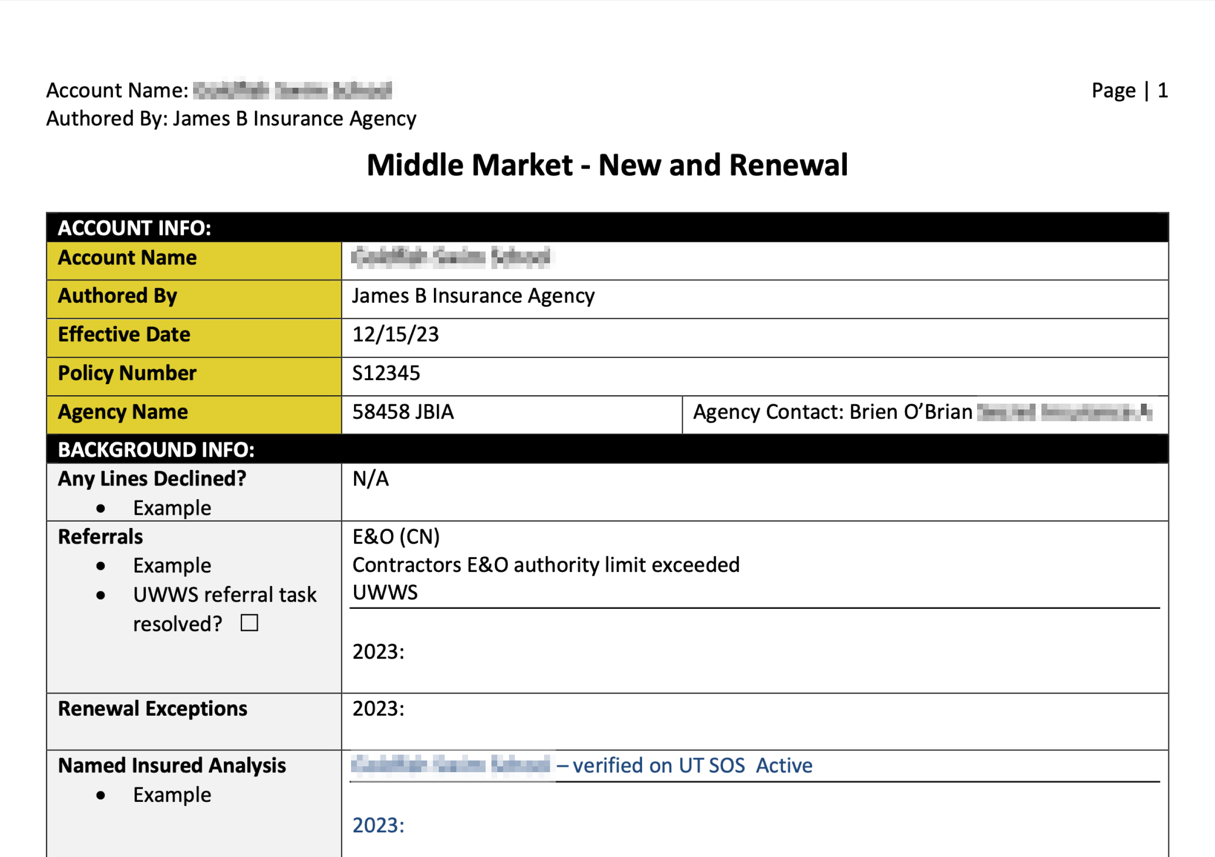
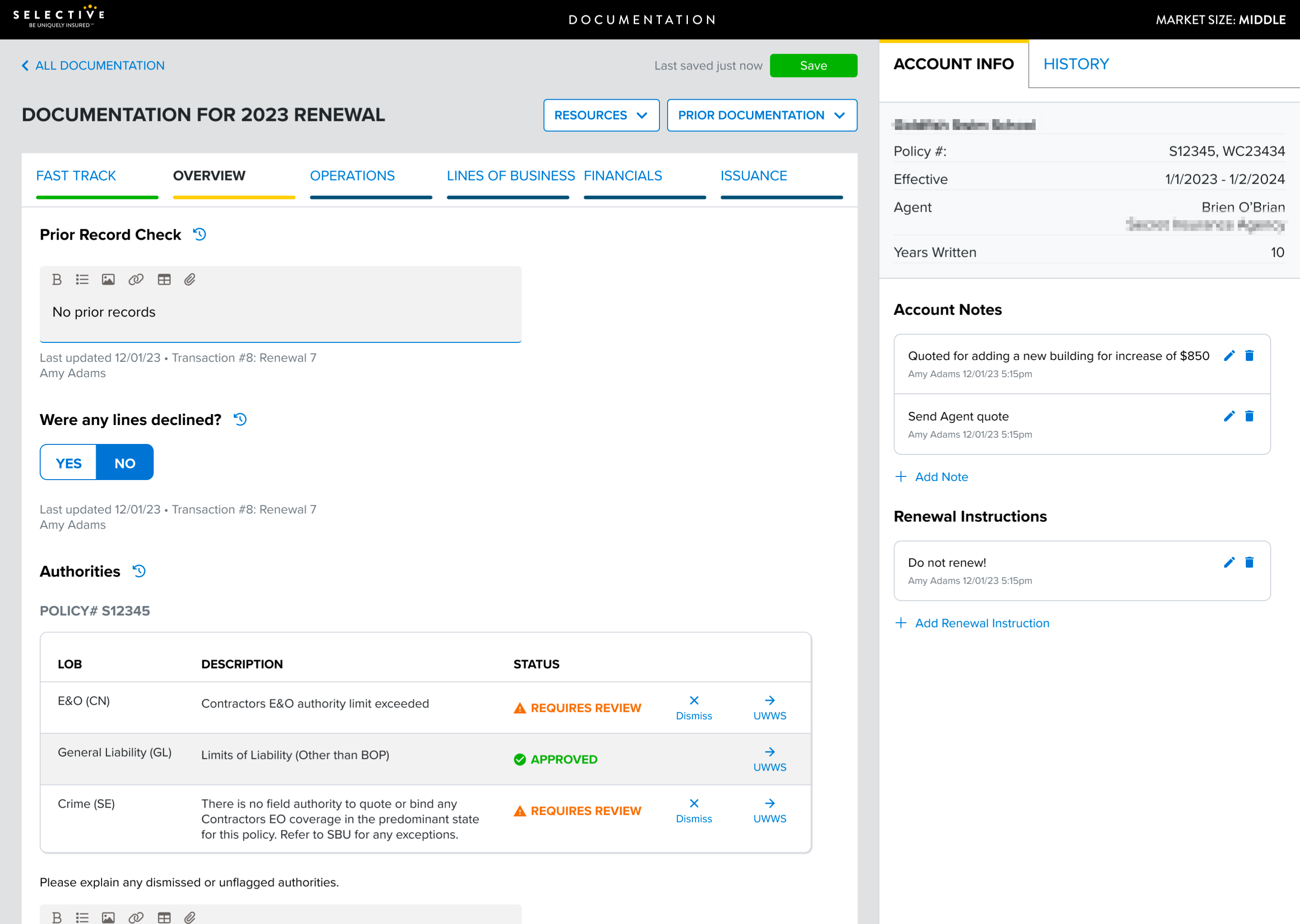
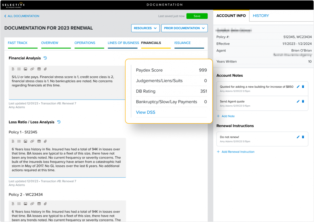
During user shadowing, underwriters and account managers expressed frustration with manually typing info into documentation already available in the quote. Placing this reference material next to the analysis helps separate data from the analysis and provides useful information to reference when documenting decisions.
Automatic saving
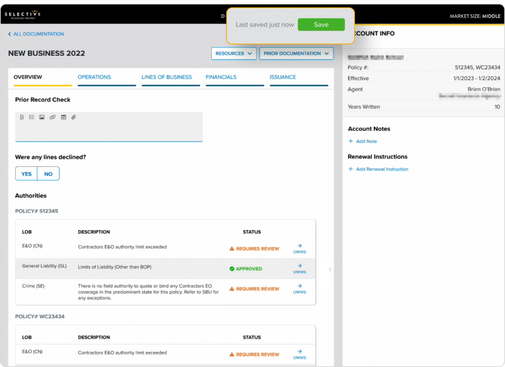
Usability testing revealed users felt anxious and skeptical about whether their progress was being saved. To help users feel confident, we introduced an automatic saving feature and animation to indicate the information is constantly being saved.
Building effective development solutions
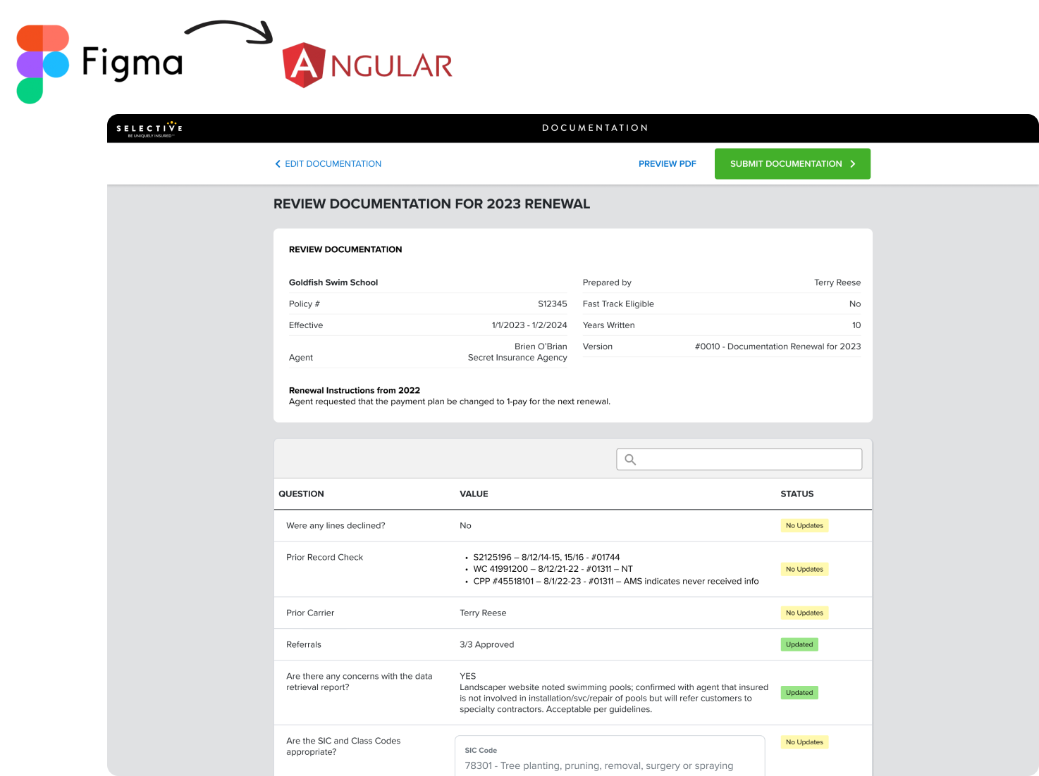
We transformed the Figma designs into a high-fidelity Angular prototype, delivering development-ready assets to Selective for integration. The redesigned web-based form replaced Microsoft Word documents, enabling underwriters and assistants to collaborate effortlessly in real time.
Accessible via a simple link within the quote, the form ensures consistency and accuracy with clearly defined questions and contextual insights. This modern solution improves the underwriting process, fostering better collaboration across teams.
Conclusion
As we set out to test the new design in the coming months, our strategy hinges on engaging users through comprehensive interviews. These interviews will spotlight the redesigned interface, allowing us to observe firsthand how users interact with each step, from navigating the interface to utilizing its features.
By keenly observing their interactions and carefully noting their feedback, we’ll refine the design iteratively, ensuring that it aligns seamlessly with user expectations. These interviews serve as our compass, guiding the final tweaks needed to craft an interface that’s not just user-friendly but tailored precisely to meet the diverse needs of our users.
As users acclimate to the new design and overcome the learning curve, they’ll discover a more intuitive and responsive system. Any initial discomfort will give way to a seamless experience, empowering users to navigate swiftly, perform tasks efficiently, and accomplish goals faster than before.
Related case studies
Selective Insurance Small Business
Small business insurance policy quoting and issuance software
Mesa Underwriters Specialty Insurance Company (MUSIC)