Top UX trends that need to end in 2022
This is usually the time of year when we start seeing lists that attempt to predict what User Experience (UX) design trends to expect in the coming year. However, we thought it would be more useful to call attention to the trends we hope will end. It turns out, there are so many that we could probably make this post into a series (and maybe we will) but, for now, here are the ones our team came up during one of our morning stand-ups.
These trends are in no particular order, and they are a mix of both software and website trends. And, you’ll also notice that most of them have nothing to do with User Interface (UI) Design — yet all of them impact the User Experience.
Not involving UX during UAT
User Acceptance Testing (UAT) is typically the final stage of the software development lifecycle that occurs before a product release is deployed into production. Oddly enough, even though the word “User” is in the name, this testing method rarely involves actual end-users. More often, it involves the client and/or members of the product team that test and accept the software product as if they are the end-users. This needs to end.

It’s probably an exercise in futility to convince product teams to involve real end-users in UAT but, at the very least, they should involve members of the UX Team because they are the ones that designed the UX. When you hire an architect to design your house, the architect will make site visits during construction to make sure the house is being built the way they designed it. The same goes for software. You involve UX during UAT because they are far more likely to catch flaws and issues related to their design than anyone else.
Too often, UX Team is only involved in the beginning of the project and then a hand-off of their designs and (maybe) front-end assets are given to the development team — at which point the UX Team’s job is done. That is, until the product is released to actual end-users and the UX Team is brought back in to fix or enhance whatever issues are found by the users. A lot of times, the flaws found by users are not major usability flaws (because those would have been identified and resolved during usability testing, right?) — but they are typically things that would have been easily caught by the UX Team if they had been involved during UAT. Some of the most common UX issues we find during UAT (when we’re involved) include:
- Incorrect use of CSS classes
- Incorrect use of UI elements or components
- Incorrect use of colors
- Incorrect use of fonts
- Incorrect responsive breakpoint layouts
- Incorrect wording in messages
- Display/rendering issues
- Missing progress indicators
- Missing transitions or animations
- Missing table listing features
Auto-playing videos
Do you ever visit a website to read an article and all of a sudden, a video at the top or in the sidebar starts automatically playing? If you have your volume up, you may also be startled by the loud audio. Yeah, that needs to end. We realize there are browser settings to prevent videos from automatically playing, but users shouldn’t have to do that. Videos should only play when the user chooses to play them.
In addition, we’re seeing a trend where these auto-playing videos often have little to do with the actual article content. So now the site is not only interrupting the user from reading their content, they are doing so with a video that isn’t even related to the article.
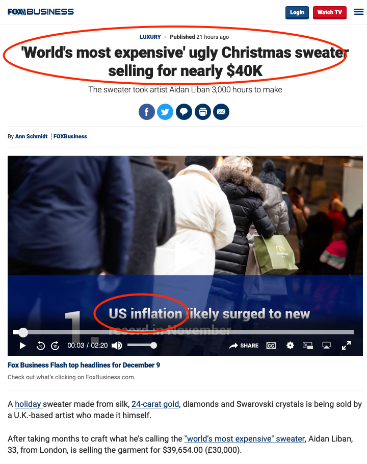
For example, in this Fox Business article, the video portion at the top automatically starts playing an ad (unless your browser preferences are set to prevent it). The article headline reads “‘World’s most expensive’ ugly Christmas sweater selling for nearly $40K” but the video is about “US inflation”.
This needs to end.
Video-only content
Sometimes you just want to skim the text of an article to get the gist, or you are in a place where you are unable to watch and listen to a video, but you can’t do this if the article page contains nothing but a video. This needs to end.
At the very least, a video should always contain a transcription of the words used in the video. In this example of an article about “Instagram head testifies before Congress on app’s impact on kids“, it would have been nice to give the users the option of skimming parts of the transcript if they wanted to learn more about what the Instagram CEO said to Congress.
Sure, there may be times when a simple little blurb about the contents of a video is all you need, such as this video about a woman leading police on crazy car chase across Florida golf course – but more often a text transcript or written text describing the video would also be handy.
Subscription-only articles
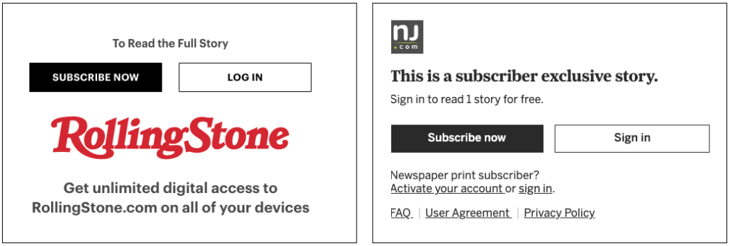
We know how a lot of magazine and newspaper websites are hurting and need to generate revenue to survive but suddenly blocking your loyal readers from accessing your content can’t be the answer. We’ve spoken to several people about this trend and everyone has stopped visiting the websites they used to frequent once they started to require subscriptions.
The most valuable thing a website can do is build a loyal base of repeat visitors. So, to suddenly block those same visitors from reading your content is like hiring a bouncer to stand outside your place of business so they can stop loyal customers from entering. Keep in mind that these websites already fill every pixel of available screen real estate with ad banners, video ads, and pop-ups, and they track your every movement, download cookies to your device, and sell your activity to advertisers. In other words, loyal website visitors are already paying a price to read a website’s content (whether they know it or not). So, these websites need to figure out a better model that rewards their loyal readers and puts an end to these traffic-killing subscription-only articles.
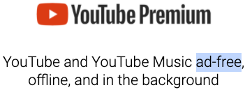
If websites insist on having a subscription, perhaps they should consider including an added incentive for buying a paid subscription, such as an “Ad-Free Experience.” This would be similar to what YouTube does with its YouTube Premium subscription. If you want to experience the website without a subscription, you pay with ads and your data. If you don’t want to see ads or have your data used, pay for a premium subscription.
We’re not sure if an “Ad-Free Premium Subscription” model is the answer – but we can’t think of a worse user experience than one that blocks your users from having any experience at all.
Enormous memory and CPU hog websites
If you go to a website and it immediately kicks on your CPU fans and brings your laptop to a crawl, the site just might be an enormous memory and CPU hog. We don’t mean to pick on RollingStone.com but take a look at the 354 MB JS heap the site requires. If that’s not bad enough, the site also utilizes over 94% of your CPU. This is completely unacceptable.
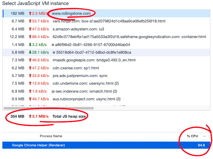
Rollingstone.com JS heap size and CPU usage.
When we ran the GTMetrix Lighthouse tool on RollingStone.com, it literally errored out before the site could even load.
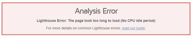
Lighthouse’s explanation for the error is that:
“The page took too long to load (No CPU idle period)
This usually happens because your page is repeatedly doing something and constantly utilizing the CPU.
Lighthouse requires a period of CPU idle, meaning we must observe a brief period of no CPU activity. This is required for a page to be considered “Fully Loaded” or finished loading.
You want to make a poor user experience, crash your user’s computers or make them come to a crawl when they visit your website.
This has to end.
Mobile designs used on desktops
We don’t know if this is a purposeful design decision or a sign of laziness, but too many websites are starting to display mobile-friendly designs to their desktop users, which negatively impacts the user experience. These websites take the whole idea of a mobile-first approach a few steps too far. While hamburger menus may be a good solution for small screens, why would you purposefully hide your website’s primary navigation and make your users work to navigate your website? In the example below, the site not only hides the main navigation menu in a hamburger menu but it also hides the full name of the company behind the icon. Sure, minimalist web design has its place and can be effective but requiring users to work extra hard to use your website has to end.

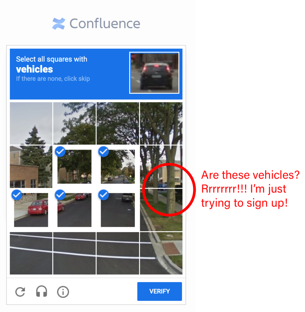
Unusable CAPTCHAs
We’ve all run into these user-hating roadblocks where you’re trying to get something done online, and all-of-a-sudden you’re asked to somehow figure out what a CAPTCHA prompt is asking you to do. Hopefully, you pass the test and move on to complete what you were trying to do. However, if you get the dreaded “Please try again.” message, you run the risk of acting out online rage on your device and start screaming profanities at the website you are using.
We get the need to prevent unwanted bots from inundating websites with false form submissions, but why would a business place this burden on its users? That’s having a customer come to your place of business and then making them solve The Da Vinci Code before they can start doing business with you. It’s terrible, and it needs to end.
Not involving users because you are a user
We wrote a blog post about this one called “3 Reasons Why You Should Never Design Software As If You Are The User“. The topic for the post was born from a few clients that asked us to design their software, but they didn’t think we needed to involve their users in the process because they told us, “I’m a user – so if I like it and I can use it, my users will too.” While it may be true that you represent the typical user of your own product, there are at least three reasons why you should never exclude your actual users in the design process.
- You are too close to your own product
- You don’t know what you don’t know
- Your users will thank you
This needs to end.
UI text written for (and by) developers instead of users
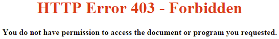
How many times have you used a software product or website and been scolded by rude, accusatory bold error messages, such as “Error 403 – Forbidden“! This needs to end.
Perhaps a nicer way to inform your valuable users that the page they were trying to access isn’t available to them would be something like this instead: “Oops! We are unable to give you access to this page or document. Please contact support at support@nicemessages.com for help.” A message like this does not scold or shout at the user, and the tone of the text even places the blame on itself rather than the user while also providing the user with a way to get help if it is needed.”
Also, why do the words “HTTP Error 403” need to be the biggest words on the screen? Not only is the website yelling at its users, but it’s also confusing them with some meaningless error code. If these codes are needed for some technical debugging purpose, why not display them as the smallest text near the bottom of the page?
In addition, far too many message pop-ups contain verbose and confusing text that force the user to stop, read and attempt to figure out what their next action should be.
Sorry software developers – but it’s really not your fault. In fact, all the developers on our staff love it when our UX staff provides them with the exact text to be used in error messages and content throughout the UI because they’d rather be coding instead of copy writing.
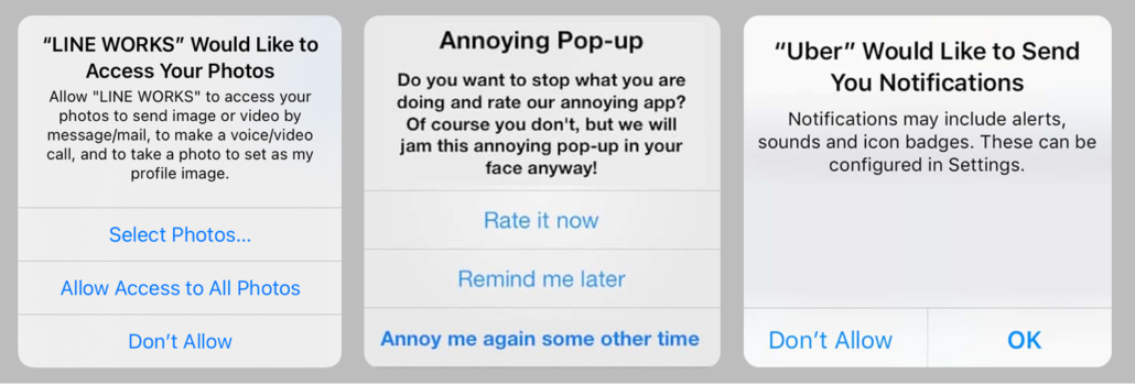
Out of context "allow" popups
How many times have you downloaded a mobile app to your phone and the first time you open it, you get bombarded with a series of “Allow” popups to things like your Camera app, Contacts, Microphone, etc. — even though you haven’t even used any part of the app that may or may not need access to those parts of your phone. This needs to end.
Rather than bombard your users before they even use your app, app makers should consider prompting these “Allow” popups only when the user needs to use a feature of the app that needs access to a part of the phone. For example, we designed an insurance app that enabled customers to upload photos of their damaged car when submitting a claim. So rather than prompt the user as soon as they launch the app, we prompted the user only when they needed to upload a photo from the photo app. This way, the user has a better understanding of why they are being asked and are therefore more likely to “Allow” access to that part of their phone.