I own a 2016 Volvo XC60. It’s been a great car except for one glaring design flaw that probably only affects those of us that live in that special place I call ‘Designer’s Hell’. In this case, it’s the design of the main dashboard readout. Like most newer cars, the dashboard in the XC60 utilizes a software-driven dashboard display, which sounds cool, looks aesthetically cool, and provides some options that a non-digital dashboard could not provide, such as different design themes.
The problem is that the usefulness of the readout fails miserably — especially with the ‘Elegance’ theme. Keep in mind that the users of this software-driven display are typically people driving down the highway at 65-75mph. So, the design must be hyper-optimized for users who need to find important information within fractions of a second.
The thing that jumps out the most is that it is unimaginable that the design was ever tested with customers before it was rolled out. A 2-minute test with 5-10 customers containing these 2 questions would have quickly revealed the flaws:
Can you tell how many miles of gas you have left?
Can you tell if you are in normal ‘Drive’ mode or ‘Sport’ mode?
Below, we focus on the design flaws of these 2 very important features for any dashboard.
Similarity and proximity
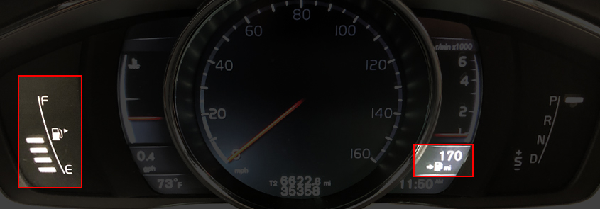
The above picture highlights how the remaining gas mileage indicator is located clear across the display from the main gas level indicator. To this day, I still find myself looking at the main gas level indicator area first when I’m looking for the remaining gas mileage. This is such an obvious design flaw, which also violates the design principle known as “Similarity And Proximity”.
In software design, we use “Similarity” to inform the user about which elements are related to each other and which are not. In this case, all gas-related elements should be grouped together so the user only has one place to find anything related to gas. We would also use “Proximity” by placing those elements close to each other while keeping them visually separate from all other elements.
Omit needless things
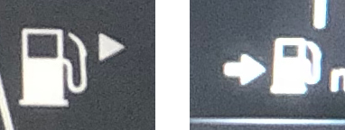
One of my favorite (lesser known) design principles is “Omit Needless Things” – originally known as “Omit Needless Words“. In this case, we not only have two duplicate and competing gas icons but we also have conflicting directional arrows. One arrow is correctly placed on the right side of the gas icon and is pointing right. The other is also pointing right, but it is located on the left-side of the gas icon. The solution for this is simple — remove the redundant gas indicator on the right altogether.
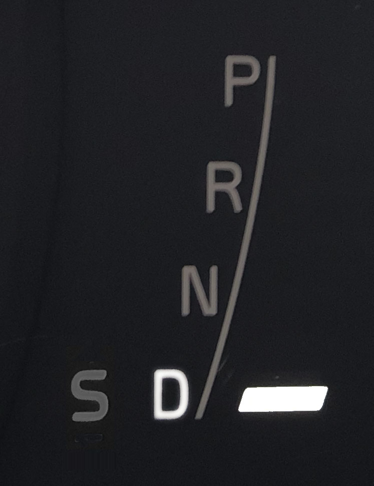
What's selected?
Another important design principle in software design is clearly visually communicating where the user is and what is selected and what is not selected.
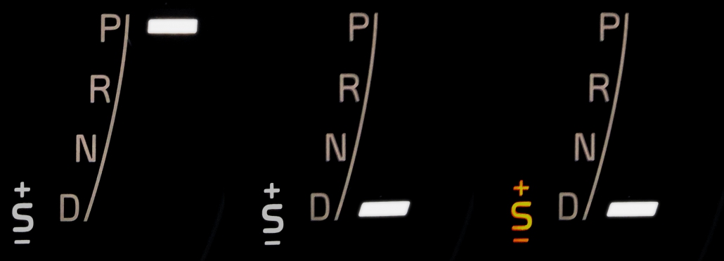
Looking at the gear indicator on the left, it is difficult to tell if the car is in ‘Park’ or in ‘Sport’ mode or in both because there’s a white bar lit up next to the ‘P’ for ‘Park’ and the ‘+S’ is not only also lit up but it also appears underlined. However, the underline may actually be a minus symbol (-) to coincide with the plus symbol (+), which only adds to the confusion of its purpose. When you move the shifter down to the ‘Drive’ position, it is still unclear if the car is in ‘Sport’ mode or regular ‘Drive’ mode because, again, the ‘+S’ indicator is lit up and underlined. It’s not until you slide the shifter to the left do you see that the ‘+S’ indicator turns yellow, which oddly enough is the only indicator that ever turns yellow.
In conclusion
Since this is a software-driven display, it should be easy enough to upgrade and fix all these issues. As we have written about many times, good user experience design requires meticulous scrutiny of every micro-design decision. The design of this dashboard display clearly did not get the meticulous scrutiny it deserved.
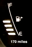
Revised gas indicator
A revised gas indicator could look something like this whereby:
All gas-related elements are combined into a single area
“170 miles” is positioned below the ‘E’ since it is directly related to how many miles can be driven before the gas tank is empty
There is now a single gas icon with the gas tank arrow properly located on the right-side of the icon
Revised gear indicator
A revised gear indicator could look something like this whereby:
The selected gear position is highlighted by both a lit up white ‘D’ and the white bar while unselected hear positions are dimmed out.
The ‘Sport’ mode indicator:
Is no longer lit up when it is not selected
No longer has a plus (+) or minus (-) symbol
Aligns to the left of the ‘D’ since it related and, in fact, mimics the physical action of moving the shifter to the left of the Drive position when selecting the Sport mode.