This Google Ads #UXFAIL is costing customers thousands of dollars
Like most businesses these days, we run ads on Google to try and attract new business. The concept of Google Ads is great in theory because it helps you get found by people who are already searching for your type of business. However, despite the enormous success of Google, it is not without its flaws — especially from a UX design perspective. We already covered the 5 Things The New Gmail Design Got Wrong, so we don’t want to look like we’re picking on Google – but this #UXFail is actually costing Google’s customers hundreds, if not thousands, of dollars each month.
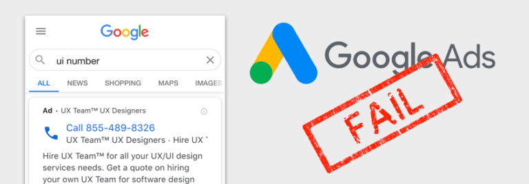
Google Ads has a campaign type called “Call Only” ads. As the name implies, these ads are geared towards getting people to call your business. Well, during the pandemic, we decided to run some Call Only ads, and instead of qualified leads, we received hundreds of calls from people looking for their local Unemployment Insurance office. Our phone began ringing off the hook – but for all the wrong reasons.
At first, we assumed there was something wrong with the way Google routes calls from their number (to track the clicks) to our business number. Google looked into it and they said it was not an issue. We tried asking each caller where they got our number and most just said they “Googled it”. We talked to our phone company to see if they could track down any routing issues. Given the fact that millions of people were suddenly unemployed, we thought the phone systems could be getting overloaded and causing issues. They found no issues. We looked up Unemployment Insurance office phone numbers to see if our phone number was published by mistake anywhere. It was not. We spent weeks and hundreds of dollars on clicks trying to figure out the issue until we gave up and just paused the Call Only ads.
Finally, a breakthrough
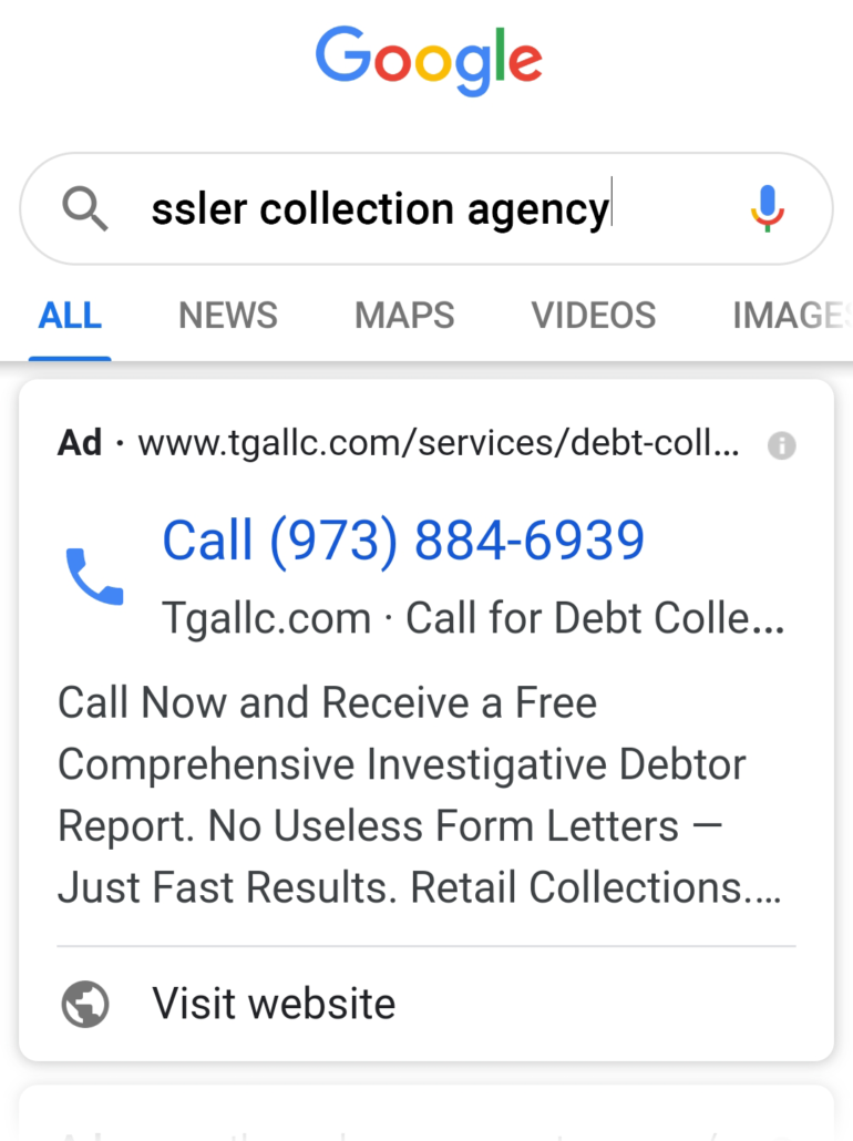
My brother owns TGA Legal Collections (shameless plug) and he asked me to help him run some Google Ads. These ads were set up to target companies that are looking to hire a firm to collect money from debtors who owe them money. Within one week of running his Call Only ads, he began getting calls. Unfortunately, the calls were not from companies but from debtors who were looking to make payments to a collection agency. Luckily, one of the debtors was nice enough to actually send my brother a screenshot of exactly what they Googled before calling his business. As you can see in the screenshot on the right, the debtor typed in the full name of the collection agency they were looking to make a payment to, and the first result Google displayed was my brother’s ad. Clearly the debtor never read a word of the text in the ad — even after sending the screenshot to my brother — they just saw the huge phone number and clicked it.
Now, you may think, “Why would someone click a phone number without reading whose number it is?”. Well, a good UX designer always empathizes with users rather than blame them. So when we looked into it further, it was clear that many Google users have become used to seeing the first result on Google’s Search Engine Results Page (SERP) as the one they want. Look at the screenshots below. Google a flight number and you get its status first. Google the weather, and you will see the weather first. Google the age of a celebrity and you see their age and photo first. It goes on and on. So when a Google user searches for a business, many users are being trained to believe that the first result is what they want. When they see a huge phone number, they assume it’s the number of the business they want to call.
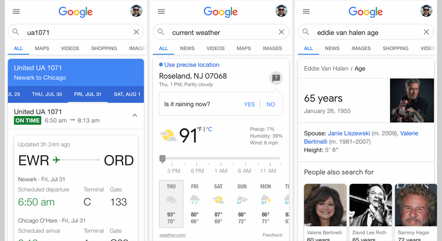
Google users have become used to seeing a result at the top as the one they need.
But why were these ads displayed at all?
The answer is simple: Since one of the main keywords we added to our UX Team campaign was “ui“, the ad was served up because millions of people during the pandemic were searching for their local Unemployment Insurance office — or “UI” office. Since one of the main keywords added to the TGA campaign is “collection agency,” the ad was served up because the debtor searched for “pressler collection agency.” So, the ads being served up are not the issue. It’s doing exactly what it’s designed to do. The issue is that the users clicked the huge phone number without realizing it was not the number they wanted to dial.
The #UXFAIL
While making the phone number so big may seem like a good design idea for a Call Only ad, it is actually a huge flaw that is costing Google customers thousands of dollars in erroneous clicks. The visual hierarchy of the ad design places so much weight on the phone number that it drowns out all the other elements that would have informed these people whose number they were really dialing.
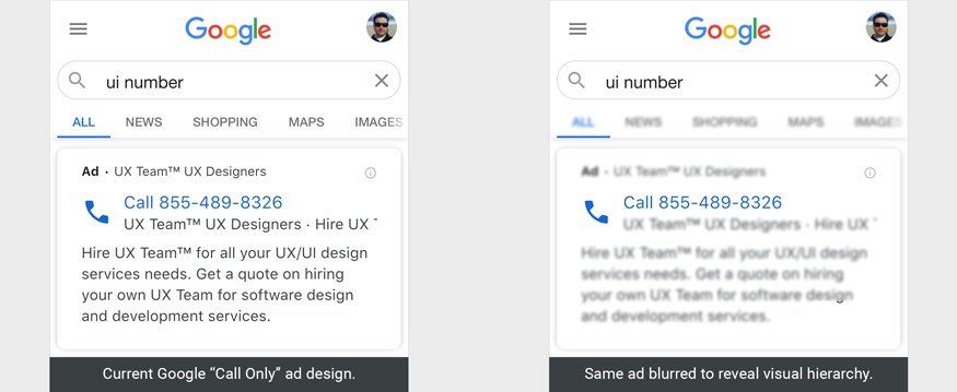
The screen on the right is blurred to help reveal the design’s visual hierarchy.
The possible solution
One possible solution to this design flaw is to address the ad’s visual hierarchy. A good visual hierarchy assigns a visual weight to various elements in a design to help inform users of what is most important, somewhat important, and less important. In these Call Only ads, the visual hierarchy should assign a high visual weight to the business name or headline, a medium visual weight to the phone number line, and a low visual weight to the description text. By assigning a high visual weight to the business or headline, the users are far more likely to read it and realize that “UX Team™ UX Designers” are not the Unemployment Insurance office.
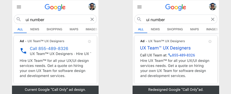
The design on the right shows how a few adjustments to the placement and visual weight of elements can improve the design and reduce erroneous calls.