Why A Poor ‘Visual Hierarchy’ Will Destroy Your Software’s User Experience
The term “Visual Hierarchy” refers to the arrangement or presentation of elements in a way that implies importance. In other words, visual hierarchy influences the order in which the human eye perceives what it sees. This order is created by the visual contrast between forms in a field of perception. Objects with the highest contrast to their surroundings are recognized first by the human mind. The term visual hierarchy is used most frequently in the discourse of the visual arts fields, notably so within the field of graphic design.
In art school, my teachers constantly reinforced the importance of assigning a proper visual weight to the elements in any design or painting so that the focal point jumps out and the overall composition is sound. When designing software, these same principles can be applied to enhance the overall user experience and goals of the product. Some of these will seem obvious, but when you’re in the throws of the project, and your client is asking you to do things that you believe will negatively impact the UX, it’s more effective to back up your suggestions with data, research findings, and these simple Visual Hierarchy principals:
"When everything appears important, nothing is important"
"Make something important, appear important"
"Make something unimportant, appear unimportant"
You guessed it, in contrast to “making something important appear important”, you need to make sure elements that are not important or less important appear less important. This can be achieved in many different ways, such as:
- Location of the element
- Size of the element
- Color of the element
- Boldness or thickness of the element
If your brand guidelines dictate that all buttons should appear the exact same size and color, you need to reexamine your guidelines. The appearance of something as simple as a button should be carefully scrutinized for how important or unimportant it is so that it visually informs the user without making them think much about it.

"Every Element Competes with Every Other Element"
Whether we were designing a magazine ad or creating an illustration, our teachers would often say, “Remember, every element you add to your (ad/illustration) visually competes with all the other elements — so be careful about what you choose to add so that it doesn’t take away from your primary focal point.” This is a great lesson to use when a client asks, “Can we add these (buttons, images, links, text, etc…) to this screen?”. Our response is usually, “Are you sure you want these elements to visually compete and take away from the other important elements on the screen now?” Sometimes, the answer is “Yes.” – but it at least creates a habit of stopping and carefully thinking through the decision.
So How To Define A Clear Visual Hierarchy?
Whether we were designing a magazine ad or creating an illustration, our teachers would often say, “Remember, every element you add to your (ad/illustration) visually competes with all the other elements — so be careful about what you choose to add so that it doesn’t take away from your primary focal point.” This is a great lesson to use when a client asks, “Can we add these (buttons, images, links, text, etc…) to this screen?”. Our response is usually, “Are you sure you want these elements to visually compete and take away from the other important elements on the screen now?” Sometimes the answer is “Yes.” – but it at least creates a habit of stopping and carefully thinking through the decision.
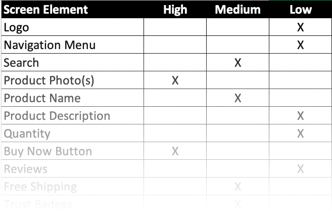
Sometimes, when we are struggling to define a clear visual hierarchy, we create a simple spreadsheet (like the one on the right) with a column that lists each element on the screen and columns for “Low,” “Medium,” and “High.” We then give this spreadsheet to the client as a homework assignment and ask them to do their best to assign a single visual weight to each element. The key is to make sure there are only one or two elements in the ‘High’ column. Oftentimes, this can be a struggle for the client, which is partly why we do it because we want to demonstrate that if it is difficult for them to define the visual hierarchy for the screen, imagine how it will be for their users.
How To Test Your Design's Visual Hierarchy
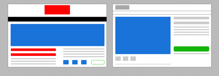
Another art school lesson I learned was “The Blur Test“. This is when we would stand back from our paintings or designs and squint our eyes to blur our vision. When you do this, your design immediately reveals its most important and least important elements. This technique also mimics how your users’ brains initially scan and process your design. Whenever we perform an audit of our client’s software design or evaluate our own designs, we like to open a screenshot of a design in Photoshop and apply a 3 to 4-pixel Gaussian Blur to the screenshot to help reveal the true visual hierarchy of the screen.
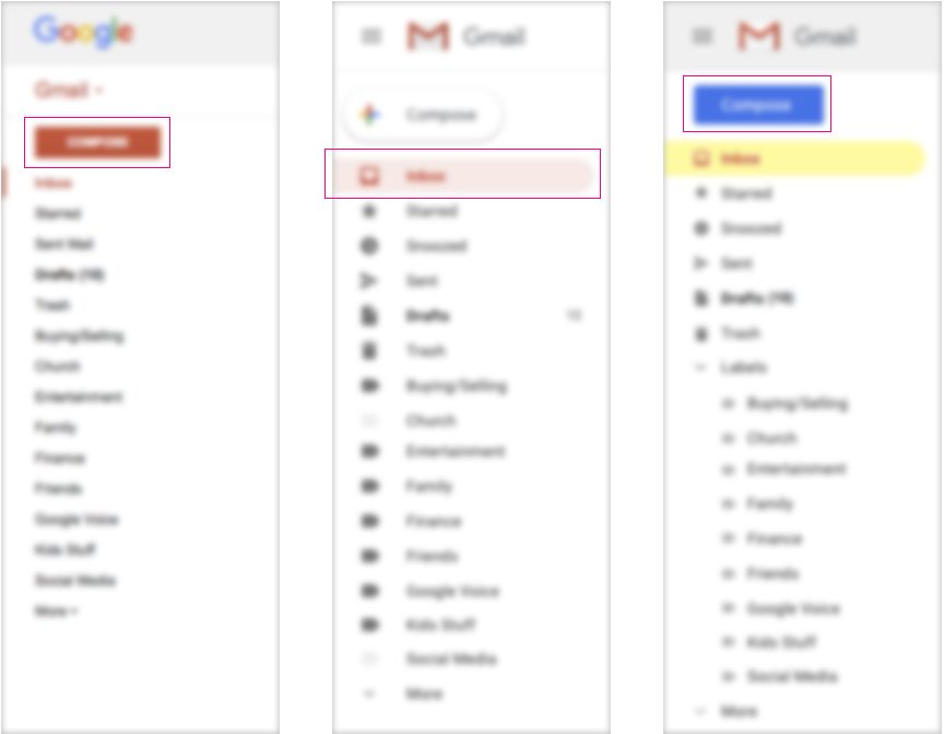
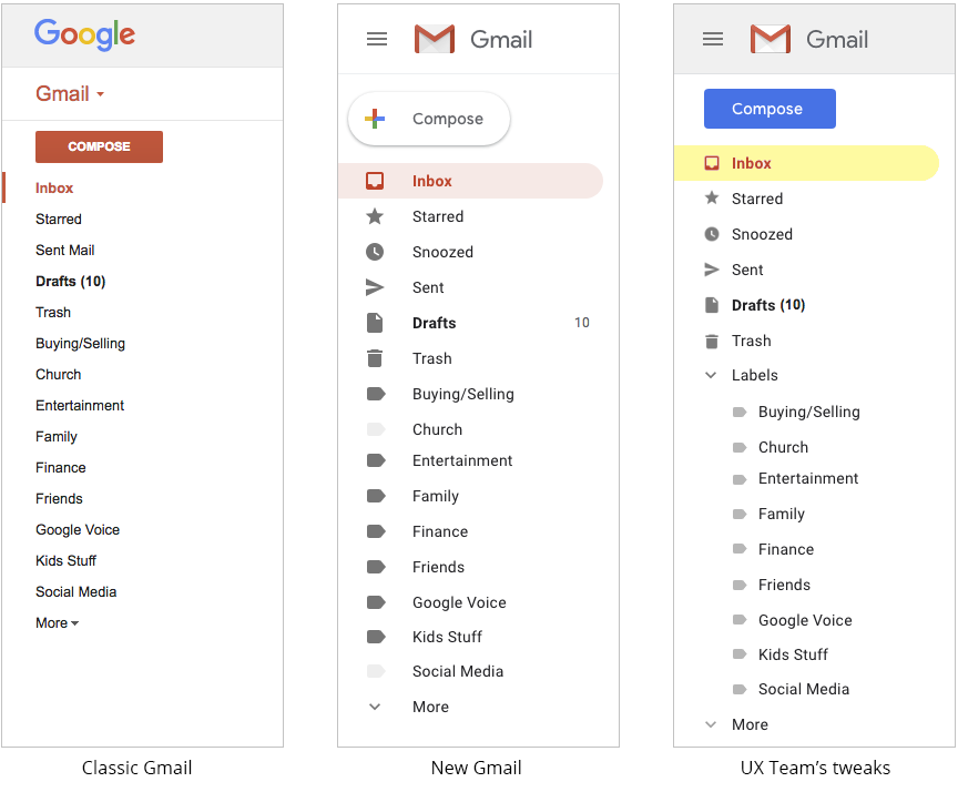
For example, in our blog post “5 Things The New Gmail Design Got Wrong,” we used The Blur Test to reveal the flaws in Gmail’s new sidebar design. The screenshot on the left is the old Gmail design, which correctly makes the “Compose” button appear as the most important element in the sidebar. In the middle is the new Gmail design, which makes the inbox navigation link the most important element in the sidebar. We would recommend that a navigation element have the appearance of a supporting element (not the most important element) because it simply helps reinforce what screen the user is on. Meanwhile, the ‘Compose’ button almost entirely disappears into the background. The screenshot on the right is our recommended redesign. This design assigns a heavy visual weight to a blue ‘Compose’ button, which we felt was also a better color than red since red is typically reserved for errors, warnings, and alerts. We then highlighted the Inbox navigation link with a yellow highlight to, well, highlight what screen the user is on.
And, as always, test your design with users and monitor the use of your design with heat map tools and video playback tools.