5 Things The New Gmail Design Got Wrong

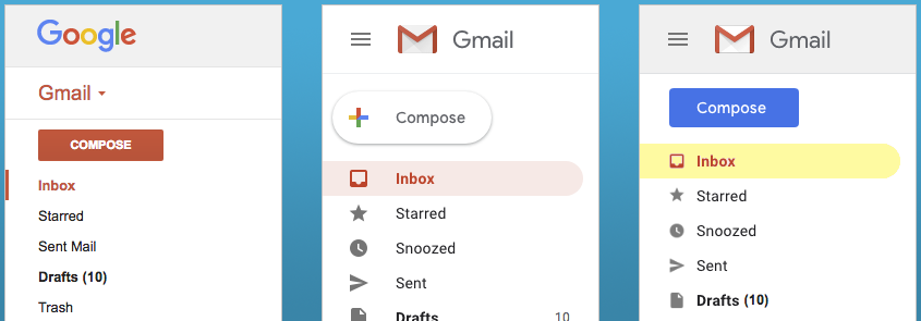
Google recently launched its revamped Gmail design and, while there many things they got right, there are some things we feel they got wrong — in just the left sidebar. So, we took it upon ourselves to make a few suggested design tweaks that we feel correct some of the things the new Gmail does wrong and builds upon some of the good things Google introduces in their new design.


1. Poor Visual Hierarchy

As plain and simple the old “Classic” version of Gmail was, the one thing it had was a clear visual hierarchy. One of the most important considerations in any design is making sure the important elements appear important and the less important elements appear less important. In the Classic design, it was very clear that the ‘Compose’ button was the most important element. Then, maybe the Google logo appears to be the second most important, then the highlighted ‘Inbox’ label and ‘Drafts’ label, and then everything else. In the new Gmail design, the ‘Compose’ white button appears so unimportant that it almost gets lost and the red highlighted ‘Inbox’ appears most important. In addition, the weight of the icons seem to far outweigh their relative importance.

The Blur  Test
A great method we use to test a design’s visual hierarchy is the ‘Blur Test’, which is an old art school trick that helps reveal a design’s or painting’s primary focal point. In UX design, we take a screenshot of a design and apply a 3 to 4 pixel blur to it or we use a browser plugin such as Funkify to simulate someone visually impaired. When you do this, certain elements jump out and others drop back. As you can see in the blurred screenshots below, the new Gmail design has a fairly weak visual hierarchy. Beyond the highlighted ‘Inbox’, most elements carry a very similar visual weight. In our tweaked design, we made the ‘Compose’ button the most important, followed by the highlighted ‘Inbox’, followed by ‘Drafts’ and the other icon folders. In addition, we also indented the label names to help offset them from the other icon folders.

2. Using ‘Error Message’ colors for the highlight color

The new Gmail design uses a highlight color that is typically reserved for error messages and warnings. In general, UX designers need to be very careful about how and where they use the color red in their software designs because users are so used thinking something has gone wrong when they see red. In the screenshot below you will see a typical error message displayed below the new ‘Inbox’ to demonstrate how similar they look. In our tweaked design, we used used the familiar color of a yellow highlighter marker as the background instead of using a light red/pink background.

3. Detached “Unread” numbers

In the ‘Classic’ Gmail design, the total number of unread messages appears directly connected to the corresponding folder. In the new Gmail design, the unread numbers appear very far away from its corresponding folder. In our tweaked design, we moved the number back to where it was in the ‘Classic’ design.

4. Inconsistent primary action button color

The new ‘Compose’ button uses a white background which not only gets lost but it’s also inconsistent with Google’s own design standards. In other Google applications, the primary action color is blue. Even within Gmail’s message window, the ‘Send’ button is blue – so it would seem logical to use a blue ‘Compose’ action button. We are not saying the ‘Compose’ button must follow Google’s own standards but if it is meant to be the most important element on the screen it should look like it.

5. Poor icon spacing and size

The icons are a nice touch in the new Gmail design but they are far bigger than they need to be and the 27 pixels of space between the icons and the label names make the icons feel a bit too detached from each other. In our tweaked design, we made the icons 20% smaller and reduced the space between the icons and label to just 12 pixels.


The Blur Test: NY Times

The Blur Test is an old art school technique used to reveal a design’s focal point and visual hierarchy. I recommend using it during the design process to mimic the way a user initially views the elements in your design. Read more

The Blur Test: Go Daddy

The Blur Test is an old art school technique used to reveal a design’s focal point and visual hierarchy. Let’s see how Go Daddy holds up to The Blur Test. Read more