Spotify Logo

How We’d Make It Better: Spotify (Vol. 1)

One of the things I hope you’ll notice when we go through the examples of how we would make Spotify better is that most of it has little to do with the User Interface design — but all of it has to do with the User Experience.

Content

Currently, Spotify provides a small area buried at the bottom of each Artist page containing a blurb ‘About’ the artist (if the artist provided one). However, there is a huge opportunity for Spotify to fill a void that’s been missing since the days of vinyl records, CDs and even cassettes and that is: Liner Notes and Artwork.

“Back in the day”, listening to music was always a multi-sensory, immersive experience where you would sit in your bedroom listening to music while looking at the artwork and reading all the Liner Notes, which often included :

  • Lyrics
  • Songwriting credits
  • Producer and sound engineering credits
  • Guest musicians
  • Album artwork credits
  • Thank you notes
  • And more

When you read the liner notes, you felt like you were really getting to know the band on a different level because you would learn all kinds of behind-the-scenes details about the music you were listening to. Sometimes it even gave you a better sense of the band’s personality and talents. Unfortunately, this whole experience went away when music started to be distributed via download and streaming services.

How We’d Make It Better:
The good news is that all this content exists — so if/when Spotify includes it in their product, they will fill that void and create an even better user experience for its customers.

This is a sample page of liner notes from Green Day’s ‘Dookie’ album. I always loved the raw sketchy look of this because it reminds me of the doodles I would make in my notebooks during school.


Sortable Column Headers

One of the great features of Spotify is its recommendation algorithm, which suggests artists that you may like based on other artists you’ve listened to. Now lets say you visit one of these recommended Artist’s page to see what other songs they have. The first thing you will see is a list called ‘Popular’ at the top, which seems to be a list of the most popular songs by the artist – but we’re not sure. Assuming this is a list of the artist’s most popular songs, the list (for some reason) is not sorted by showing songs with the most plays at the top. In fact, there’s no way of knowing how the list is sorted at all. And, even if you wanted to manually sort the song list by the number of plays, there’s no way to do that either.

In addition, it would also be useful if there was a column for ‘Album’ so that the users could see what album a particular song is on and link to it.

Spotify’s Artist Page with a song list you can’t sort.

How We’d Make It Better:

  • Add sortable column headers
  • Make the default view show the most popular songs first
  • Add a column for the name of the Album

We could do a whole series on what we would do to improve the iTunes user experience but it does have all the above features.

The Winery Dogs on iTunes

iTunes Song List with sortable columns.


The Spotify Artist Page does not provide a way to access “All Songs” by the selected Artist.

“All Songs” List

While the Artist page appears to show the top 5-10 most popular songs, there is no list or link to all songs by the Artist. You can expand the “Popular” list to see 5 more popular songs but somehow the Artist page leaves out a section and a link to all “Songs” by the artist. We’ve talked to several people about this one and they all noticed the same thing and are frustrated by this seemingly obvious omission. How can the Artist page in a music listening app contain all the sections listed below but not include a section for “Songs”?:

  • Popular
  • Popular releases
  • Albums
  • Singles and EPs
  • Featuring [Artist Name]
  • Fans also like
  • Discovered on
  • About
  • Offers

Of course there is a way to get to all the songs by an Artist — but you can’t get to it from the Artist page. Instead, you have to search for the artist and then filter the search results by “Songs” to see them.

How We’d Make It Better:

  • Simply change the “Popular” section name to “Songs”
  • Sort the “Songs” list by the most played songs at the top
  • Provide a link to “All Songs”

No-Repeat Shuffle

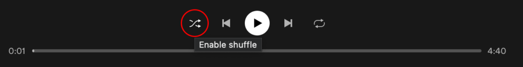
When a user uses the shuffle feature on either their own playlist of any list of songs, the expectation is that the songs will not repeat until all the songs have been played once. If you’re a Spotify user, you may be saying “But that’s what shuffle already does!” and you would be right, sort of. If you use shuffle on a song list and then close the app and open it again hours later or the next day and go back to play that same song list, you will likely hear songs repeat. For example, I have a Beach Mix containing 94 beach-themed songs. When my wife and I were on vacation with friends, I put my Beach Mix on one day and then, at some point, I turned it off. The next day, I put my Beach Mix on again and I heard several songs repeat from the previous day before playing other songs that had not played yet. In another example, we were driving a long distance and I was playing my mix of 98 Mellow Rock songs. We stopped a few times along the way and whenever we got back in the car and I put the same playlist on, we would hear songs repeat.

How We’d Make It Better:
Ideally, Spotify should utilize a songs “last played” date and time stamp so that when you shuffle a list of songs it knows to select songs with the older “last played” dates before playing songs with the newer dates.

Spotify Shuffle


In Conclusion…

As you can see, none of the examples above are focused on how the User Interface was designed or laid out but all of them impact the User Experience. They’re really more about content and either missing features or enhancements to existing features.