Popular minimalist designs take the “less is more” approach. In software, that often means lots of white space, streamlined flows and concise language. It might also mean fewer features. As UX designers, we generally prioritize function over form in software design. That means we let the functions of the software take center stage, while form (aesthetics) is carefully used to support the functions. It’s particularly important to balance form vs function in minimalist design because the design can be very sparse. In that regard, physical products are no different from software.
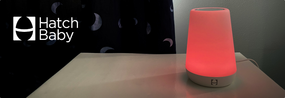
The Hatch Baby Rest is a device with sound machine and nightlight features. It’s got a super sleek, minimalist design – so minimalist that the buttons are all hidden underneath the base. So while it’s very easy to control from an app on your smart phone, it’s not so easy when you don’t have your phone with you.
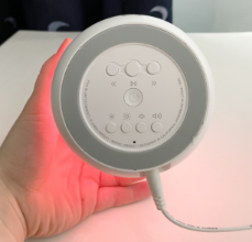
The gist of how the manual controls work
When the device is standing upright, you can turn it on by tapping it or off by touching and holding the top. You can also cycle through your favorite settings that you saved from the app. However, if you want to do anything more than that, you’ll have to flip the device over.
The left/right controls on the top half allow you to toggle through your saved settings from the app. The brightness and volume buttons on the bottom are all the same size and shape, making them difficult to distinguish.
How we’d make it better
Put the (next) most important controls on the side of the base
Obviously, on/off is the most important control, and you can already control that by tapping on the top of the device. However, all other controls are on the bottom. When you’re holding a cranky baby, it’s not that easy to flip the device over with one hand and press the buttons with the other. Plus, it’s awkward because it’s tethered to the wall by the power plug. An easy solution is to put the buttons on the side so they’re accessible without flipping it over.
Make the controls distinguishable
Since this product is often used while your baby is sleeping in the dark of the night, it’s usually not possible to see the buttons. In addition, most of the buttons are the same size and shape, so there is no way to tell them apart as you touch them in the dark. Therefore, we would also recommend making the buttons feel different to make them easier to distinguish by touch.
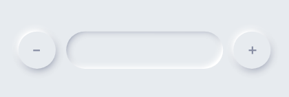
A touch slider like this could work perfectly for the brightness.
A traditional knob would work great for volume.
Balancing function and form
We often find that minimalist designs are both pleasing to look at and easy to use, but it’s important to keep key features and controls easily accessible. With the buttons tucked away underneath the base, it’s super sleek and beautiful, but it makes the device harder to use. The same-size-and-shape buttons on the base provide great design unity, but again, since the product is often used in the dark, the controls are harder to distinguish from each other and use. Each of these examples speaks to the importance of making sure form does not hinder the usability of function.
While a customer may purchase a product because of its aesthetic beauty and potential usefulness, those initial good impressions may quickly fade if they find the product difficult to use. Then, you’ll have frustrated customers writing bad reviews or, even worse, writing a blog post about your product.