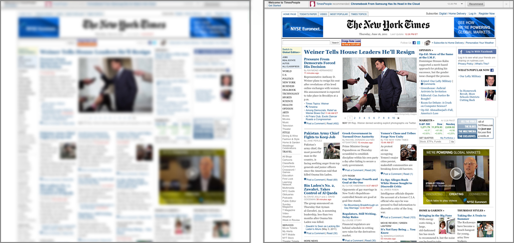
The Blur Test: NY Times
The Blur Test is an old art school technique for revealing a design’s focal point and visual hierarchy. I recommend using it during the design process to mimic how a user initially views the elements in your design.
Initial glance
NY Times statement of purpose
NY Times visual hierarchy

- Top Story: News article on Anthony Weiner
- Masthead: NY Times logo and advertisements
- Advertisement: NYSE advertisement
- Secondary Stories: News articles on Pakistan and Yemen
- Tertiary Stories: All other news articles
Does this visual hierarchy align with the site’s stated purpose? Does it appear that the NY Times visual hierarchy is focused on displaying “high-quality news, information, and entertainment?”
I would say: not really. The Top Story does appear to be the most important, and it is indeed a news item, but whether it’s “high-quality” news is subject to debate. Regardless, the next two most prominent areas are the Masthead and large Advertisement, and neither are news items. The fourth and fifth most prominent are Secondary and Tertiary Stories, which would be fine were it not for the Tertiary Stories being blended together in a sea of noise, thereby making them almost impossible to scan through and read. Even the structure of how the headlines and excerpts are formatted and displayed is a mess. A few points:
- Too many headline font sizes
- Irrelevant author bylines are displayed in all CAPS
- Red time stamps scream for attention and are stuck after the bylines
- News items end with even less important “Post a Comment | Read (41)” content
What can be improved
To say this site suffers from “kitchen sink” syndrome is an understatement. What this design could use most is a delete button, but I would start with this:
- Strip out all unnecessary content – Any content (text or graphics) that is not absolutely valuable to a reader looking to consume news should be removed first.
- Document a Screen Inventory – List out all the unique content components.
- Assign a visual weight to each item in the screen inventory—e.g., highest, highest, medium, low, lowest.
- Create a few UI design structures (in wireframe format) to support the visual hierarchy.
- Test the UI designs with users.
- Iterate.
- Create Visual Design.
- Test the Visual Design with users.
- Iterate.
- Begin development.


