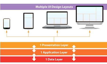
Responsive Web Design involves designing and coding the front end of a website or app so that the layout “responds” or automatically adjusts (using CSS) to a layout optimized for the user’s display size.
So, a single web page or template may have different optimized layout variations for different types of displays, such as:
Small, medium, and large computer/laptop displays
Portrait and landscape tablet displays
Smartphone displays
Depending on the user’s unique display size, the web design can adjust or snap to a layout that uses unique attributes that are optimized for the user’s display, such as:
More or less columns
Bigger or smaller font sizes
More or less content
Bigger or smaller images
Unique URI scheme names, such as “tel:” for linking a phone number to initiate a phone call on a mobile phone, etc…

