How to make long online web forms suck less (for your users)
We’ve all been there. We open a screen in our web browser to refinance our home, get an insurance quote, file our taxes, or anything else and the form is overwhelmingly long. We take a deep breath, sigh and trudge forward. In our heads though, we’re cursing the screen in front of us with thoughts like “I don’t f#@kin’ have time for this?!” or “This s#%t is going to take forever!”. Clearly, none of these are thoughts you should ever want your users to have.
Sometimes, the data that needs to be collected in all those form fields is truly necessary – but that doesn’t mean the user experience should suffer. Luckily, there are several different things you should consider to make long online web forms suck less.
Visually segment sections
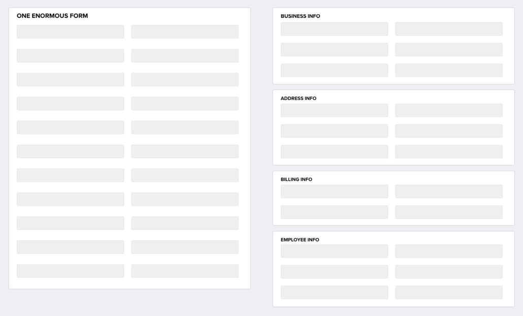
When a screen is just one enormous form filled with tons of form fields, users can feel overwhelmed before they even begin. One way to help alleviate this initial negative reaction is to visually segment the screen into smaller, logical groupings. This enables users to process the screen easier in their minds and quickly get the gist of what they’re going to need to do before they begin. Part of what overwhelms users is a feeling that they may not be able to complete the form once they begin. If your users can quickly understand what they’re being asked to do, it will build their confidence and help make them think “I got this.”
Compare the screen mockups below. Even though the screen on the right is taller/longer, it appears more manageable because you quickly get the gist of what you’ll need to do to complete the form. In fact, the card headings alone can put the user at ease because they provide context for what type of information is needed in each section, which can help make a user think, “Oh, I know all this info, this should be easy.” as opposed to “Oh boy, what are they asking me for now!”.
Dynamically displayed fields
Oftentimes, a lengthy form will contain “parent” and “child” fields whereby certain “child” fields only need to be displayed if the “parent” field is completed a certain way. If this is the case with your form, consider developing the form so that it dynamically displays the “child” field if/when the “parent” field is completed. One of the simplest examples is a “Yes/No” checkbox. If the user clicks the “Yes” checkbox, only then should you display the “If yes,…” child fields associated with that parent checkbox. More complex examples may include developing logic whereby a combination of different answers drives the display of certain additional fields. Either way, by eliminating the initial display of the child fields, you greatly reduce the overall volume of fields and noise on the screen.
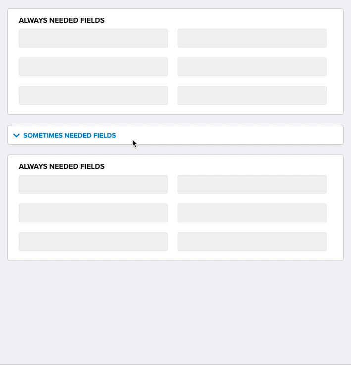
Accordions
If certain fields in your form are only needed in certain cases, consider moving those fields into a collapsed accordion that can be expanded only if/when the users needs to complete those fields. By moving those fields into a collapsed accordion, you greatly reduce the initial clutter of the screen and make the form appear easier and faster to complete.
Modal and fly-in windows
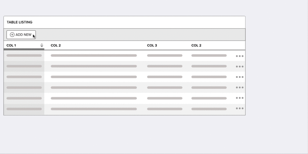
Sometimes, a large form may contain form fields that are only needed when the user needs to add a new item or record to the form. Other times, there may be a need to display detailed data about something in a form. In these cases, it may make sense to implement modal popups or fly-in windows that are displayed only when the user takes an action. For example, if the user needs to add vehicle information to a form, consider displaying the vehicle information fields in a modal or fly-in rather than displaying all of the vehicle fields in the main form. In addition, the main form screen may contain a table listing of vehicles, but only certain column headers are needed to help distinguish one vehicle from another, while all other details can be displayed in the modal or fly-in.
Question consolidation
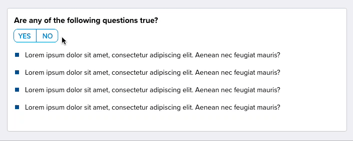
Forms that contain a series of questions requiring a “Yes” or “No” answer don’t always need to be displayed as individual questions with their own “Yes” or “No” checkboxes. Instead, consider whether the question section can be consolidated into a single question with a single “Yes” or “No” checkbox or toggle. For example: “Are any of the following questions true?” This enables the user to quickly scan the questions and take a single action to answer all of them.
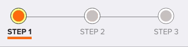
Wizards
Step-by-step wizards may seem like an old-school method to break up a lengthy form field, but they can still be an effective way to segment large chunks of related fields and create a positive sense of progress as the user moves through each step of the wizard. In addition, a good wizard will display the number of steps to inform the user of not only how many steps they will need to complete but also which step they are currently on and which steps they’ve already completed. A huge factor in creating a positive user experience is to give the user a sense that they are making progress towards the finish line.
In conclusion
Making long forms suck less is often about making a lot of micro-design decisions and optimizations that add up to a much better user experience. So put the time in to “trim the fat” on your forms so that the result is a positive user experience — rather than a verbally abusive experience.