How we’d make It better: Amazon Fire TV
The Amazon Fire TV user experience is a classic example of where the Visual UX is clearly not centered on the user. We make the Visual UX distinction because the Voice UX is actually pretty darn good while the Visual UX (or what you see and interact with on your TV screen) focuses far more on promoting things than on what users may actually find useful. In this blog post, we will dissect the Amazon Fire TV Visual UX and recommend ways that we could make it better.
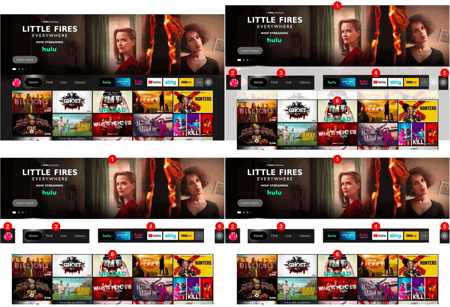
- Hero promotion
This area is nothing more than an enormous billboard carousel for promoting new or popular releases from various streaming services. - Profile
This is where you can change “Who’s watching” to someone else. One seemingly useful feature that Fire TV recently introduced is different profiles for different people who may be watching TV. The feature does enable each unique profile to customize certain options – but the options are very limited. Our hope is that future releases will include features that most users would expect when selecting a profile. - Main menu
This is where you can navigate to different sections of the interface, such as Home, Find, Live, and Library. The center of the screen seems to be an odd location for a main menu but what makes it worse is that its size and lack of color make it barely visible – yet, it may be one of the more useful sections on the screen. - My apps
This is a customizable list of some of the apps you have installed along with an ellipses icon on the end that links to a screen containing all your installed apps and a feature to customize the order of apps. - Settings
This is where you can access various settings (as you would expect). - More promos
This section contains a long list of other various movies and TV series. The problem is that there appears to be no rhyme or reason as to why those specific promos are there or what even determined the order that they are displayed.
How we'd make it better
Better visual hierarchy
We totally understand how the business needs to push revenue-generating promotions but this design takes it way too far. A great design takes into consideration the overall visual hierarchy of elements on the screen and assigns a visual weight to each element that should inform the user of what is very important, somewhat important, or not really important. In the graphic below on the left, you can see how the dark grey “PROMOS” rectangles in the current layout carry an enormous amount of visual weight while the small light grey “USEFUL STUFF” rectangle carries very little weight at all. We would strike a more appropriate balance between usefulness and revenue-generating promotions because if you don’t have a useful product, you won’t have users to promote things too.

Personalized home screen
Since the user selected their own profile before getting to the Home screen, the user’s expectation is likely to be that the Home screen is really a personalized “My Home” screen. Given this expectation, two features that would make the Home screen a lot more useful are:
- Last watched
Oftentimes, when a user turns the TV on, they want to return to the series they were just binge-watching. Right now, there is nothing on the Home screen that makes it easy for the user to return to what they “Last Watched”. Each individual streaming service typically provides a “Keep Watching” feature once the user launches the service – so it should be possible to surface whatever show or movie the user last watched from any streaming service onto the main Fire TV Home screen. If the user finished the series or movie they last watched, then this area could be used for promotion. - My watch list
One of the most useful features of each streaming service is the ability to add shows and movies to a Watch List so that you can easily find things you may want to watch in the future. Since this feature already exists in each streaming service, it would be handy if each show and movie on their Watch Lists could be displayed on the main Home screen. This would enable the user to jump directly into a show from the Home screen without having to first select (and remember!) the streaming service that show or movie is on.
Labeled promotions
As we mentioned above, the promotional section at the very bottom of the screen appears to have no rhyme or reason as to why those specific promos are there or what even determines the order in which they are displayed. Therefore, it would be very helpful if they categorized the promos with different label names such as “New Releases,” “Trending,” “You May Also Like,” etc. This simple labeling of the promos may actually entice the users to explore the bottom section a lot more rather than view it as just a bunch of unorganized clutter.
Suggested redesign
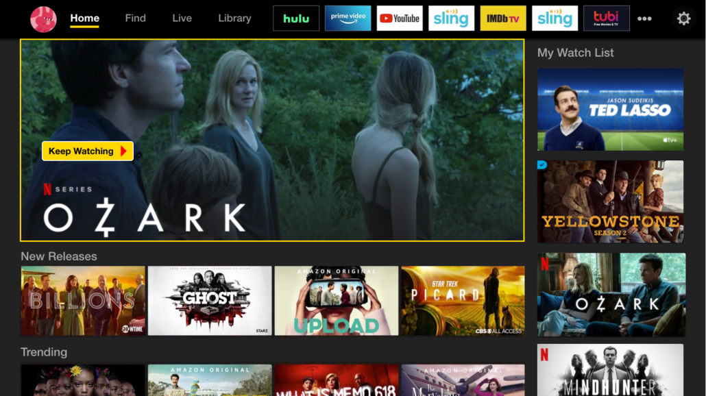
The mockup below represents a starting point for a design that we would want to test with real users and then make refinements based on the results of the tests. Overall, you will see the above-referenced recommendations implemented in the redesign, such as:
- The main menu is moved to the top, the text is more visible, and we’ve clearly marked what screen you are on with a bright yellow underline.
- The enormous billboard carousel is replaced with a “Last Watched” feature that displays and highlights what the user last watched so that they can quickly return to it.
- A “My Watch List” section has been added to the right side that surfaces selections for each streaming service Watch List (or equivalent) and they are ordered by last activity – meaning, either last watched or last added, whichever is more recent.
- The promotional section at the bottom is now organized into labeled sections to help entice the user to explore each section.
These recommendations only scratch the surface of what could be done to improve the Amazon Fire TV’s UX. In fact, this is only the Home screen! However, we think these changes would have a dramatic impact on creating a much more positive user experience.


