A strong design system is the foundation of cohesive digital experiences. We create scalable, well-documented systems that act as a single source of truth—helping teams design and build faster while maintaining consistency across products and platforms.
We equip your team with everything needed for seamless collaboration. With a combination of a style guide, component library, interactions, usage guidelines, and spec documentation, you’ll be ready to streamline your design and development workflows.
Style guide
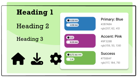
Style guides are built using your brand guidelines to define the system’s core styles, like color and typography. These styles are used when creating all other elements to ensure consistency and cohesiveness across the system.
Component library
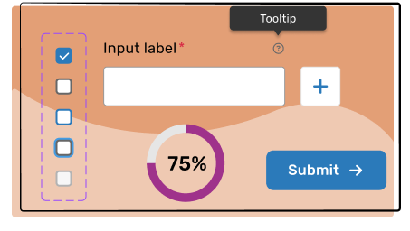
Think of components as the materials used to build a house, except they are reusable elements used to build the structure and features in an app. Depending on your needs, we include components like buttons, cards, checkboxes, input fields, radio buttons, and tags.
Interactions
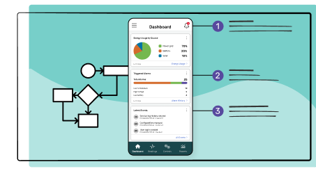
From hover states and animations to transitions and gestures, we create interaction systems that enhance usability and deliver a polished, professional experience.
Usage guidelines
Usage guidelines provide clear, actionable instructions for creating cohesive user experiences. Designed with scalability and accessibility in mind, these guidelines empower teams to maintain brand integrity and usability across every project.
Spec documentation
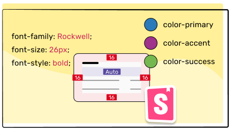
Developers won’t need to think about design and can focus on developing since our documentation outlines precise measurements, spacing, colors, and interaction behaviors. Providing even the smallest details ensures that every element is implemented accurately.
In a study performed by Figma, participants completed designs 34% faster when given access to a design system than without one.
Shared components and clear guidelines help designers and developers move faster without sacrificing quality.
Build, don’t redesign.
Developers can focus on implementation instead of interpretation, reducing back-and-forth and rework.
One system. Every platform.
A centralized source of truth ensures visual and interaction consistency across web, mobile, and future products.
Design systems speed up design and development while keeping apps consistent and cohesive!
If you’re building consistently, start with this design system checklist
This checklist helps you review the core principles of an effective design system. Use it to assess components, patterns, documentation, and governance—so your system supports consistency, scalability, and faster product development across teams.
Note: This checklist provides general guidance and may not cover every scenario. Always adapt it to your product, team workflows, and level of system maturity.


