Management Dashboard for
AI-Driven Skill Training

Project overview

Unboxed is a recognized industry leader providing training solutions globally. With recent advancements in AI, they are launching a new product that focuses on AI-driven roleplays designed to help employees develop their skills. This innovative product generates detailed performance data from roleplays, which managers can use to support their teams effectively.

Our project focused on designing a dashboard that enables managers to gain actionable insights into their team’s roleplay performance, allowing them to manage employees at both the individual learner and team levels.

Services
User research, Prototyping, Design system, UX support

Challenges

Present comprehensive data in a clear, usable way

The dashboard must present a wide range of detailed roleplay metrics on a single page without overwhelming the user.

Communicate performance changes clearly

Managers must quickly and accurately understand week-over-week changes in roleplay performance.

Implement tools that enable fast access to information

Managers require a flexible solution to filter data, spot trends, and surface relevant insights from large data sets.

Open and collapsed view of the tablet and mobile navigation with the active state on the Dashboard page. The open state also has a dropdown to select different software.
Filter options shown in a bottom modal sheet. Users can select one or more filters across multiple categories to refine the results.
Dashboard widgets for Roleplay average, Roleplay completion, Top Strengths and Areas for Growth. All widgets except the completion show a percentage score with a progress chart visualizing the same score.
Desktop date picker modal, empty state example with no activity in the last 7 days, and buttons to select larger date ranges.
Open and collapsed view of the tablet and mobile navigation with the active state on the Dashboard page. The open state also has a dropdown to select different software.
Dashboard widgets for Roleplay average, Roleplay completion, Top Strengths and Areas for Growth. All widgets except the completion show a percentage score with a progress chart visualizing the same score.
Filter options shown in a bottom modal sheet. Users can select one or more filters across multiple categories to refine the results.
Desktop date picker modal, empty state example with no activity in the last 7 days, and buttons to select larger date ranges.

Evidence gathering

Purpose of our research

After understanding the business requirements, goals, and available user data, we focused our research on:

  • Identify user needs and pain points
  • Analyzing competitor products and features to understand industry standards and opportunities
  • Interviewing stakeholders to identify key metrics and KPI’s important to managers
  • Exploring data visualization patterns that make key metrics easy to digest quickly

Studies

Key insights

Designing for one-page efficiency reduces managers’ workload
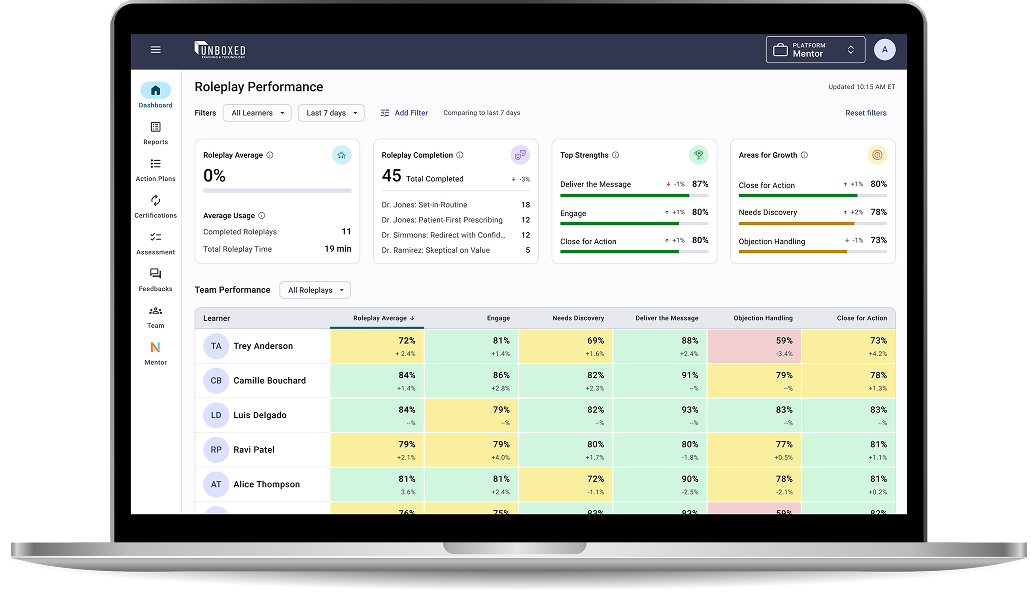
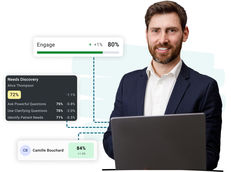
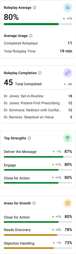
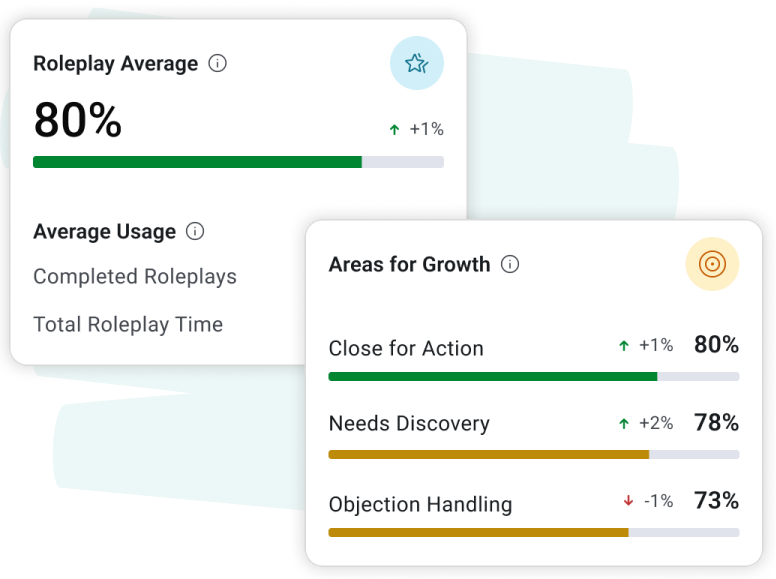
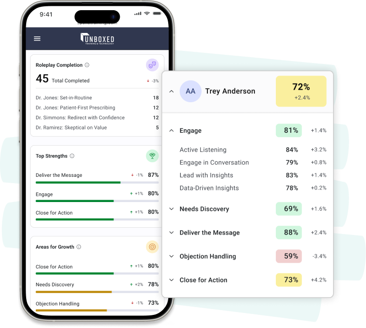
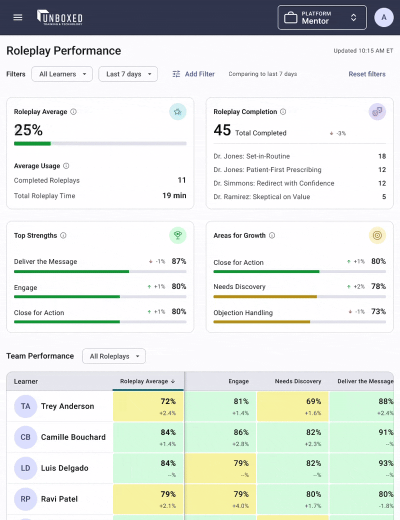
By consolidating all essential roleplay performance data onto a single dashboard page, we eliminated the need for navigating between screens. Combining critical insights with data visualizations, contextual insights in tooltips, and color-coded scoring, managers can quickly identify strengths and areas for improvement.
Team performance table sorted by the roleplay average, and additional columns for all skills. Accessing a tooltip on a table cell is demonstrated by hovering, which displays a breakdown of the behaviors and scores making up that skill.
The roleplay average card shows a score of 80% with a progress chart under it. To the right of the score is the trend indicator, with an up arrow and +1%. The Areas for Growth card illustrates scores, trends, and charts, similar to the Roleplay Average card, and lists the bottom three skills of the team.

Instant insights empower decision-making

The top row of the dashboard highlights key performance takeaways, like overall performance, top and bottom skills, and team activity, in one place. By showing this information upfront, managers can spot trends, progress, and prioritize actions without digging into detailed data or running reports.

Visualizing trends over time improves manager engagement

Clear visual indicators tracking week-to-week performance shifts, paired with current scores, help managers quickly spot progress or areas that need attention. Managers get a better picture of how roleplay training is impacting sales tactics and techniques for their sales teams, which also aids in more informed coaching decisions.

The mobile layout of the performance performance table is organized by learner, with accordions for each skill. When open, the behaviors and skills are displayed, along with the trend.

Demonstrating the value of prototyping

To showcase the dashboard’s capabilities and gather early feedback, we developed an interactive prototype that was presented at a major industry conference. This hands-on demo allowed attendees, including potential clients and internal stakeholders, to explore the dashboard’s insights and functionality firsthand. The prototype effectively communicated the value of the AI-driven roleplay platform and sparked valuable conversations that informed further design refinements.

Conclusion

UX Team transformed a legacy application into a robust, centralized data management system designed for efficient data uploads, improved data control, and API integration. Our solution introduced automated data checks and real-time validation to ensure compliance with California’s heavy metal testing regulations. By modernizing system functionality, we streamlined workflows and established a scalable foundation for future enhancements.

Your 100% USA-based, dedicated UX Team is ready!

Contact us for help with your enterprise software design.

Let's talk design

Related case studies

Power Conversion Confidential Client

Power Conversion

An industry leader in power conversion technology.