Empowering healthcare workers to navigate their career journeys with ease and efficiency.
Project overview
Supplemental Health Care (SHC) was experiencing several challenges with its job application system — a vital part of its staffing business. Users struggled to complete the confusing and lengthy application, impacting the pool of talent that SHC could offer its healthcare clients.
UX Team was hired to reimagine the entire SHC job application User Experience from the ground up to dramatically reduce the time to complete the job application while increasing the quality of data provided by applicants.
Activities and deliverables User Research, Prototyping, Usability testing, Developer handoff
Who we worked with Project Manager, Vice President of Product
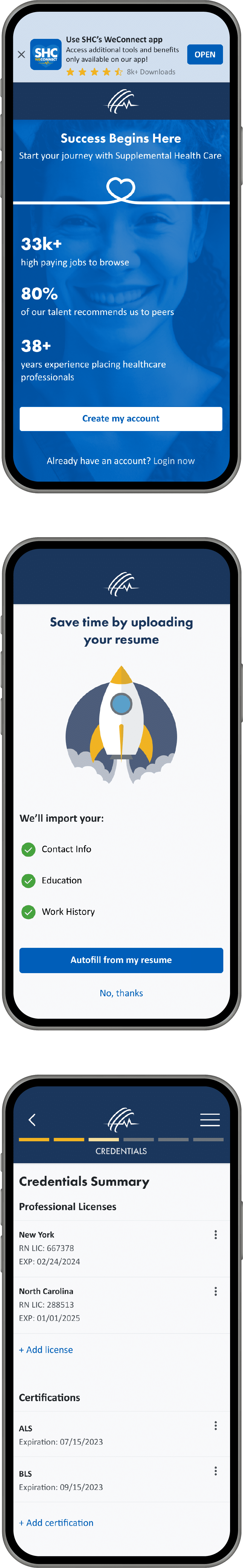
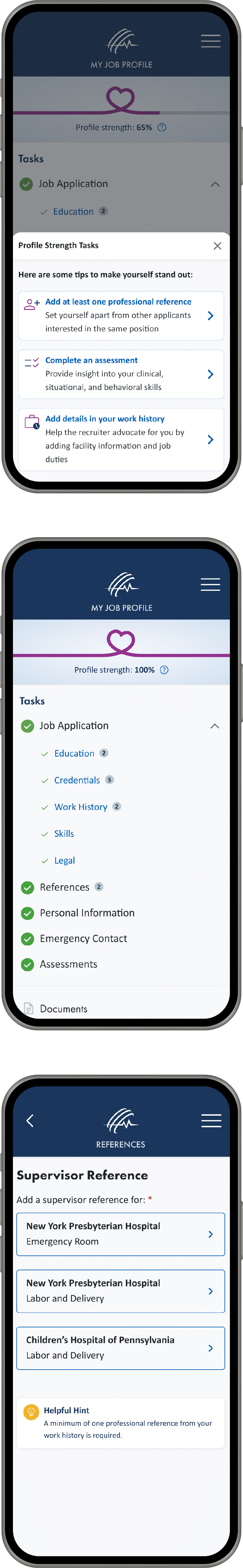
Boost completion rates by adding progress indicators and simplifying tasks. Offer guidance, and reduce unnecessary steps, focusing users on essential actions.
Simplify navigation
Simplify the app through a clear navigation and concise instructions. Maintain consistency, and prioritize user-friendly features to enhance usability.
Minimize workload
Reduce manual data entry by automatically filling in content from third-party sources and eliminating unnecessary fields.
Evidencegathering
Purpose of our research
Reduce the time it takes to complete the application
Reduce the number of user errors
Increase the quality of data
Activities
Teamwork sessions with stakeholders
UX audit
Competitive analysis
User shadowing and interviews
Surveys
Card sort study
Key Insights
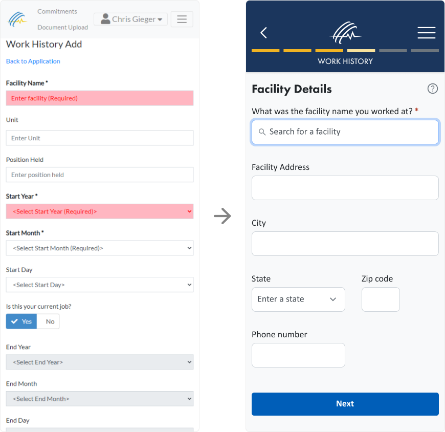
Streamlining text and improving error message clarity
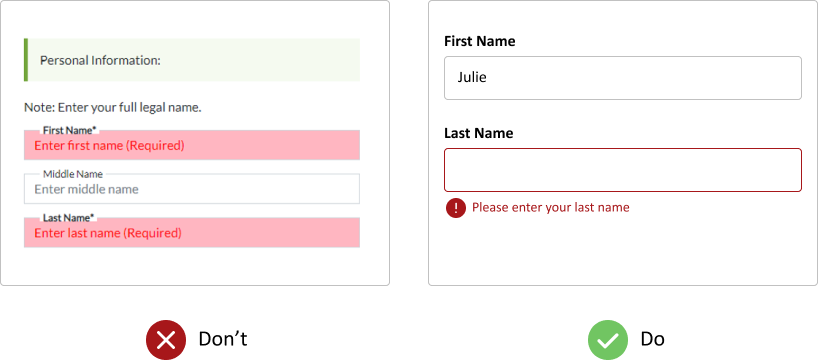
To enhance usability, we reduced text on each screen to avoid overwhelming users and ensured error messages are clear and positioned directly beneath the corresponding form fields.
Previously, vague error messages and improper placement confused users, making it difficult to identify and resolve input issues.
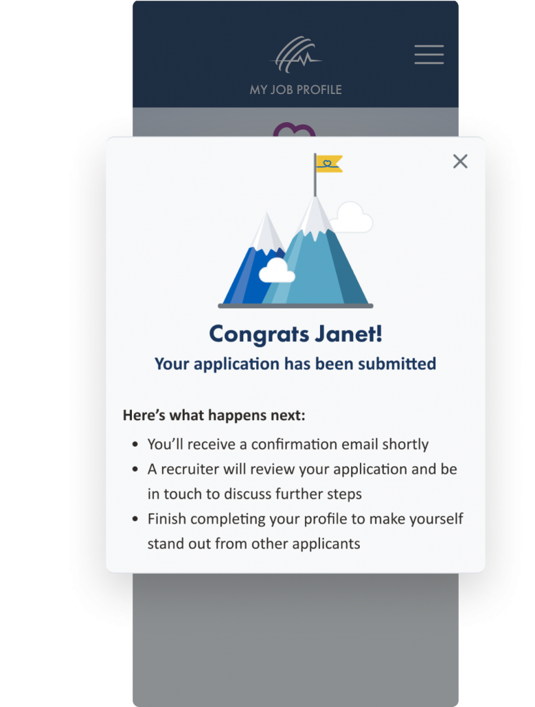
Am I done?
After finishing the application, users had no indication they were done, so we designed a new completion screen congratulating them and telling them what happens next.
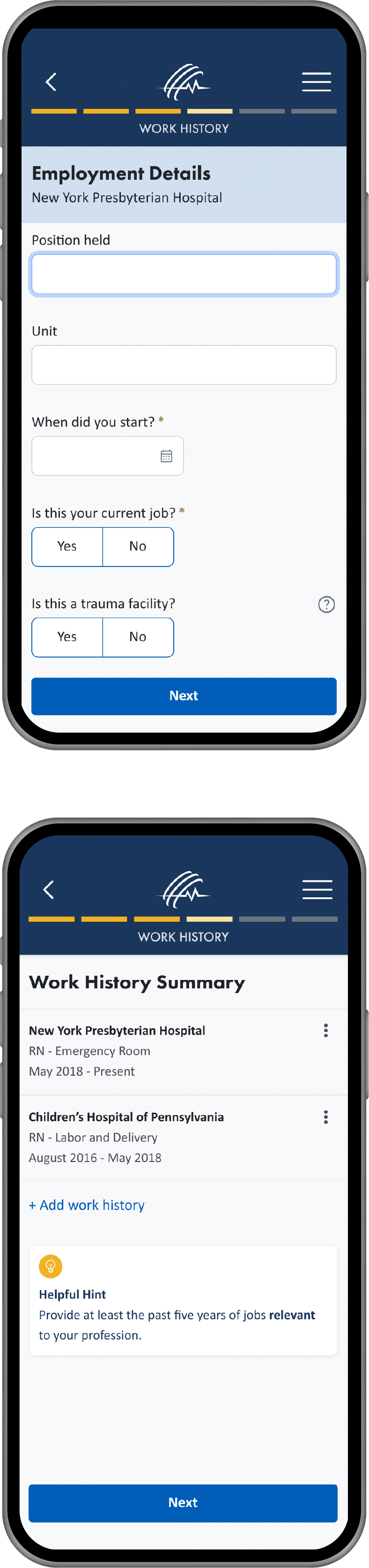
Chunking data entry into smaller, simpler tasks
We incorporated a linear progression by grouping related content and splitting the form into smaller, more manageable steps. Doing so benefits the user by reducing cognitive load, eliminating distractions, and improving efficiency.
Implementation and technical collaboration
Once the navigation and interface designs were finalized, we ensured a smooth handoff to the development team using tools like Figma. The designs were annotated with detailed specifications, including spacing, font sizes, and interaction behaviors, to minimize ambiguity. Components were organized in a design system within Figma to streamline development and maintain consistency across the platform.
Design handoff and tools
Once the navigation and interface designs were finalized, we ensured a smooth handoff to the development team using tools like Figma. The designs were annotated with detailed specifications, including spacing, font sizes, and interaction behaviors, to minimize ambiguity. Components were organized in a design system within Figma to streamline development and maintain consistency across the platform.
Conclusion
Session recordings reveal pain points
Reviewing real session recordings on FullStory to gather quantitative and qualitative data was immensely helpful during our UX Audit. We uncovered many pain points we may not have discovered otherwise.
Involve real users when designing a user experience
Seems obvious, but too often, we see designs that are developed without ever involving the actual end-users in the design process. After all, we are not designing the experience for ourselves, we are designing it for the users.
Your 100% USA-based, dedicated UX Team is ready!
Contact us for help with your enterprise software design.
Let's talk design
Related case studies
Nestlé
Centralized Product Information Management (PIM) system