Stand Together is a 501(c)(3) nonprofit organization that empowers and supports communities to tackle our country’s biggest problems.
Stand Together Overview
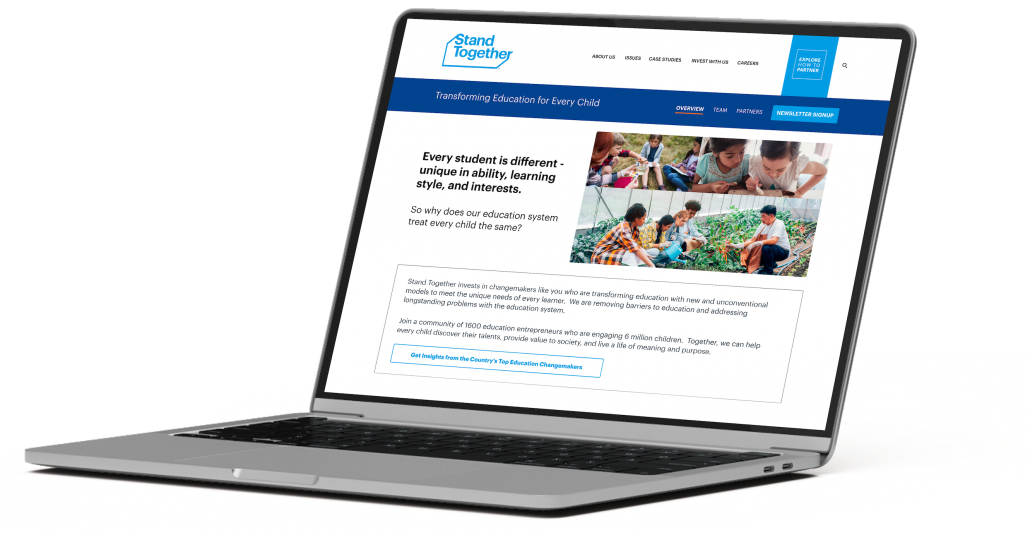
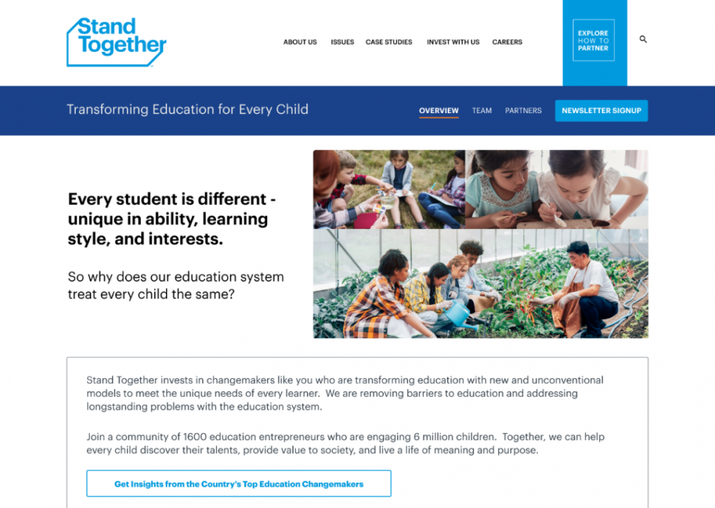
In our recent collaboration with Stand Together, we undertook the challenge of crafting a campaign-aligned landing page/site. The mission was to diminish existing bounce rates and, more importantly, captivate, engage, and inspire the target audience towards specific actions. Aligned with the project’s key messages, our design focused on reinforcing the narrative that Stand Together and its partners boldly lead the charge in reimagining the purpose of education for every child in the United States. We also highlighted the transformative initiatives of innovative social entrepreneurs, emphasizing the numerous opportunities for education changemakers to engage with the content and community.
Goals
Enhance Engagement and Interaction
Increase user engagement with the landing page/site by providing interactive elements and compelling content.
Optimize Call-to-Action (CTA) Effectiveness
Improve the conversion rates for desired actions like newsletter signups, event attendance, and requests for more information.
Reduce Bounce Rates and Enhance User Retention
Decrease bounce rates and increase the time users spend on the landing page/site.
Evidence Gathering
Purpose
Implement a visually appealing and intuitive design that aligns with the branding and key messages.
Engage the community with the content and be part of their vision.
Optimize conversion pathways, and ultimately contributing to the success of the larger K-12 audience strategy.
Activities
Teamwork sessions with stakeholders
Competitive analysis
Key Findings
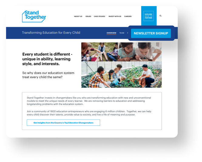
CTA in the menu
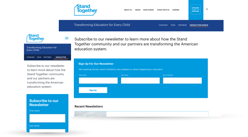
Evidence from eye-tracking studies, user behavior research, and industry best practices supports the placement of a newsletter sign-up CTA in the menu for enhanced visibility, accessibility, and overall improved user experience.
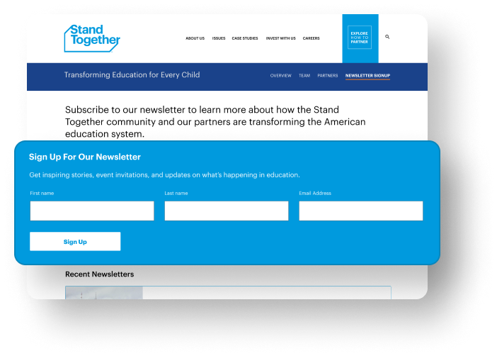
Newsletter signup
Persuasive content: They convince people to sign up for your newsletter.
Prominent location: People can only sign up if they see the form.
Compliant: The form needs to be compliant with regulations like GDPR.
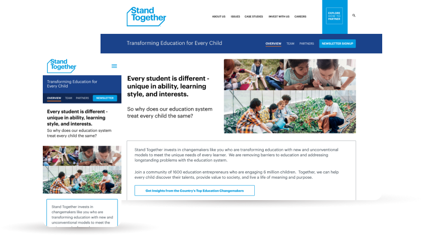
Visual Design
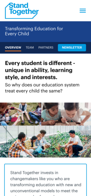
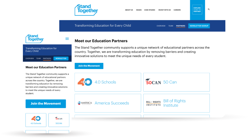
Overview
Partners
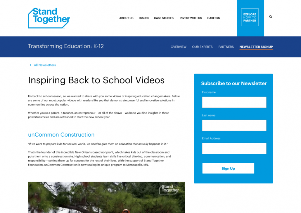
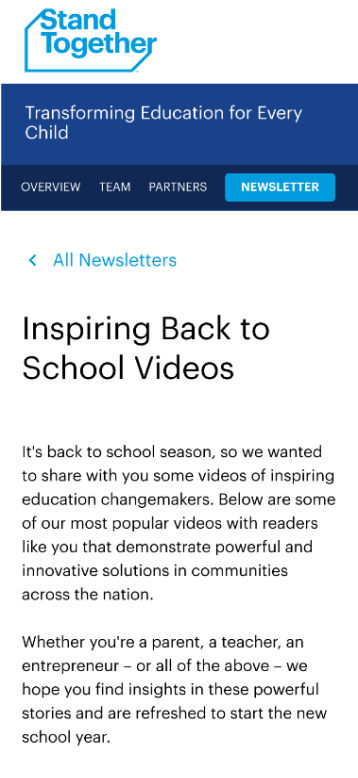
Newsletter
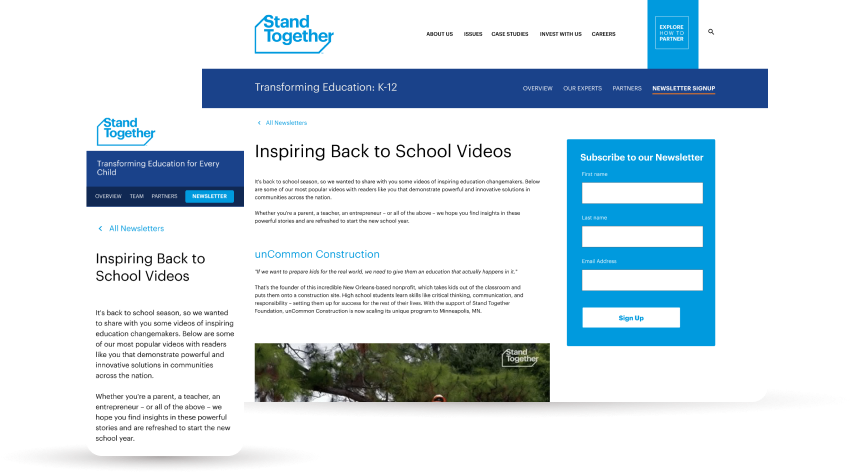
Newsletter post
Conclusion
Conversion Optimization
Implementation of strategic CTAs, including a newsletter sign-up in the menu, aligns with industry best practices, enhancing conversion rates for desired actions.
Key Message Reinforcement
The design effectively communicates Stand Together’s key messages, emphasizing the transformative initiatives in education and opportunities for education changemakers.
User-Centric Design
Anticipating user needs and simplifying the user journey, the design minimizes friction and enhances overall satisfaction, contributing to a positive user-centric experience.