5 Invisible Things You Can Do to Make Your UX Less Scary
Good UX should feel smooth and welcoming, not like wandering through a haunted house full of hidden traps.
When users get confused or stuck, it can feel a little spooky. Luckily, a few behind-the-scenes tweaks can make your experience friendlier and easier to use.
Here are five invisible ways to make your UX less scary and a lot more delightful.
Tame Your Haunted Microcopy
Clear words light the path. Unclear ones leave users wondering what’s lurking around the corner.
Replace vague labels like “Submit” or “OK” with clear, helpful phrases such as “Save Changes” or “Send Message.”
When people understand what will happen next, they feel confident continuing through your product.

Clear the Cobwebs from Your Flow
Every extra step is like a cobweb that slows users down.
Watch someone use your product and notice where they hesitate, pause, or backtrack.
If you can remove even one confusing click or unnecessary field, the whole experience will feel smoother and faster.
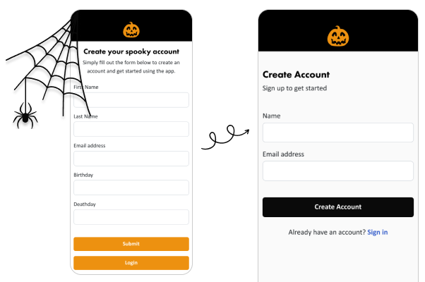
Here are some common cobwebs you can probably sweep away:
- “Retype Password” fields
Modern password reveal options and “show password” toggles make these extra fields unnecessary. They double the effort without adding much security. - Unnecessary form fields
If a field isn’t essential to completing the task, remove it. Birthday, gender, company name, and phone number are often collected by default but not truly needed. - Redundant buttons or steps
Do users really need to click “Next” after every small section? Combine steps where possible and streamline multi-page forms into logical groups. - Forced account creation
If users can try your product as a guest, let them. People are more likely to sign up after they experience value, not before.

Don’t Leave Users in the Dark
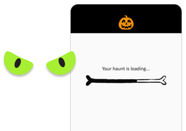
Nothing is scarier than clicking a button and seeing…nothing.
Give immediate feedback so users know their action worked.
A quick progress bar, success message, or subtle animation helps them trust that the system is alive and working as expected.

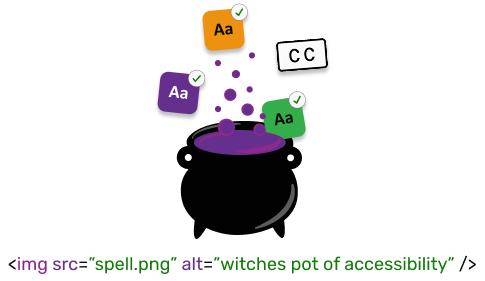
Make Accessibility Your Magic Spell
Accessibility isn’t scary, but inaccessible products sure are!
Check your color contrast, button sizes, and keyboard navigation early.
Most users will never notice these invisible improvements, but they will feel how easy and comfortable your product is to use.

The Final Treat
The best UX rarely needs a dramatic redesign. Often, it is the quiet, invisible adjustments like clearer wording, smoother flows, and faster feedback that make the biggest difference.
A little UX magic can turn a confusing experience into one that feels effortless—and your users will thank you for it.


