How To Make Long Online Web Forms Suck Less (For Your Users)

We’ve all been there. We open a screen in our web browser to refinance our home, get an insurance quote, file our taxes, or anything else and the form is overwhelmingly long. We take a deep breath, sigh and trudge forward. In our heads though, we’re cursing the screen in front of us with thoughts like “I don’t f#@kin’ have time for this?!” or “This s#%t is going to take forever!”. Clearly, none of these are thoughts you should ever want your users to have.

Sometimes the data that needs to be collected in all those form fields is truly necessary – but that doesn’t mean the user experience should suffer. Luckily, there are several different things you should consider to make long online web forms suck less.

Visually Segment Sections

When a screen is just one enormous form filled with tons of form fields, users can feel overwhelmed before they even begin. One way to help alleviate this initial negative reaction, is to visually segment the screen into smaller, logical groupings. This enables users to process the screen easier in their minds and quickly get the gist of what they’re going to need to do before they begin. Part of what overwhelms users is a feeling that they may not be able to complete the form once they begin. If your users can quickly understand what they’ve being asked to do, it will build their confidence and help make them think “I got this.”

Compare the screen mockups below. Even though the screen on the right is taller/longer, it appears more manageable because you quickly get the gist of what you’ll need to do to complete the form. In fact, the card headings alone can put the user at ease because they provide context for what type of information is needed in each section, which can help make a user think “Oh, I know all this info, this should be easy.” as opposed to “Oh boy, what are they asking me for now!”.

Dynamically Displayed Fields

Often times, a lengthy form will contain “parent” and “child” fields whereby certain “child” fields only need to be displayed if the “parent” field is completed a certain way. If this is the case with your form, consider developing the form so that it dynamically displays the “child” field if/when the “parent” field is completed. One of the simplest examples is a “Yes/No” checkbox. If the user clicks the “Yes” checkbox, only then should you display the “If yes,…” child fields associated with that parent checkbox. More complex examples may include developing logic whereby a combination of different answers drive the display of certain additional fields. Either way, by eliminating the initial display of the child fields, you greatly reduce the overall volume of fields and noise on the screen.

Dynamically Displayed Form Fields

Accordions

If certain fields in your form are only needed in certain cases, consider moving those fields into a collapsed accordion that can be expanded only if/when the users needs to complete those fields. By moving those fields into a collapsed accordion, you greatly reduce the initial clutter of the screen and make the form appear easier and faster to complete.

Modal and Fly-In Windows

Often times, a large form may contain form fields that are only needed when the user needs to add a new item or record to the form. Other times, there may be a need to display detailed data about something in a form. In these cases, it may make sense to implement modal popups or fly-in windows that are displayed only when the user takes an action. For example, if the user needs to add vehicle information to a form, consider displaying the vehicle information fields in a modal or fly-in rather than displaying all of the vehicle fields in the main form. In addition, the main form screen may contain a table listing of vehicles but only certain column headers are needed to help distinguish one vehicle from another while all other details can be displayed in the modal or fly-in.

Question Consolidation

Forms that contain a series of questions requiring a “Yes” or “No” answer don’t always need to be displayed as individual questions with their own “Yes” or “No” checkboxes. Instead, consider whether the question section can be consolidated into a single question with a single “Yes” or “No” checkbox or toggle. For example: “Are any of the following questions true?” This enables the user to quickly scan the questions and take a single action to answer all of them.

Wizards

Step-by-step wizards may seem like an old school method to break up a lengthy form field but they can still be an effective way to segment large chunks of related fields and create a positive sense of progress as the user moves through each step of the wizard. In addition, a good wizard will display the number of steps to inform the user of not only how many steps they will need to complete but also which step they are currently on and steps they’ve already completed. A huge factor in creating a positive user experience is to give the user a sense that they are making progress towards the finish line.


In Conclusion

Making long forms suck less is often about making a lot of micro design decisions and optimizations that add up to a much better user experience. So put the time in to “trim the fat” on your forms so that the result is a positive user experience — rather than a verbally abusive experience.

How Elon Musk’s 5-Step Process Applies To Software Development

In a fantastic, super geeked-out interview (courtesy of the Everyday Astronaut), Elon Musk breaks down the 5-Step Process he’s implemented to develop everything from Tesla electric cars to Space X rockets. One of the great things about Elon’s explanation of each step is that he speaks in a very blunt manner and uses examples of the mistakes he and his teams have made that drove him to implement these steps. As he explains each step, it occurred to us how these exact same steps can and should be applied to developing software products.

STEP 1. Make Your Requirements Less Dumb

In this clip, Musk says “The requirements you were given are definitely dumb — and it’s particularly dangerous if a smart person gave you the requirements because you might not question them.” Basically, he encourages everyone to assume that there are things wrong with the requirements they’ve received so that they feel much more free to ask questions and make them better (or, less dumb).

In addition, Musk requires all requirements to come with a person’s name attached to them – not just a department name. This way, a person takes responsibility for the requirement and everyone knows who to go to with questions.

How this relates to software development

Here are a few real-world examples of scenarios that we run into a lot with our clients during our Team Work Sessions:

  • UX Team asks “Why is this a requirement?” The client says “That’s what the business team wants.”
    The fact that product teams often do not question or challenge why a requirement is a requirement in the first place probably speaks more to a problem with the corporate culture dynamic than anything else. In other words, often times product teams are put in a position of focusing purely on delivering what they are asked to deliver — without being empowered to ask “why?”.
  • UX Team asks “Why does your current software product function this way?” The client says “That’s just how it’s always functioned.”
    This one actually happens quite a lot and it’s often the result of a product team that:

    • Can no longer “see the forest for the trees” because they’ve been so close to the product for so long
    • Has new members that don’t feel comfortable questioning things until they’ve earned their stripes.
  • UX Team asks “What drove this to become a requirement in the first place?” The clients says “Feedback from our users”. Then UX Team asks “How many users and what was their specific feedback?” The client says either “I don’t know. It’s just what we were told.” or “We had one or two users complain.”
    This also happens quite a lot and it often causes product teams to get sidetracked with enhancements or new requirements that should have a much lower priority than others in their backlog. It’s sort of like the “The squeaky wheel gets the grease” treatment.

Ideally, if product teams followed Elon’s “Step 1” advice, they would attach a name to every requirement and create a culture whereby everyone felt not only empowered but expected to ask questions about the requirements they were given before they spend tons of time designing and developing them.


STEP 2. Try Very Hard To Delete A Part Or Process

In this clip, Musk says “The bias tends to be “let’s add this part or process ‘in case’ we need it” – but you can make ‘in case’ arguments for almost everything.”

How this relates to software development

In art school, they teach “When everything is important, nothing is important”. In UX design, when you make the visual weight of too many things on a given screen the same, you create a visual hierarchy that does not inform the user about what is important vs less important. Therefore, whenever you add something you need to always consider whether it is worth degrading the visual weight of other existing things or if you should remove existing things to make room for the new thing.

This also holds true for adding functions and features to a software product. As Musk explains, the tendency is for product teams to add more and more features to their product when they should be equally considering what they can remove. After all, if the end goal is to make a better product but the bells and whistles you want to add make your product more difficult to use, are they really worth adding?

As this relates to a “Process“, a few years ago we were hired to redesign an existing product but the first priority was to get the live product working. Soon after we engaged with our client, we fixed the existing code and were ready to deploy it – but we couldn’t because the client’s development team was still working out the details of their new Continuous Integration (CI) scheme and how our team was going to get integrated with it. We suggested that, for this particular release, we simply push the updated code files to production manually without CI in place. Then, we will shift our focus to the redesign effort while the client development team takes their time to implement a proper CI scheme for us to use. Processes can be good but when teams get so programmed to follow them, it can prevent teams from considering simple, logical solutions.


3. Simplify or Optimize

In this clip, Musk talks about how he purposely makes this his third step so that it helps prevent teams from “optimizing a thing that shouldn’t exist”. In other words, it’s great that you were able to optimize the performance of that new feature – but did you consider whether it was needed in the first place?

How this relates to software development

This one speaks directly to the creation of a good user experience. When we design a software product, we test the usability of our designs before it is developed. When we deploy the tested and refined design into production, we then monitor how it is being used and even A/B test different designs to further optimize it. Sometimes our tests reveal what we call a “design thorn”, which is an element in our design that we are struggling to optimize but it continues to cause problems for the users. In many cases, the best way to handle a design thorn is to simply remove it.

This also applies to application and infrastructure optimizations, which can speed the performance of a product and help keep it more stable. A product that performs quickly, is error free, and is always available is one that is far more likely to create a great user experience.


4. Accelerate Cycle Time — or, “Go faster!”

In this clip, Musk says “Go faster — but don’t go faster until you’ve worked on the other 3 (steps) first.”

How this relates to software development

In Agile Development, “Velocity” is an indication of the average amount of Product Backlog turned into an Increment of product during a Sprint. So to increase Velocity, it would help if you made your requirements “less dumb”, deleted features or processes, and simplified or optimized your product. Once you’ve done these, you can be in a much better position to “Go faster!


5. Automate

In this clip, Musk talks about the importance of never starting with automation first and going through the Steps in reverse. This is our favorite video because Musk tells a great story where he’s made this exact mistake when they were struggling with a fiberglass mat that was mounted to the top of the Tesla battery. The installation of this mat was “choking the whole production line”. So, he and his team spent a lot of time working on ways to optimize the automation (robots) until one day Musk finally asked the The Battery Safety Team, “What the hell are these mats even for?”. They told him they were for “noise and vibration”. So he went to the Noise and Vibration Team, and they said they were for “fire safety”. So, they placed microphones and sensors inside 2 different cars and tested the noise and vibration with the mats in and with the mats out and they found no difference whatsoever. Needless to say, the mats were removed.

How this relates to software development

This one can relate to everything from a simple ticketing system to an elaborate e-commerce website. Both require people, processes and technology to be in place before any true automation can be implemented. Much the way the robots on the Tesla assembly line were not implemented until they were designed, tested, and optimized for each step of the assembly line, you should not automate anything until you can support that automation.

In one software product we made for a client, they wanted a Task Management feature that auto-generated tasks for people based on specific triggers within the system. For example, “When Team B enters X data, generate a task for Team B”. The problem was, the client didn’t have the teams to support all the auto-generated tasks — so tons of tasks were getting generated and left open in the system and the users eventually just ignored the whole Task Management feature.


The Importance of a Minimum Viable Product (MVP)

Even though this one isn’t a ‘Step’, it’s a great clip where Musk talks about how the first few Starship rockets all blew up for reasons that were not on their “Risk List”. In other words, the first Starship rockets they launched helped them uncover flaws that no one on their teams expected, which is one of the main points of launching an MVP first. You simply do not know, what you do not know.

How this relates to software development

Too many software product teams have a hard time whittling down the backlog of their product requirements to something that could be termed a Minimum Viable Product. We often hear excuses like “It’s really not a ‘Viable’ product without all its features.”, which is usually nonsense. More often than not, a product can be broken down into a logical set of releases that grow from an MVP to and official “1.0” full release. Whether you release only one set of features to a small sample of user personas or you release only the core features of the product that may still require manual work to be done on the back-end, and MVP is critical to the success of any product launch.

5 Reasons Why You Should Hire A ‘Dedicated UX Team’

Lately, more and more of our clients are taking advantage of our ‘Dedicated UX Team‘ engagement model whereby we carefully select and assign a group of UX resources to our client’s project(s) throughout the entire duration of our engagement. It seems too many businesses have experienced failed relationships with design firms because the firm constantly reassigns resources from one client project to another. So, unless you specifically request your consulting firm to provide you with a Dedicated Team, you’re likely going to engage in a time and material project where there’s no guarantee that the resources that start on your project are the ones that stay on your project.

Here are 5 reasons why you should make sure you hire a dedicated team:

1. Intellectual Capital

A lot of our clients have businesses that require a deep understanding of complex complicated business rules, regulations and compliance laws, technology requirements and limitations, and even unusual nomenclature and acronyms. So, there is simply no way a resource could be assigned to a halfway through a project’s completion and expect to create a great software product without that deep understanding. With a Dedicate Team, all the knowledge that is gained throughout a project is never lost. In fact, often times we end up presenting things about our client’s business that they didn’t even know about because our methodology requires us to perform specific research and user shadowing activities that were never done before.

2. Continuity & Consistency

Whether a given team people are designing a product, a website or a building, it is important that the design maintains a certain level of continuity and consistency throughout its complete end-user experience. Since a ‘Dedicated Team’ works on a project from its beginning, the design of your product will be far more consistent than if you had team members swapping out throughout your project. Any great design has baked-in design standards, rules and characteristics that are known by those who create them and those that document them. If you don’t maintain continuity and consistency in your product’s design, you’re users will surely let you know about it.

3. Trust & Stability

Throughout the course of any project, team members begin to develop a trust in each others abilities and recommendations. This trust adds stability to the team and makes the overall team perform much better and faster because everyone spends less time doubting each other and more time getting their jobs done.

4. The Best of Each Role

A great UX Team is typically comprised of Lead UX designer, UX designers, Front-end Developers, a Project Manager and sometimes other supporting resources such as researchers, testers and analysts. When you have a Dedicated Team, you can make sure that each resource on the team is focused on what they’re really good at instead of requiring team members to stretch their abilities to do things they’re not good at. The bottom line is that it is simply never a good idea to have Developers designing and Designers developing.

5. Enhanced Long-lasting Relationship

Some firms shield their clients from getting to know exactly who is doing the actual work for them. We believe in building a long-lasting relationship between our clients and their assigned team members. In fact, our clients get to know each team member on a first name basis, which sounds petty but this kind of enhanced relationship leads to better communication and a sense of comradery that helps the team gel and work more better together.

What’s a Hybrid App and When Should You Choose it

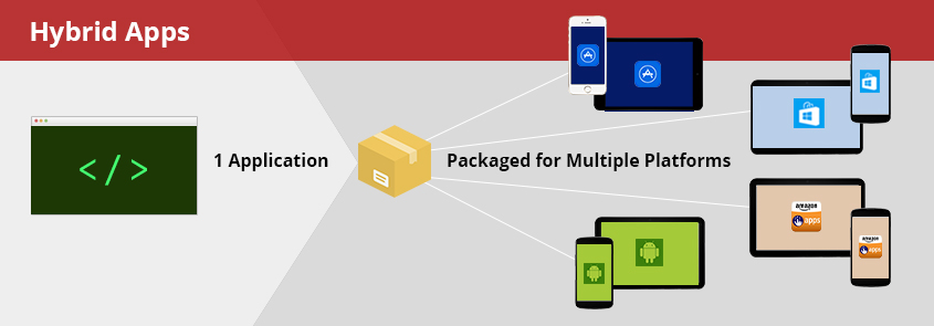
Learn why many of the most popular apps available in app stores today, such as: Twitter, Uber, Instagram, Evernote and even the Apple App Store itself, are actually hybrids.

User Shadowing on The Trading Floor at Morgan Stanley

For about four months, I had the pleasure of working on an exciting new project for Morgan Stanley. The details of the project can not be disclosed for obvious confidentiality reasons but I can speak in general terms about the experience. As with most UX projects, we like to spend as much time as we can observing users in their natural work environments while they perform their daily activities. In the case of Morgan Stanley, this meant spending a good amount of time in the trenches, on the trading floor, sitting with the traders and sales reps. My job was to not only observe the users but also build a sense of empathy for how they perform all their job activities. In fact, one of the main purposes of user shadowing is to build empathy so that you can see your design through the eyes of the users. Read more

Why You Need a UX Team (Part 1)

In Part 1 of this series on “Why You Need a UX Team”, we examine what specific roles, responsibilities and skill sets a UX Team typically brings to the table. Read more

Sometimes, To See “The Big Picture”, You Need To Draw A Big Picture

To truly understand and design the best possible information architecture for an application or website, find the biggest whiteboard in your office and start drawing.

Read more

Why User Experience is More Than Just User Interface Design

If I’ve ever had the pleasure of working with you or for you, you’ve probably heard me preach on my soapbox more than once about how User Experience is so much more than just the design of a user interface. User Experience is, as the term implies, about everything and anything that can impact the experience a user has when interacting with a software product or website.  In this post, I touch on a few areas that can have a direct impact on a user’s experience – but have nothing to do with UI design. Read more

The Healthcare.gov AbomiNation

A Lesson In How Not To Make Software

The recent failed rollout of Healthcare.gov is riddled with so many issues that it’s hard for the average American to comprehend why it happened and who is to blame. Even the mainstream news reports appear to be confused and scattered about what caused this #EpicFail. Read more

What Is Responsive Web Design?

Responsive Web Design is designing and coding the front-end of a website or app so that the layout “responds” or automatically adjusts (using CSS) to a layout that is optimized for user’s display size. Read more