
5 Invisible Things You Can Do to Make Your UX Less Scary
Good UX should feel smooth and welcoming, not like wandering through a haunted house full of hidden traps.

Good UX should feel smooth and welcoming, not like wandering through a haunted house full of hidden traps.

Redesigning legacy software can feel overwhelming, especially when timelines are tight, budgets are limited, or the dev team isn’t ready for sweeping changes.

Discover why refining the user experience during development is essential to aligning the final product with the expectations established during the design phase.

From the horrors of Comic Sans to the terror of tiny clickable targets, these scenarios are every designer’s worst nightmare and will send shivers down

Onboarding is a crucial aspect of UX design, which can make or break a product’s success. An ideal onboarding flow strikes the right balance between

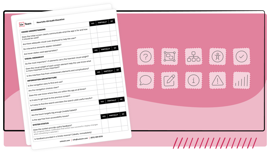
Discover the importance of a full UX audit for your software and how they can ensure successful redesigns improve the user experience.
Identify some initial opportunities to improve your software product or website based on established principles, research studies, and best practices.

In this article, we will explore essential factors to keep in mind when designing for dark mode and provide practical tips for creating user-friendly interfaces.

The following post was written entirely by ChatGPT when we asked it to “Write a blog post on why Instagram has a bad user experience.

The Hatch Baby Rest is a super sleek, minimalist device with a sound machine and nightlight features. However, it’s not so easy to use.