Quick Wins: High-Impact UX Fixes for Legacy Apps Without a Full Redesign
Redesigning legacy software can feel overwhelming, especially when timelines are tight, budgets are limited, or the dev team isn’t ready for sweeping changes. But improving the user experience doesn’t always require a full overhaul.
There are quick, high-impact UX fixes you can implement right now to reduce friction, increase usability, and rebuild user trust. These improvements not only make your product more user-friendly, but they also build the case for bigger UX investments down the line.
Clarify navigation and reduce cognitive load
Legacy apps often suffer from bloated, outdated navigation structures. Menus are buried, labels are unclear, and users feel lost.
Quick Wins:
Rename labels for clarity (“Documents” → “Patient Records” or “Project Files”)
Remove rarely used or outdated items
Add visual hierarchy with section headings, icons, or groupings
Introduce breadcrumb trails if none exist
Example:
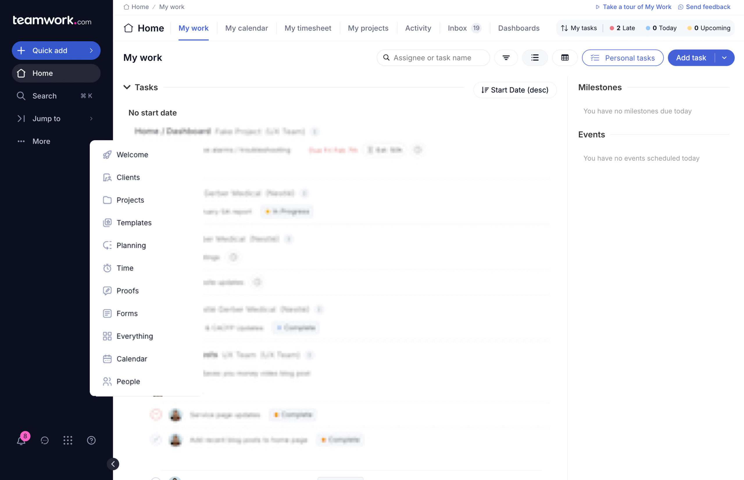
Teamwork’s interface is a good example of how multi-level navigation can still feel organized when designed with purpose. It uses a combination of a persistent sidebar, a top horizontal menu, and a contextual hidden dropdown to separate different types of actions and content. For instance, the sidebar gives quick access to core modules. Meanwhile, the top menu is task-focused, offering filters and views specific to the “My Work” section. This layered structure prevents any single area from becoming overcrowded, and it allows users to quickly orient themselves depending on their goal—whether they’re managing tasks, planning timelines, or switching between teams. For legacy apps suffering from bloated dashboards, this kind of separation can help users regain a sense of control.
Improve visual hierarchy on key screens
Many legacy interfaces overload users with too much information at once, all given equal visual weight.
Quick Wins:
Increase contrast between headers and body text
Use spacing and groupings to chunk related information
Highlight key actions (like “Submit” or “Next”) with a distinct button style
Suppress rarely used fields or actions
Example:
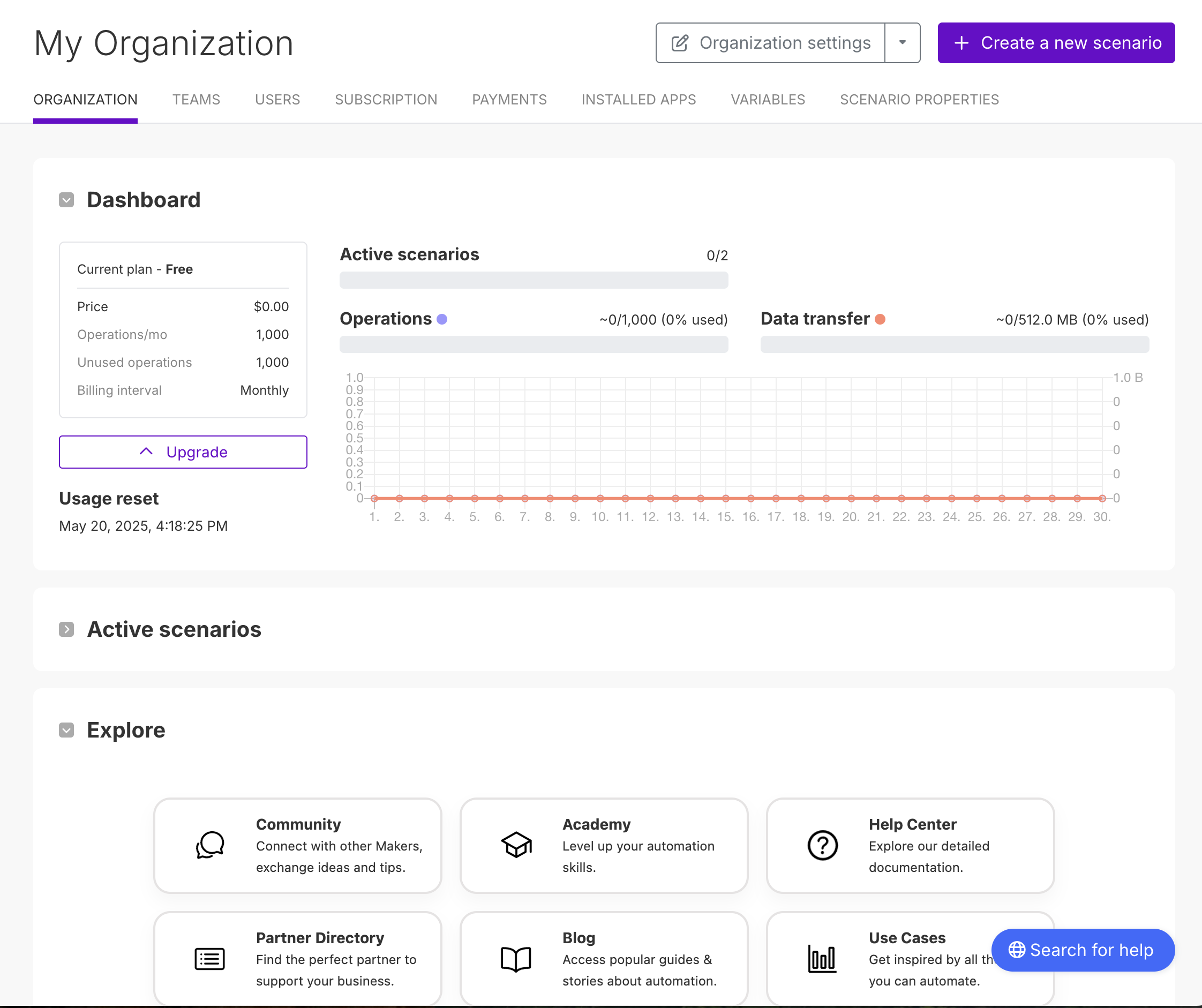
Make demonstrates strong visual hierarchy through consistent typographic styling and structured layout. Each section header—like “Dashboard,” “Active Scenarios,” and “Explore”—is clearly distinguished using larger, bold text and generous spacing, making it easy to scan the page. Subheadings and labels, such as “Current plan” and “Operations/mo,” use smaller font sizes and lighter weights, visually separating them from primary content. Body text remains minimal and functional, letting the headings guide user focus. This clarity helps users absorb information quickly and understand which sections are most important, an essential practice for modernizing legacy systems where visual clutter often overwhelms users.
Update language for clarity and tone
Outdated microcopy is a silent UX killer—often formal, vague, or full of jargon that no longer reflects how users think or talk.
Quick Wins:
Replace jargon with plain language (“Initiate Action Sequence” → “Start Process”)
Add helpful tooltips or inline guidance
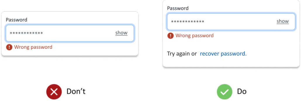
Rewrite error messages to be friendly, clear, and actionable
Replace system-centric labels with user-centric ones
Many legacy systems predate accessibility standards or ignored them altogether. You don’t need to wait for a redesign to start fixing this.
Quick Wins:
Improve text contrast for better readability
Add descriptive alt text to important images
Ensure form labels are properly associated with inputs
Add focus states and keyboard navigation where missing
Introduce lightweight usability testing
Not all fixes have to come from assumptions. Even light testing with 3–5 users can reveal where people are getting stuck and what can be improved immediately.
Quick Wins:
Test key workflows (like signing in or completing a task) with users
Use screen recordings or feedback tools to collect data
Prioritize issues that can be resolved without engineering (copy, layout, color)
Share small wins with stakeholders to build buy-in for larger fixes
Conclusion
You don’t need to tear everything down to make things better.
Quick wins:
Provide relief to frustrated users
Reduce training time
Improve task completion rates
Build credibility with stakeholders
And best of all? They’re low-risk, fast to implement, and pave the way for future improvements.
Whether you’re working within tight constraints or simply don’t have the buy-in yet for a full rebuild, these fixes can help breathe new life into legacy apps—one smart change at a time.