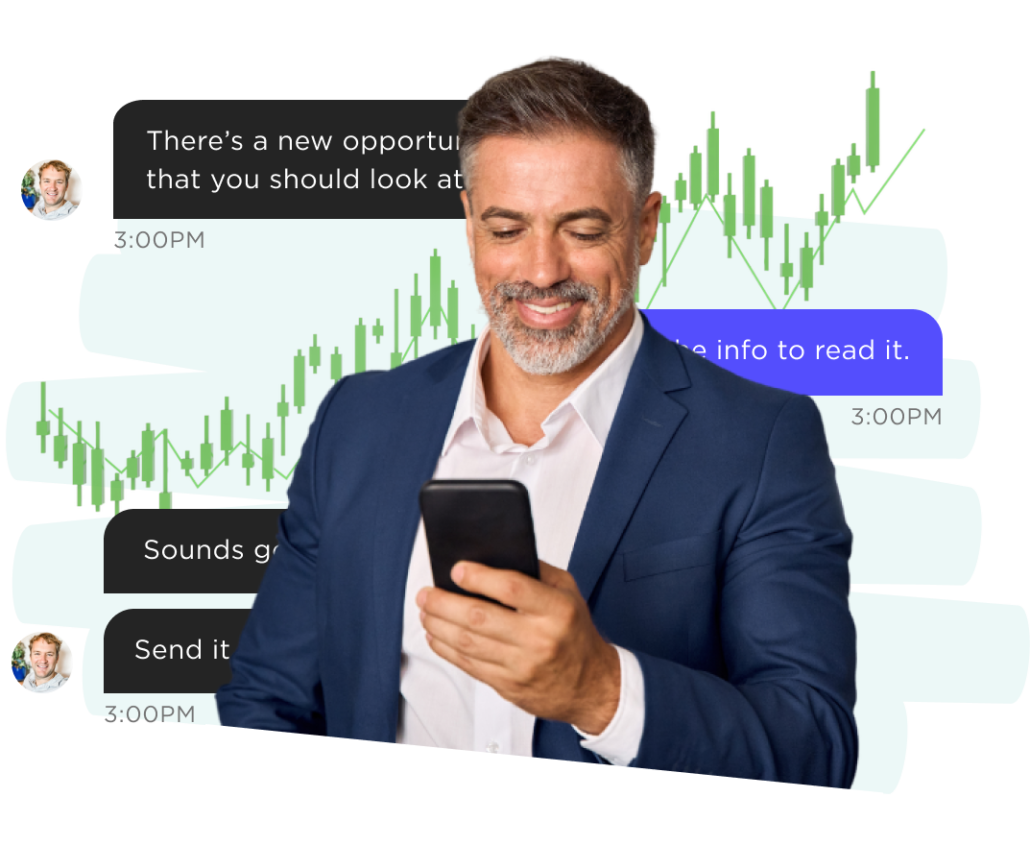
Investment and social media platform for finance pros and investors.
Project overview
When we first met with the folks at Prometheus Alts, they already had a working product that they piloted with friends and colleagues. They contacted UX Team for help making their mobile app more usable and to translate it to a web app for desktop as well.
We started with a heuristic analysis where we compared their design to UX best practices and made quick recommendations for improvement. Then, we observed people using the app, surveyed and interviewed users, and did a competitive analysis of the space.
Activities and deliverables User Research, Prototyping, Usability testing, Developer handoff, Design system
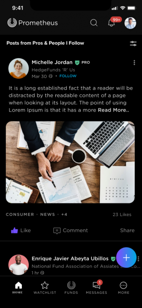
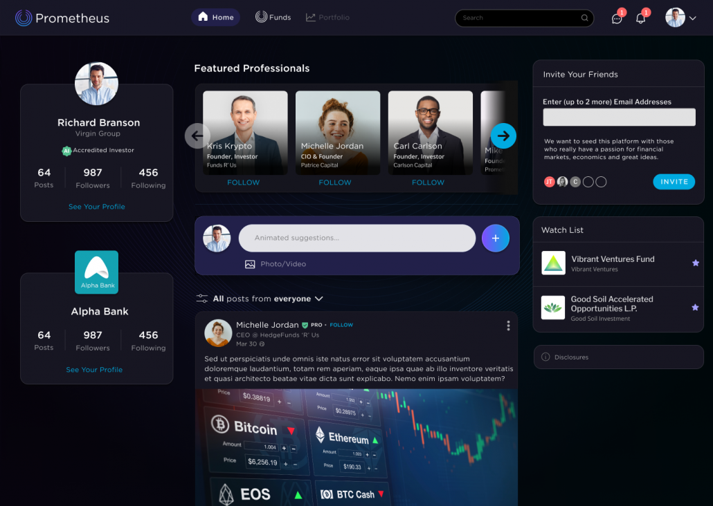
Based on best practices, find ways to improve the overall user experience of the mobile app.
Clarify navigation
A “best stab” at the navigation structure can work sometimes, but that best stab doesn’t usually match what a user would expect.
Use intuitive language
Industry terminology is great for professionals, but since Prometheus Alts is partially geared toward amateurs, it’s important to use language they understand.
Evidencegathering
Purpose of our research
Given an aggressive timeline, we had to prioritize our research. We sought to gain a deep understanding of:
The goals and vision of Prometheus Alts
How alternate investments work
Each persona’s day-to-day activities, goals, priorities and frustrations
What goes into the decision making when choosing whether to make an investment in an alternative fund.
Studies
Teamwork sessions with stakeholders
UX audit
Competitive analysis
User shadowing and interviews
Surveys
Card sort study
Key insights
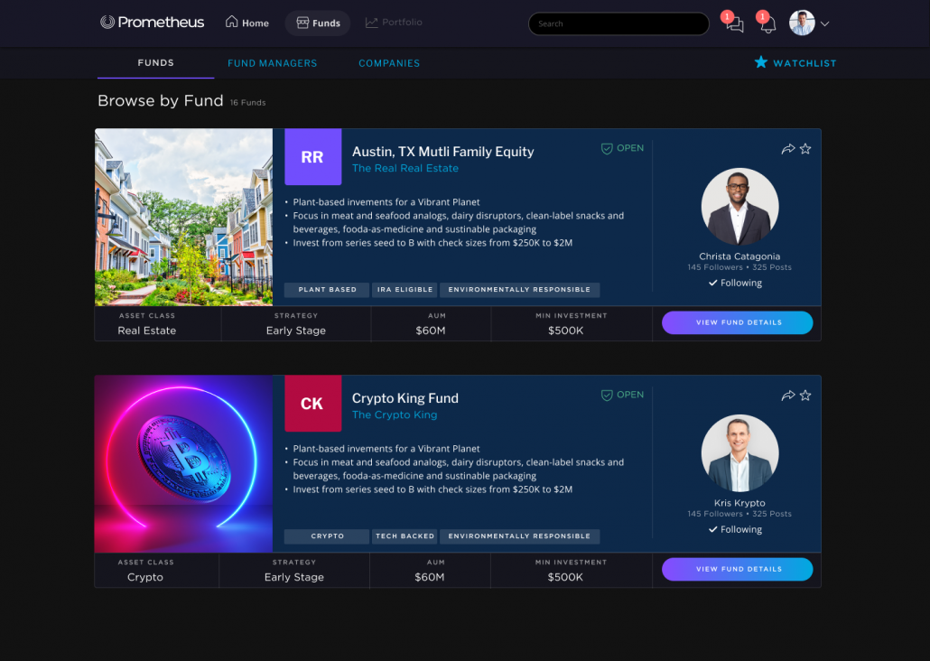
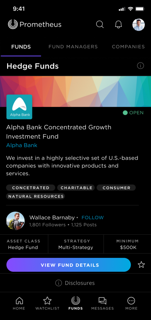
Interviewees expressed that they often invest based on the fund manager, even over performance statistics and investment minimum.
The new design features the fund manager prominently on the fund profile page.
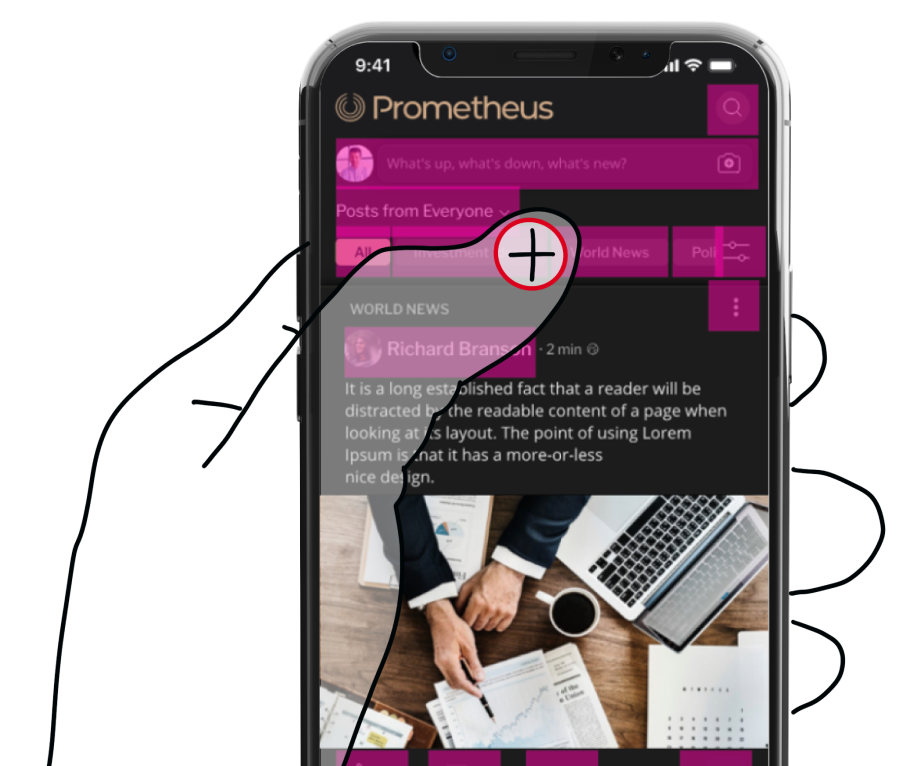
Our UX Audit revealed that touch targets on mobile in the initial design were too small and often overlapped each other.
All touch targets in the new mobile design are at least 48x48px and do not overlap.
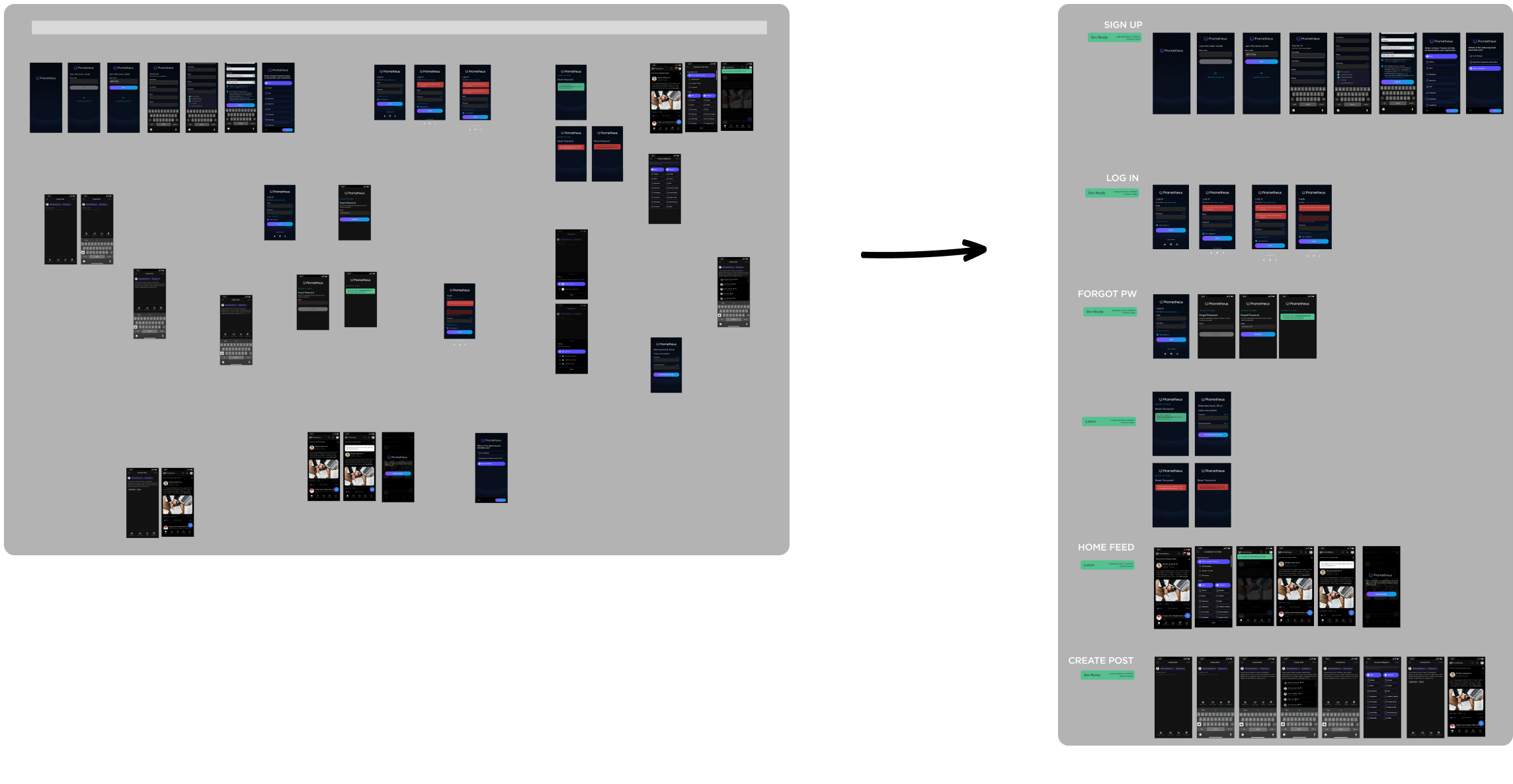
From chaos to clarity
Organizing and refining a disjointed project for handoff
When Prometheus Alts engaged UX Team, their product lacked organization, creating challenges for usability and scalability. We conducted extensive stakeholder interviews, user research, and a heuristic analysis to identify pain points and align on goals.
By reorganizing the project structure and providing clear documentation, we streamlined the process, ensuring a smooth handoff for the web and mobile app redesign.
Conclusion
UX Team worked with Prometheus developers to implement the solution. We worked hand-and-hand with them via Slack, answering questions, providing additional assets and performing UX remediation and review on developed screens and flows. After launch, UX Team handed off the design system and screen designs to Prometheus’ new internal design team.
Your 100% USA-based, dedicated UX Team is ready!
Contact us for help with your enterprise software design.
Let's talk design
Related case studies
Morgan Stanley
Bond trading app to capture and manage quote requests
Urner Barry
Market intelligence and price tracking for the food industry