UX Team Spotlighted Among Top User Experience Design Firms by GoodFirms
Our success modernizing legacy systems is rooted in one thing—collaborating with great partners.

Our success modernizing legacy systems is rooted in one thing—collaborating with great partners.
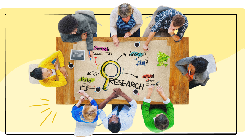
UX Design Glossary Essential Terms for Beginners Understanding UX (User Experience) design can feel overwhelming with all the technical jargon and industry-specific terms. Whether you’re

Discover why refining the user experience during development is essential to aligning the final product with the expectations established during the design phase.

When we use software, we subconsciously paint a mental model in our heads for how we believe the product should work. A misunderstanding of your
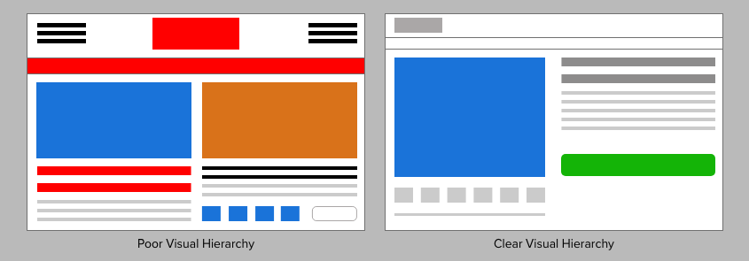
“When everything appears important, nothing is important”. This quote still repeats in my head everyday — and for good reason.

If you need to get people off a desert island, do you build one big boat or many small boats? Find out how this relates