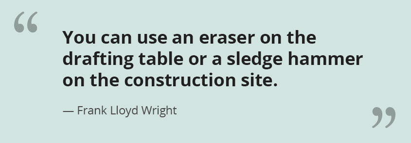
Top UX trends that need to end in 2022
Instead of predicting what UX Trends will catch on in 2022, we thought it would more useful to call out the UX Trends we hope

Instead of predicting what UX Trends will catch on in 2022, we thought it would more useful to call out the UX Trends we hope
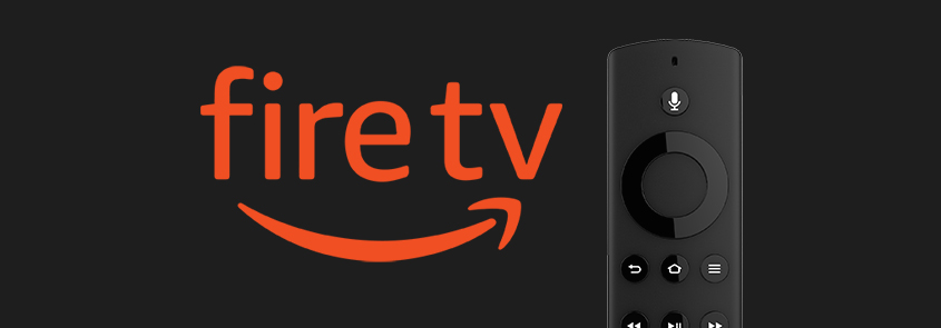
The Amazon Fire TV user experience is a classic example of where the Visual UX is clearly not centered on the user.

Online web forms with tons of form fields can be extremely cumbersome to complete – but there are a few ways you can to make

Not only do people confuse Focus Groups with Usability Testing but many also confuse User Feedback and even QA Testing with Usability Testing.
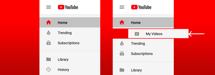
If you’ve ever uploaded a video on YouTube, you may have found it difficult to find that video in your YouTube account later on after
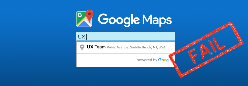
Whenever we perform usability tests, we inevitably discover something we didn’t expect — which is exactly why we test. Read why our implementation of Google’s
Sometimes ideas sound great in theory, but don’t work well in practice. That’s why prototyping with actual users is essential.
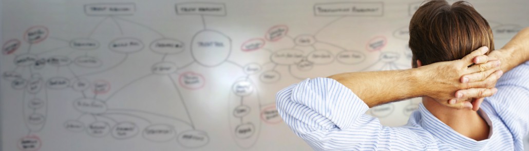
To truly understand and design the best possible information architecture for an app or website, find the biggest whiteboard in your office and start drawing.
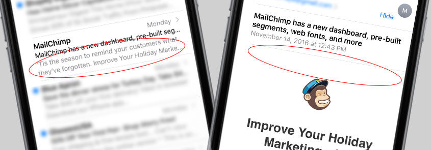
For the last few years, marketers have used ‘teaser text’ to give users a sneak peak of an email’s content. Learn why we’ve found that
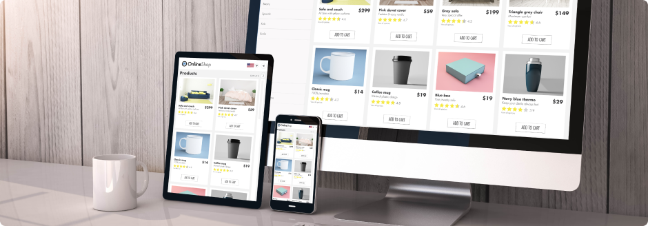
In this research article, they discuss how you should provide features that allow shoppers make easy, final purchase decisions.