How [ChatGPT] Would Make It Better: Instagram

The following post was written entirely by ChatGPT when we asked it to “Write a blog post on why Instagram has a bad user experience. “


Instagram has become one of the most popular social media platforms in the world, with over 1 billion monthly active users. However, despite its popularity, many users have complained about the platform’s poor user experience. In this post, we will explore some of the reasons why Instagram’s user experience is lacking and what the platform can do to improve it.

One of the biggest issues with Instagram’s user experience is the algorithm that determines which posts users see in their feeds. Unlike other social media platforms, Instagram’s algorithm prioritizes posts from accounts that users interact with frequently, rather than displaying them in chronological order. This can lead to users missing out on content from accounts that they don’t frequently engage with, but would still like to see. Additionally, the algorithm can also lead to users seeing irrelevant or low-quality content, which can be frustrating.

Another issue with Instagram’s user experience is the way it handles notifications. The platform sends notifications for all types of interactions, such as likes, comments, and direct messages, which can quickly become overwhelming for users. Additionally, Instagram’s notification settings are not as customizable as other social media platforms, making it difficult for users to control which notifications they receive.

Instagram’s Explore page, which is supposed to help users discover new content and accounts, can also be a source of frustration. The page is often filled with irrelevant content, and users have complained that it’s difficult to find content that they’re actually interested in.

Lastly, Instagram’s Direct Messaging feature can also be a source of user frustration. The feature is cluttered, and the user interface is not very intuitive. Additionally, Instagram’s DM feature does not have end-to-end encryption, which can be a concern for users who value their privacy.

In conclusion, Instagram’s user experience has a lot of room for improvement. By addressing the issues with its algorithm, notifications, Explore page, and Direct Messaging feature, the platform could provide a better experience for its users. Additionally, providing more customization options and security features would also be beneficial for users.

Note: The above post is based on the user complaints about Instagram, but it is worth noting that Instagram is always working on improving its platform and user experience, it’s just a matter of time that these issues are addressed.

Top UX Trends That Need To End In 2022

This is usually the time of year when we start seeing lists that attempt to predict what User Experience (UX) design trends to expect in the coming year. However, we thought it would be more useful to call attention to the trends we hope will end. It turns out, there are so many that we could probably make this post into a series (and maybe we will) but, for now, here are the ones our team came up during one of our morning stand-ups.

These trends are in no particular order, and they are a mix of both software and website trends. And, you’ll also notice that most of them have nothing to do with User Interface (UI) Design — yet all of them impact the User Experience.

Not Involving UX During UAT

User Acceptance Testing (UAT) is typically the final stage of the software development lifecycle that occurs before a product release is deployed into production. Oddly enough, even though the word “User” is in the name, this testing method rarely involves actual end-users. More often, it involves the client and/or members of the product team that test and accept the software product as if they are the end-users. This needs to end.

Agile UX Methodology

It’s probably an exercise in futility to convince product teams to involve real end-users in UAT but, at the very least, they should involve members of the UX Team because they are the ones that designed the UX. When you hire an architect to design your house, the architect will make site visits during construction to make sure the house is being built they way they design it. The same goes with software. You involve UX during UAT because they are far more likely to catch flaws and issues related to their design than anyone else.

Too often, the UX Team is only involved in the beginning of the project and then a hand-off of their designs and (maybe) front-end assets are given to the development team — at which point the UX Team’s job is done. That is, until the product is released to actual end-users and the UX Team is brought back in to fix or enhance whatever issues are found by the users. A lot of times, the flaws found by users are not major usability flaws (because those would have been identified and resolved during usability testing, right?) — but they are typically things that would have been easily caught by the UX Team if they had been involved during UAT. Some of the most common UX issues we find during UAT (when we’re involved) include:

  1. Incorrect use of CSS classes
  2. Incorrect use of UI elements or components
  3. Incorrect use of colors
  4. Incorrect use of fonts
  5. Incorrect responsive breakpoint layouts
  6. Incorrect wording in messages
  7. Display/rendering issues
  8. Missing progress indicators
  9. Missing transitions or animations
  10. Missing table listing features


Auto-Playing Videos

You ever visit a website to read an article and all of a sudden a video at the top or in the sidebar starts automatically playing? And, if you have your volume up, you may also be startled by the loud audio. Yeah, that needs to end. We realize there are browser settings to prevent videos from automatically playing but users shouldn’t have to do that. Videos should only play when the user chooses to play them.

In addition, we’re seeing a trend where these auto-playing videos often have very little to do with the actual article content. So now the site is not only interrupting the user from reading their content, they are doing so with a video that isn’t even related to the article content.

For example, in this Fox Business article, the video portion at the top automatically starts playing an ad (unless your browser preferences are set to prevent it) and the article headline reads “‘World’s most expensive’ ugly Christmas sweater selling for nearly $40K” but the video is about “US inflation”.

This needs to end.


Video-Only Content

Sometimes you just want to skim the text of an article to get the gist or you are in a place where you are unable to watch and listen to a video but you can’t do this if the article page contains nothing but a video. This needs to end.

At the very least, a video should always contain a transcription of the words used in the videos. In this example of an article about “Instagram head testifies before Congress on app’s impact on kids“, it would have been nice to give the users the option of skimming parts of the transcript if they wanted to learn more about what the Instagram CEO said to Congress.

Sure, there may be times when a simple little blurb about the contents of a video is all you need, such as this video about a woman leading police on crazy car chase across Florida golf course – but more often a text transcript or written text describing the video would also be handy.


Subscription-Only Articles

We know how a lot of magazine and newspaper websites are hurting and need to generate revenue to survive but suddenly blocking your loyal readers from accessing your content can’t be the answer. We’ve spoken to several people about this trend and everyone has stopped visiting the websites they used to frequent once they started to require subscriptions.

The most valuable thing a website can do is build a loyal base of repeat visitors. So, to suddenly block those same visitors from reading your content is like hiring a bouncer to stand outside your place of business so they can stop loyal customers from entering. Keep in mind, these websites already fill every pixel of available screen real estate with ad banners, video ads, pop-ups, and they track your every movement, download cookies to your device, and sell your activity to advertisers. In other words, the loyal website visitors are already paying a price to read a website’s content (whether they know it or not). So these websites need to figure out a better model that rewards their loyal readers and puts an end to these traffic killing subscription-only articles.

YouTube PremiumIf websites insist on having a subscription, perhaps they need to consider including an added incentive for buying a paid subscription, such as having an “Ad-Free Experience”. This would be similar to what YouTube does with its YouTube Premium subscription. If you want to experience the website without a subscription, you pay with ads and your data. If you don’t want to see ads or have your data used, pay for a premium subscription.

We’re not sure if an “Ad-Free Premium Subscription” model is the answer – but we can’t think of a worse user experience than one that blocks your users from having any experience at all.


Enormous Memory and CPU Hog Websites

If you go to a website and it immediately kicks on your CPU fans and brings your laptop to a crawl, the site just might be an enormous memory and CPU hog. We don’t mean to pick on RollingStone.com but take a look at the 354 MB JS heap the site requires and, if that’s not bad enough, the site also utilizes over 94% of your CPU. This is completely unacceptable.

Rollingstone.com JS heap size and CPU usage.

Rollingstone.com JS heap size and CPU usage.


When we ran the GTMetrix Lighthouse tool on RollingStone.com, it literally errored out before the site could even load.

Lighthouse’s explanation for the error is that:

“The page took too long to load (No CPU idle period)
This usually happens because your page is repeatedly doing something and constantly utilizing the CPU.
Lighthouse requires a period of CPU idle, meaning we must observe a brief period of no CPU activity. This is required for a page to be considered “Fully Loaded” or finished loading.

You want to make a poor user experience, crash your user’s computers or make them come to a crawl when they visit your website.

This has to end.


Mobile Designs Used On Desktops

We don’t know if this is a purposeful design decision or a sign of laziness but too many websites are starting to display mobile-friendly designs to their desktop users, which negatively impacts the user experience. These websites take the whole idea of a mobile-first approach a few steps too far. While hamburger menus may be a good solution for small screens, why would you purposefully hide your website’s primary navigation and make your users work to navigate your website? In the example below, the site not only hides the main navigation menu in a hamburger menu but it also hides the full name of the company behind the icon. Sure, minimalist web design has its place and can be effective but requiring users to work extra hard to use your website has to end.


CAPTCHAUnusable CAPTCHAs

We’ve all run into these user-hating roadblocks where you’re trying to get something done online and all-of-a-sudden you’re asked to somehow figure out what a CAPTCHA prompt is asking you to do. Hopefully, you pass the test and move on to complete what you were trying to do. However, if you get the dreaded “Please try again.” message, you run the risk of acting out online rage on your device and start screaming profanities at the website you are using.

We get the need to prevent unwanted bots from inundating websites with false form submissions but why would a business place this burden on its users? That’s having a customer come to your place of business and then making them solve The Da Vinci Code before they can start doing business with you. It’s insane and it needs to end.


Not Involving Users Because You Are A User

We wrote a blog post about this one called “3 Reasons Why You Should Never Design Software As If You Are The User“. The topic for the post was born from a few clients that asked us to design their software but they didn’t think we needed to involve their users in the process because they told us “I’m a user – so if I like it and I can use it, my users will too”. While it may be true that you represent the typical user of your own product, there are at least three reasons why you should never exclude your actual users in the design process.

  1. You are too close to your own product
  2. You don’t know what you don’t know
  3. Your users will thank you

This needs to end.


UI Text Written For (and by) Developers Instead of Users

How many times have you used a software product or website and were scolded by rude, accusatory bold error messages, such as “Error 403 – Forbidden“! This needs to end.

Perhaps a nicer way to inform your valuable users that the page they were trying to access isn’t available to them would be something like this instead: “Oops! We are unable to give you access to this page or document. Please contact support at support@nicemessages.com for help.” A message like this does not scold or shout at the user and the tone of the text even places the blame on itself rather than the user while also providing the user with a way to get help if it is needed.”

Also, why does the words “HTTP Error 403” need to be biggest words on the screen? Not only is the website yelling at its user, it’s also confusing them with some meaningless error code. If these codes are needed for some technical debugging purpose, why not display it as the smallest text near the bottom of the page?

In addition, far too many message pop-ups contain verbose and confusing text that force the user to stop, read and attempt to figure out what their next action should be.

Sorry software developers – but it’s really not your fault. In fact, all the developers on our staff love it when our UX staff provides them with the exact text to be used in error messages and content throughout the UI because they’d rather be coding instead of copy writing.


Out of Context “Allow” Popups

How many times have you downloaded a mobile app to your phone and the first time you open it, you get bombarded with a series of “Allow” popups to things like your Camera app, Contacts, Microphone, etc. — even though you haven’t even used any part of the app that may or may not need access to those parts of your phone. This needs to end.

Rather than bombard your users before they even use your app, app makers should consider prompting these “Allow” popups only when the user needs to use a feature of the app that needs access to a part of the phone. For example, we designed an insurance app that enabled customers to upload photos of their damaged car when submitting a claim. So rather than prompt the user as soon as they launch the app, we prompted the user only when they needed to upload a photo from the photo app. This way the user has a better understanding of why they are being asked and are therefore more likely to “Allow” access to that part of their phone.


Got some more UX Trends that you’d like to end? Tweet us: @TheUXTeam

How We’d Make It Better: Amazon Fire TV

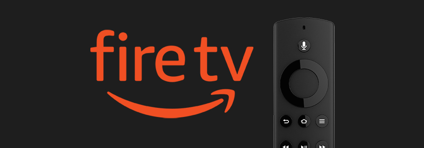
The Amazon Fire TV user experience is a classic example of where the Visual UX is clearly not centered on the user.
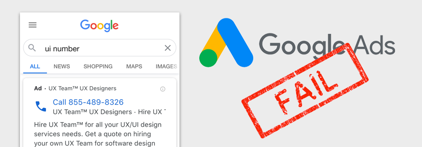
 We make the Visual UX distinction because the Voice UX is actually pretty darn good while the Visual UX (or what you see and interact with on your TV screen) focuses far more on promoting things than on what users may actually find useful. In this blog post, we will dissect the Amazon Fire TV Visual UX and recommend ways that we would make it better.

Current Home Screen Design

The current Home screen is segmented into the following main sections:

Amazon Fire TV Home Screen

  1. Hero Promotion
    This area is nothing more than an enormous billboard carousel for promoting new or popular releases from various streaming services.
  2. Profile
    This is where you can change “Who’s watching” to someone else. One seemingly useful feature that Fire TV recently introduced is different profiles for different people that may be watching TV. The feature does enable each unique profile to customize certain options – but the options are very limited. Our hope is that this future releases will include features that most users would expect when selecting a profile.
  3. Main Menu
    This is where you can navigate to different sections of the interface, such as Home, Find, Live, Library. The center of the screen seems to be an odd location for a main menu but what makes it worse is that its size and lack of color make it barely visible – yet, it may be one of the more useful sections on the screen.
  4. My Apps
    This is a customizable list of some of the apps you have installed along with an ellipses icon on the end that links to a screen containing all your installed apps and a feature to customize the order of apps.
  5. Settings
    This is where you can access various settings (as you would expect).
  6. More Promos
    This section contains a long list of other various movies and TV series. The problem is that there appears to be no rhyme or reason as to why those specific promos are there or what even determined the order that they are displayed.

How We’d Make It Better

Better Visual Hierarchy

We totally understand how the business needs to push revenue-generating promotions but this design takes it way too far. A great design takes into consideration the overall visual hierarchy of elements on the screen and assigns a visual weight to each element that should inform the user of what is very important, somewhat important, or not really important. In the graphic below on the left, you can see how the dark grey “PROMOS” rectangles in the current layout carries an enormous amount of visual weight while the small light grey “USEFUL STUFF” rectangle carries very little weight at all. We would strike a more appropriate balance between usefulness and revenue-generating promotions because if you don’t have a useful product, you won’t have users to promote things to.

Personalized Home Screen

Since the user selected their own profile before getting to the Home screen, the user’s expectation is likely to be that the Home screen is really a personalized “My Home” screen. Given this expectation, two features that would make the Home screen a lot more useful are:

  1. Last Watched
    Often times when a user turns the TV on, they want to return to the series they were just binge-watching. Right now, there is nothing on the Home screen that makes it easy for the user to return to what they “Last Watched”. Each individual streaming service typically provides a “Keep Watching” feature once the user launches the service – so it should be possible to surface whatever show or movie the user last watched from any streaming service onto the main Fire TV Home screen. If the user finished the series or movie they last watched, then this area could be used for promotion.
  2. My Watch List
    One of the most useful features within each streaming service is the ability to add shows and movies to a Watch List so that you can easily find things you may want to watch in the future. Since this feature already exists in each streaming service, it would be handy if each show and movie on their Watch Lists could be displayed on the main Home screen. This would enable the user to jump directly into a show from the Home screen without having to first select (and remember!) the streaming service that show or movie is on.

Labeled Promotions

As we mentioned above, the promotional section at the very bottom of the screen appears to have no rhyme or reason as to why those specific promos are there or what even determined the order that they are displayed. Therefore, it would be very helpful if they categorized the promos with different label names such as “New Releases”, “Trending”, “You May Also Like”, etc. This simple labeling of the promos may actual entice the users to explore the bottom section a lot more rather than view it as just a bunch of unorganized clutter.

Suggested Redesign

The mockup below represents a starting point for a design that we would want to test with real users and then make refinements based on the results of the tests. Overall, you will see the above referenced recommendations implemented in the redesign, such as:

  1. The main menu is moved to the top, the text is more visible, and we’ve clearly marked what screen you are on with a bright yellow underline.
  2. The enormous billboard carousel is replaced with a “Last Watched” feature that displays and highlights what the user last watched so that they can quickly return to it.
  3. A “My Watch List” section has been added to the right side that surfaces selection for each streaming services Watch List (or equivalent) and they are ordered by last activity – meaning, either last watched or last added, whichever is more recent.
  4. The promotional section at the bottom is now organized into labeled sections to help entice the user to explore each section.

These recommendation only scratch the surface for what could be done to make the Amazon Fire TV UX better. In fact, this is only the Home screen! However, we think these changes would have a dramatic impact on creating a much more positive user experience.

This Google Ads #UXFAIL Is Costing Customers Thousands of Dollars

Like most businesses these days, we run ads on Google to try and attract new business. The concept of Google Ads is great in theory because it helps you get found by people that are already searching for your type of business. However, despite the enormous success of Google, it is not without its flaws — especially from a UX design perspective. We already covered the 5 Things The New Gmail Design Got Wrong so we don’t want to look like we’re picking on Google – but this #UXFail is actually costing Google’s customers hundreds, if not thousands, of dollars each month.
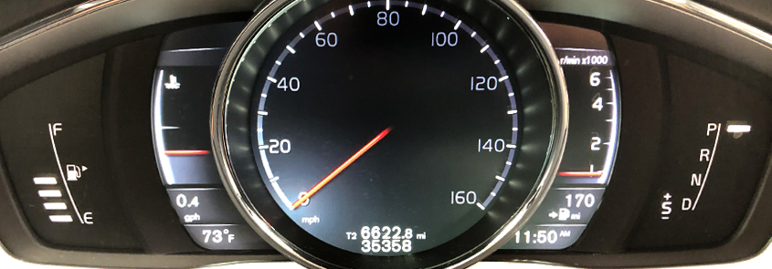
Google Ads has a campaign type called “Call Only” ads. As the name implies, these ads are geared towards getting people to call your business. Well, during the pandemic we decided to run some Call Only ads and instead of qualified leads we received hundreds of calls from people looking for their local Unemployment Insurance office. Our phone began ringing off the hook – but for all the wrong reasons. At first we assumed there was something wrong with the way Google routes calls from their number (to track the clicks) to our business number. Google looked into it and they said it was not an issue. We tried asking each caller where they got our number and most just said they “Googled it”. We talked to our phone company to see if they could track down any routing issues. Given the fact that millions of people were suddenly unemployed, we thought the phone systems could be getting overloaded and causing issues. They found no issues. We looked up Unemployment Insurance office phone numbers to see if our phone number was published by mistake anywhere. It was not. We spent weeks and hundreds of dollars on clicks trying to figure out the issue until we gave up and just paused the Call Only ads.

Finally, a Breakthrough

TGA Google Ad

My brother owns TGA Legal Collections (shameless plug) and he asked me to help him run some Google Ads. These ads were set up to target companies that are looking to hire a firm to collect money from debtors that owe them money. Within one week of running his Call Only ads, he began getting calls. Unfortunately, the calls were not from companies but from debtors that were looking to make payments to a collection agency. Luckily, one of the debtors was nice enough to actually send my brother a screenshot of exactly what they Googled before calling his business. As you can see in the screenshot on the right, the debtor typed in the full name of the collection agency they were looking to make a payment to and the first result Google displayed was my brother’s ad. Clearly the debtor never read a word of the text in the ad — even after sending the screenshot to my brother — they just saw the huge phone number and clicked it.

Now you may think “why would someone click a phone number without reading who’s number it is?”. Well, a good UX designer always empathizes with users rather than blame them. So when we looked into it further it was clear that many Google users have become used to seeing the first result on Google’s Search Engine Results Page (SERP) as the one they want. Look at the screenshots below. Google a flight number and you get its status first. Google the weather and you see the weather first. Google the age of a celebrity and you see their age and photo first. It goes on and on. So when a Google user searches for a business, many users are being trained to believe that the first result is what they want and when they see a huge phone number they assume it’s the number of the business they want to call.

Google SERP

Google users have become used to seeing a result at the top as the one they need.

But Why Were These Ads Displayed At All?

The answer is simple: Since one of the main keywords we add to our UX Team campaign was “ui“, the ad was served up because millions of people during the pandemic were searching for their local Unemployment Insurance office — or “UI” office. Since one of the main keywords added to the TGA campaign is “collection agency“, the ad was served up because the debtor searched for “pressler collection agency“. So the ads being served up is not the issue. It’s doing exactly what it’s designed to do. The issue is that the users clicked the huge phone number without realizing it was not the number they wanted to dial.

The #UXFAIL

While making the phone number so big may seem like a good design idea for a Call Only ad, it is actually a huge flaw that is costing Google customers thousands of dollars in erroneous clicks. The visual hierarchy of the ad design places so much weight on the phone number that it drowns out all the other elements that would have informed these people who’s number they were really dialing.

Google Ad UX Fail Blurred

The screen on the right is blurred to help reveal the design’s visual hierarchy.


The Possible Solution

One possible solution to this design flaw is to address the ad’s visual hierarchy. A good visual hierarchy assigns a visual weight to various elements in a design to help inform users of what is most important, somewhat important, and less important. In these Call Only ads, the visual hierarchy should assign a high visual weight to business name or headline, a medium visual weight to the phone number line, and a low visual weight to the description text. By assigning a high visual weight to the business or headline, the users are far more likely to read it and realize that “UX Team™ UX Designers” are not the Unemployment Insurance office.

Google Ads UX Fail Solution

The design on the right shows how a few adjustments to the placement and visual weight of elements can improve the design and reduce erroneous calls.


2016 Volvo XC60 Dashboard Design #UXFAIL

I own a 2016 Volvo XC60. It’s been a great car except for one glaring design flaw that probably only affects those of us that live in that special place I call ‘Designer’s Hell’. In this case, it’s the design of the main dashboard readout. Like most newer cars, the dashboard in the XC60 utilizes a software-driven dashboard display, which sounds cool, looks aesthetically cool, and provides some options that a non-digital dashboard could not provide, such as different design themes. The problem is that the usefulness of the readout fails miserably — especially with the ‘Elegance’ theme. Keep in mind that the users of this software-driven display are typically people driving down the highway at 65-75mph. So the design must be hyper-optimized for users that need to find important information within fractions of a second.

The thing that jumps out the most is that it is unimaginable that the design was ever tested with customers before it was rolled out. A 2-minute test with 5-10 customers containing these 2 questions would have quickly revealed the flaws:

  1. Can you tell how many miles of gas you have left?
  2. Can you tell if you are in normal ‘Drive’ mode or ‘Sport’ mode?

Below we focus on the design flaws of these 2 very important features for any dashboard.

Similarity And Proximity

2016 XC60 Gas Mileage Readout

The above picture highlights how the remaining gas mileage indicator is located clear across the display from the main gas level indicator. To this day, I still find myself looking at the main gas level indicator area first when I’m looking for the remaining gas mileage. This is such an obvious design flaw, which also violates the design principle known as “Similarity And Proximity”.  In software design we use “Similarity” to inform the user about which elements are related to each other and which are not. In this case, all gas-related elements should be grouped together so the user only has one place to find anything related to gas. We would also use “Proximity” by placing those elements close to each other while keeping them visually separate from all other elements.


Omit Needless Things

One of my favorite (lesser known) design principles is “Omit Needless Things” – originally known as “Omit Needless Words“. In this case, we not only have two duplicate and competing gas icons but we also have conflicting directional arrows. One arrow is correctly placed on the right-side of the gas icon and is pointing right. The other is also pointing right but it is located on the left-side of the gas icon. The solution for this is simple — remove the redundant gas indicator on the right altogether.

What’s Selected?

Another important design principle in software design is clearly visually communicating where the user is and what is selected and what is not selected. Looking at the gear indicator on the left, it is difficult to tell if the car is in ‘Park’ or in ‘Sport’ mode or in both because there’s a white bar lit up next to the ‘P’ for ‘Park’ and the ‘+S’ is not only also lit up but it also appears underlined. Although, the underline may actually be a minus symbol (-) to coincide with the plus symbol (+), which only adds to the confusion of its purpose. When you move the shifter down to the ‘Drive’ position, it is still unclear if the car is in ‘Sport’ mode or regular ‘Drive’ mode because, again, the ‘+S’ indicator is lit up and underlined. It’s not until you slide the shifter to the left do you see that the ‘+S’ indicator turns yellow, which oddly enough is the only indicator that ever turns yellow.

In Conclusion

Since this is a software-driven display, it should be easy enough to upgrade and fix all these issues. As we have written about many times, good user experience design requires meticulous scrutiny of every micro-design decision. The design of this dashboard display clearly did not get the meticulous scrutiny it deserved.

Revised Gas Indicator

A revised gas indicator could look something like this whereby:

    1. All gas-related elements are combined into a single area
    2. “170 miles” is positioned below the ‘E’ since it is directly related to how many miles can be driven before the gas tank is empty
    3. There is now a single gas icon with the gas tank arrow properly located on the right-side of the icon

Revised Gear Indicator

A revised gear indicator could look something like this whereby:

    1. The selected gear position is highlighted by both a lit up white ‘D’ and the white bar while unselected hear positions are dimmed out.
    2. The ‘Sport’ mode indicator:
      1. Is no longer lit up when it is not selected
      2. No longer has a plus (+) or minus (-) symbol
      3. Aligns to the left of the ‘D’ since it related and, in fact, mimics the physical action of moving the shifter to the left of the Drive position when selecting the Sport mode.

“Where are my YouTube Videos?” #UXFAIL

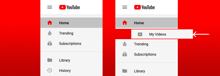
If you’ve ever uploaded a video on YouTube, you may have found it difficult to find that video in your YouTube account later on after you’ve uploaded it. We can tell this is not a unique ‘user issue’ because if you Google “Where are my YouTube Videos?”, you will see step-by-step instructions and even video tutorials (shown below) on how to find the videos you uploaded to your YouTube account. To be clear, we’re not talking about trying to find your videos as if you were someone searching on YouTube that may be looking for a video like yours. We’re talking about finding a video in your YouTube account after you’ve uploaded it so that you can edit it or delete it or whatever.

The fact that Google had to write step-step-step instructions on something that should be so simple proves there’s a design flaw.

In addition, if there are people posting video tutorials that are viewed by hundreds of thousands of frustrated people, you have a major UX problem.

So, Where Are My Videos?

For some reason, not only are your videos buried in a link under your profile’s avatar but they’re in what appears to be a separate software product called “YouTube Studio beta“. How someone would know to go to the YouTube Studio beta product to find the videos they uploaded is one problem. The fact that YouTube is requiring its users to access a ‘beta’ version of this product as the only means to get to these videos, is a whole other problem. At UX Team, we often create video demonstrations or usability test recordings for our clients that we purposely keep “unlisted” so only someone with the direct link to the video can view that video. Apparently, the only way to find and edit these “unlisted” videos in your account is to use the YouTube Studio beta product. The problem is that most users probably think of “YouTube” as the whole product and not that there are sub-products within YouTube to do special things. This just adds an unnecessary level of confusion to the whole user experience.

The Simple Solution

Since we are a UX Design firm, we don’t want to just rant about the failures of others, we want to offer our help. In this case, the solution could be as simple as adding a ‘My Videos’ link to the main navigation menu. If YouTube did this, we bet there would be a lot less people asking and searching for where to find their own videos.


== UPDATE! ==

YouTube must have gotten feedback (or read this post :-) ) because they just updated their main navigation menu to include a “Your videos” link!

Bravo YouTube, Bravo!

YouTube Your videos link