

Why Most Enterprise UX Fails Before a Single Screen Is Designed
Most enterprise UX doesn’t fail at the design stage. It fails before design even begins. By the time a design team is asked to “improve…
Why Most Enterprise UX Fails Before a Single Screen Is Designed
Most enterprise UX doesn’t fail at the design stage. It fails before design even begins. By the time a design team is asked to “improve…

The Healthcare.gov AbomiNation
CGI Federal, the development firm responsible for the botched Healthcare.gov launch, was either greedy, incompetent or both when it came to managing scope and expectations

Every dollar invested in ease of use returns $10 to $100
For developers and manufacturers, the advantages of creating usable products far outweigh the costs. The rule of thumb: Every dollar invested in ease of use

User Experience conferences
Here is a list of conferences with a focus on User Experience that are mostly in the Northeast of the United States. If you are

What Is responsive web design?
Responsive Web Design is designing and coding the front-end of a website or app so that the layout “responds” or automatically adjusts (using CSS) to

You There! Step Away From The Design!
As designers, we often get so deep into our work that we can lose our ability to see our designs through the eyes of the
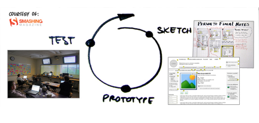
The UX Process and UX Design principles
A web application’s design and usability is just as important as that application’s functionality. If users can’t immediately figure out how to use a web