Unwrapping Our 2024 Figma Wishlist

Another year has passed, and our list of wishes for Figma has grown. We have been excited to see some of our wishes from 2023 come to life, along with many other helpful features. Figma is great at listening to its users, so we are hopeful going into 2024, our wishlist will be fulfilled.

How [ChatGPT] Would Make It Better: Instagram

The following post was written entirely by ChatGPT when we asked it to “Write a blog post on why Instagram has a bad user experience. “


Instagram has become one of the most popular social media platforms in the world, with over 1 billion monthly active users. However, despite its popularity, many users have complained about the platform’s poor user experience. In this post, we will explore some of the reasons why Instagram’s user experience is lacking and what the platform can do to improve it.

One of the biggest issues with Instagram’s user experience is the algorithm that determines which posts users see in their feeds. Unlike other social media platforms, Instagram’s algorithm prioritizes posts from accounts that users interact with frequently, rather than displaying them in chronological order. This can lead to users missing out on content from accounts that they don’t frequently engage with, but would still like to see. Additionally, the algorithm can also lead to users seeing irrelevant or low-quality content, which can be frustrating.

Another issue with Instagram’s user experience is the way it handles notifications. The platform sends notifications for all types of interactions, such as likes, comments, and direct messages, which can quickly become overwhelming for users. Additionally, Instagram’s notification settings are not as customizable as other social media platforms, making it difficult for users to control which notifications they receive.

Instagram’s Explore page, which is supposed to help users discover new content and accounts, can also be a source of frustration. The page is often filled with irrelevant content, and users have complained that it’s difficult to find content that they’re actually interested in.

Lastly, Instagram’s Direct Messaging feature can also be a source of user frustration. The feature is cluttered, and the user interface is not very intuitive. Additionally, Instagram’s DM feature does not have end-to-end encryption, which can be a concern for users who value their privacy.

In conclusion, Instagram’s user experience has a lot of room for improvement. By addressing the issues with its algorithm, notifications, Explore page, and Direct Messaging feature, the platform could provide a better experience for its users. Additionally, providing more customization options and security features would also be beneficial for users.

Note: The above post is based on the user complaints about Instagram, but it is worth noting that Instagram is always working on improving its platform and user experience, it’s just a matter of time that these issues are addressed.

Figma Wishlist 2023

Here is our wish list of things we hope to see from Figma in 2023.

How We’d Make it Better: Hatch Baby Rest

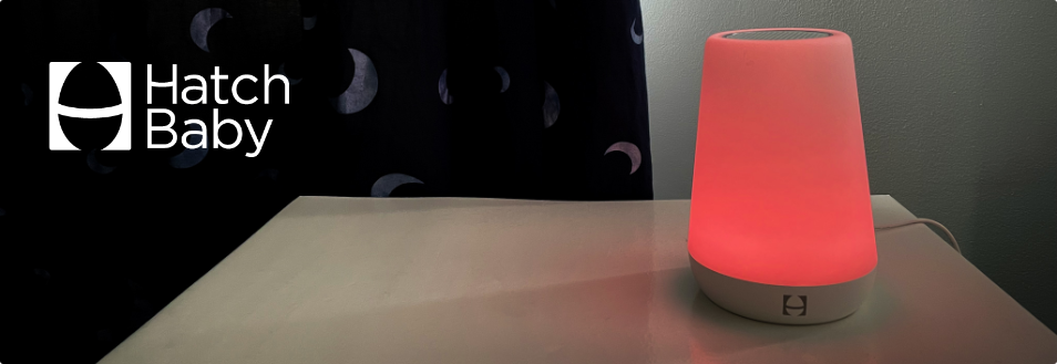
The Hatch Baby Rest is a super sleek, minimalist device with a sound machine and nightlight features. However, it’s not so easy to use.

How We’d Make It Better: Amazon Fire TV

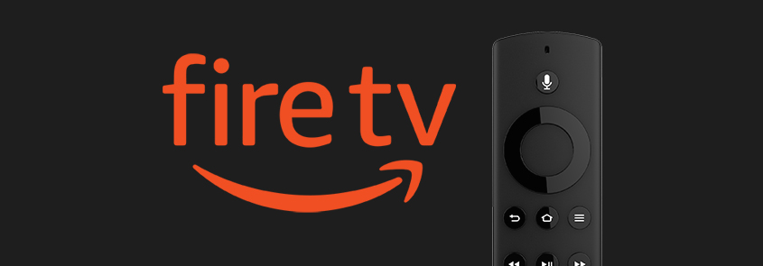
The Amazon Fire TV user experience is a classic example of where the Visual UX is clearly not centered on the user. We make the Visual UX distinction because the Voice UX is actually pretty darn good while the Visual UX (or what you see and interact with on your TV screen) focuses far more on promoting things than on what users may actually find useful. In this blog post, we will dissect the Amazon Fire TV Visual UX and recommend ways that we would make it better.

Current Home Screen Design

The current Home screen is segmented into the following main sections:

Amazon Fire TV Home Screen

  1. Hero Promotion
    This area is nothing more than an enormous billboard carousel for promoting new or popular releases from various streaming services.
  2. Profile
    This is where you can change “Who’s watching” to someone else. One seemingly useful feature that Fire TV recently introduced is different profiles for different people that may be watching TV. The feature does enable each unique profile to customize certain options – but the options are very limited. Our hope is that this future releases will include features that most users would expect when selecting a profile.
  3. Main Menu
    This is where you can navigate to different sections of the interface, such as Home, Find, Live, Library. The center of the screen seems to be an odd location for a main menu but what makes it worse is that its size and lack of color make it barely visible – yet, it may be one of the more useful sections on the screen.
  4. My Apps
    This is a customizable list of some of the apps you have installed along with an ellipses icon on the end that links to a screen containing all your installed apps and a feature to customize the order of apps.
  5. Settings
    This is where you can access various settings (as you would expect).
  6. More Promos
    This section contains a long list of other various movies and TV series. The problem is that there appears to be no rhyme or reason as to why those specific promos are there or what even determined the order that they are displayed.

How We’d Make It Better

Better Visual Hierarchy

We totally understand how the business needs to push revenue-generating promotions but this design takes it way too far. A great design takes into consideration the overall visual hierarchy of elements on the screen and assigns a visual weight to each element that should inform the user of what is very important, somewhat important, or not really important. In the graphic below on the left, you can see how the dark grey “PROMOS” rectangles in the current layout carries an enormous amount of visual weight while the small light grey “USEFUL STUFF” rectangle carries very little weight at all. We would strike a more appropriate balance between usefulness and revenue-generating promotions because if you don’t have a useful product, you won’t have users to promote things to.

Personalized Home Screen

Since the user selected their own profile before getting to the Home screen, the user’s expectation is likely to be that the Home screen is really a personalized “My Home” screen. Given this expectation, two features that would make the Home screen a lot more useful are:

  1. Last Watched
    Often times when a user turns the TV on, they want to return to the series they were just binge-watching. Right now, there is nothing on the Home screen that makes it easy for the user to return to what they “Last Watched”. Each individual streaming service typically provides a “Keep Watching” feature once the user launches the service – so it should be possible to surface whatever show or movie the user last watched from any streaming service onto the main Fire TV Home screen. If the user finished the series or movie they last watched, then this area could be used for promotion.
  2. My Watch List
    One of the most useful features within each streaming service is the ability to add shows and movies to a Watch List so that you can easily find things you may want to watch in the future. Since this feature already exists in each streaming service, it would be handy if each show and movie on their Watch Lists could be displayed on the main Home screen. This would enable the user to jump directly into a show from the Home screen without having to first select (and remember!) the streaming service that show or movie is on.

Labeled Promotions

As we mentioned above, the promotional section at the very bottom of the screen appears to have no rhyme or reason as to why those specific promos are there or what even determined the order that they are displayed. Therefore, it would be very helpful if they categorized the promos with different label names such as “New Releases”, “Trending”, “You May Also Like”, etc. This simple labeling of the promos may actual entice the users to explore the bottom section a lot more rather than view it as just a bunch of unorganized clutter.

Suggested Redesign

The mockup below represents a starting point for a design that we would want to test with real users and then make refinements based on the results of the tests. Overall, you will see the above referenced recommendations implemented in the redesign, such as:

  1. The main menu is moved to the top, the text is more visible, and we’ve clearly marked what screen you are on with a bright yellow underline.
  2. The enormous billboard carousel is replaced with a “Last Watched” feature that displays and highlights what the user last watched so that they can quickly return to it.
  3. A “My Watch List” section has been added to the right side that surfaces selection for each streaming services Watch List (or equivalent) and they are ordered by last activity – meaning, either last watched or last added, whichever is more recent.
  4. The promotional section at the bottom is now organized into labeled sections to help entice the user to explore each section.

These recommendation only scratch the surface for what could be done to make the Amazon Fire TV UX better. In fact, this is only the Home screen! However, we think these changes would have a dramatic impact on creating a much more positive user experience.

How We’d Make It Better: Microsoft Outlook

Microsoft Outlook is easily one of the most used software products by businesses — yet it is also one of the most flawed products on the market. The latest version of Outlook for Mac attempts to make a big leap forward with its updated User Experience and we will say that it appears to be heading in the right direction. However, there are several obvious flaws that we’ve pointed out below that can and should be addressed.

Hover Icons on Messages

Each message listed in the Inbox displays action icons (delete, archive, flag, or pin) that appear when the user hovers over the message. These icons not only take up a lot of valuable screen real estate but they can (and often are) accidentally clicked when the user is attempting to simply open the email message. In addition, the attachment clip icon and the reply arrow icons appear to be clickable but they are not.

How we’d make it better:

  1. Since opening and reading the email messages is the primary user action, these icons really represent secondary or even tertiary actions. Based on this, we would place all the icons into an ellipsis menu on the far right of the message rows (see screenshot on the right). This will:
    1. Make better use of valuable screen real estate
    2. Remove the possibility of accidentally clicking an action button.
    3. Provide plenty of space to label each icon so the users know what each icon does.

Multi-selecting Email Messages

Currently, the only way to select multiple email messages in the inbox is to hold down the shift key as you click each message. The problem is, this requires all users to know about this key command “trick” and a good UX should not rely solely on the users knowing tricks or hidden shortcuts. Personally, I have to re-teach my own mother and brother this key command every time they ask me how they can select multiple items.

How we’d make it better:

Include checkboxes at the beginning of each email message (see screenshot below). This will be a much clearer way for users to know how to select multiple emails without needing to know the key command. Plus, Outlook already uses checkboxes in other places in its UI so there’s even less of a reason for not including them here.


Creating a New Event (Bug?)

When attempting to create a new event by double-clicking on a day from the Calendar screen, the Reminder pop-up displays before the user even finishes saving the new event. This appears to be a bug because it only seems to happen when trying to create a new event on the current day or certain future days within the current month.


How we’d make it better:

Fix the bug so that the Reminder pop-up never displays before the new event is created.


Inconsistent Location of the Exact Same Buttons

This one doesn’t seem to make any sense and makes us wonder if different people worked on the different versions of the same screen. When you click a day on the Calender, you get the short-form modal window for creating a new event with the Discard and Save buttons located on the bottom right of the modal. When you expand open the modal to view the long-form version of the screen, the Discard and Save buttons are not only flopped but they are moved to the left side of the screen.

Here we see two different locations for the Send button. When creating a new message, the Send button is located in the top left of the screen. When creating a new Calendar Event with attendees, the Send button is located in the bottom left of the screen.

A big part of creating a great user experience is consistency throughout the application and there appears to be no good reason why these buttons display differently in the two different versions of the same screen.

How we’d make it better:
Make sure the same or similar buttons are placed consistently in the same location throughout the application.

3 Reasons Why You Should Never Design Software As If You Are The User

We get this one a lot. A client wants us to design their software but they don’t think we need to involve their users in the process because they say “I’m a user – so if I like it and I can use it, my users will too”. While it may be true that you represent the typical user of your own product, there are at least three reasons why you should never exclude your actual users in the design process.

1. You are too close to your own product

Since it’s your product, you will not only have a built-in bias about “your baby” but you will also come with built-in knowledge of the product’s design and how it is used. It doesn’t matter if you find it easy to use your own product — it only matters that your users can and the only way to make sure your users can easily use your product is to involve them in the design process. Unlike you, the users you involve will likely have no prior knowledge of your product or how to use it, which is exactly what you want because it will mimic what will happen when you launch your product.

“Be careful not to fall prey to the ‘false-consensus effect’ — assuming your beliefs and behaviors align with the users.”
— Nielsen Norman Group

2. You don’t know what you don’t know

One of the main reasons for involving your actual end-users in the design process is to learn things that you may have never have thought of before. And, it is a much better time to learn these things during the design process than it is once you’ve launched your product. We’re not talking about learning what your users like — that’s a Focus Group. We’re talking about interviews, surveys, and (our favorite) user shadowing. The goal is to learn whatever you can about your users BEFORE you begin to design a product for them. Then, when you start designing, be sure to incorporate usability testing into your process so you can observe exactly how they use your product.

3. Your users will thank you

Every single time we design a software product for a client and we’re allowed to work with end-users during the design process, we always get such enthusiastic feedback and gratitude from the users. We often hear them say things like “I am just so thankful I was asked to help design a product that I will be using. I mean, it just makes so much sense.” Yes, it does.

The other benefit of involving your users in the design process is that they are likely to become your Product Evangelists. These people are proud the role they had in helping to design your product and they will promote it (free-of-charge) to anyone who will listen. We’ve also seen cases where users will choose to do business with a company just because they now felt more of a personal connection with that company. For example, we designed an insurance quoting system that is used by independent insurance agencies and because we involved agents in the redesign of the quoting system, the agents are choosing to sell policies with our client over other carriers simply because they have more of a personal connection with our client and the software they helped design.


At the end of the day, even though we design software for a living, we are often not the true end-users of the products we design, which is why we involve the users in our process — and so should you.

How We’d Make It Better: Microsoft Teams

‘You’re Muted!’

One issue that seems to happen on nearly every video call is that users don’t know or remember that they are muted. So, they begin talking and everyone else on the call starts saying “You’re Muted!”. It’s almost become a living meme at this point. One of the reasons this happens so often is that Teams only gives users some easy-to-miss indicators that let them know they are muted.

How we’d make it better:
Other video conferencing applications like GoToMeeting can detect that you are trying to talk when your microphone is muted and they display a message on top of the microphone icon letting you know “You’re muted” — hopefully before someone on the call yells at you. They also use a solid green icon to indicate an “On” state and a grey icon to indicate and ‘Off’ state for your microphone, camera, and screen sharing options. This use of dramatically different colors helps the user know when their microphone is “On” vs “Off”.

You're Muted!


Call Selected People

Having several people be part of a ‘team’ in a group chat can be convenient for discussions and sharing ideas but arranging calls between members of that team can sometimes get tricky. If one or several members are out that day, or you simply need to speak with a few people in that group chat, the Teams app requires you to make a call to the whole team or create an entire new group chat.

How we’d make it better:
Make the Video Chat and Audio Chat buttons into dropdowns that give users the option to call the whole group or just certain selected people. This frees the user from having to constantly create new group chats and avoid calling people who aren’t needed for a certain call.

MS Teams Call Selected


A Tab for Links

Links are shared very frequently in chats on Teams but finding a link someone posted days or weeks ago can be a challenge.

How we’d make it better:
Add a ‘Links’ tab next to the ‘Files’ tab where users can quickly scroll through the links posted in the chat.

MS Team Links


Search Within a Selected Chat

Teams has a decent global search function located in the top bar that enables you to search across all chats but sometimes you just want to find something within a selected chat instead of having to scroll back through all the messages. Currently, there is a hidden trick for doing this that requires you to somehow know to use the ‘command+F’ or ‘control+F’ keyboard shortcut. This will change the global search field into a ‘/find within @Chat’ function (see screenshot below).

How we’d make it better:

  • Add a search icon near the other action buttons within a given chat. Clicking this search icon would change the ‘global search’ field into the ‘/find within @Chat’ field.
  • The search results should then behave similar to the ‘Find’ feature in your Chrome web browser whereby the words you’re looking to find are highlighted in yellow and the scroll bar indicates all places within the chat that the word can also be found.

MS Team Chat Search


Chat Filter

After several months of chatting back and forth within a given group chat, the number of messages can really pile up. Sometimes you just want to filter down the messages to just those within a certain date range or from a certain user and right now there is no good way to do this.

How we’d make it better:
Add a ‘Filter’ icon to the action buttons within a given chat. When clicked, it could display filtering options, such as a date range and users.

MS Teams Chat Filter


Reply Feature

Sometimes several conversation topics start happening within a given group chat and it’s hard to keep track of what message is replying to what other message. Or, sometimes someone asks a series of specific questions in separate messages and you want to reply directly to each question instead of adding a single message to the bottom of the whole chat thread. Unfortunately, Teams does not provide a way to reply to a single message in a chat thread.

How we’d make it better:
iOS Message does a good job of letting you reply directly to a specific message within a conversation thread by providing a contextual menu on a message that includes a simple ‘Reply’ feature. For Teams, we would simply expand the existing ellipses menu to include a ‘Reply to this message’ option.

Teams Reply To This Message

How We’d Make It Better: Spotify (Vol. 1)

One of the things I hope you’ll notice when we go through the examples of how we would make Spotify better is that most of it has little to do with the User Interface design — but all of it has to do with the User Experience.

Content

Currently, Spotify provides a small area buried at the bottom of each Artist page containing a blurb ‘About’ the artist (if the artist provided one). However, there is a huge opportunity for Spotify to fill a void that’s been missing since the days of vinyl records, CDs and even cassettes and that is: Liner Notes and Artwork.

“Back in the day”, listening to music was always a multi-sensory, immersive experience where you would sit in your bedroom listening to music while looking at the artwork and reading all the Liner Notes, which often included :

  • Lyrics
  • Songwriting credits
  • Producer and sound engineering credits
  • Guest musicians
  • Album artwork credits
  • Thank you notes
  • And more

When you read the liner notes, you felt like you were really getting to know the band on a different level because you would learn all kinds of behind-the-scenes details about the music you were listening to. Sometimes it even gave you a better sense of the band’s personality and talents. Unfortunately, this whole experience went away when music started to be distributed via download and streaming services.

How We’d Make It Better:
The good news is that all this content exists — so if/when Spotify includes it in their product, they will fill that void and create an even better user experience for its customers.

This is a sample page of liner notes from Green Day’s ‘Dookie’ album. I always loved the raw sketchy look of this because it reminds me of the doodles I would make in my notebooks during school.


Sortable Column Headers

One of the great features of Spotify is its recommendation algorithm, which suggests artists that you may like based on other artists you’ve listened to. Now lets say you visit one of these recommended Artist’s page to see what other songs they have. The first thing you will see is a list called ‘Popular’ at the top, which seems to be a list of the most popular songs by the artist – but we’re not sure. Assuming this is a list of the artist’s most popular songs, the list (for some reason) is not sorted by showing songs with the most plays at the top. In fact, there’s no way of knowing how the list is sorted at all. And, even if you wanted to manually sort the song list by the number of plays, there’s no way to do that either.

In addition, it would also be useful if there was a column for ‘Album’ so that the users could see what album a particular song is on and link to it.

Spotify’s Artist Page with a song list you can’t sort.

How We’d Make It Better:

  • Add sortable column headers
  • Make the default view show the most popular songs first
  • Add a column for the name of the Album

We could do a whole series on what we would do to improve the iTunes user experience but it does have all the above features.

The Winery Dogs on iTunes

iTunes Song List with sortable columns.


The Spotify Artist Page does not provide a way to access “All Songs” by the selected Artist.

“All Songs” List

While the Artist page appears to show the top 5-10 most popular songs, there is no list or link to all songs by the Artist. You can expand the “Popular” list to see 5 more popular songs but somehow the Artist page leaves out a section and a link to all “Songs” by the artist. We’ve talked to several people about this one and they all noticed the same thing and are frustrated by this seemingly obvious omission. How can the Artist page in a music listening app contain all the sections listed below but not include a section for “Songs”?:

  • Popular
  • Popular releases
  • Albums
  • Singles and EPs
  • Featuring [Artist Name]
  • Fans also like
  • Discovered on
  • About
  • Offers

Of course there is a way to get to all the songs by an Artist — but you can’t get to it from the Artist page. Instead, you have to search for the artist and then filter the search results by “Songs” to see them.

How We’d Make It Better:

  • Simply change the “Popular” section name to “Songs”
  • Sort the “Songs” list by the most played songs at the top
  • Provide a link to “All Songs”

No-Repeat Shuffle

When a user uses the shuffle feature on either their own playlist of any list of songs, the expectation is that the songs will not repeat until all the songs have been played once. If you’re a Spotify user, you may be saying “But that’s what shuffle already does!” and you would be right, sort of. If you use shuffle on a song list and then close the app and open it again hours later or the next day and go back to play that same song list, you will likely hear songs repeat. For example, I have a Beach Mix containing 94 beach-themed songs. When my wife and I were on vacation with friends, I put my Beach Mix on one day and then, at some point, I turned it off. The next day, I put my Beach Mix on again and I heard several songs repeat from the previous day before playing other songs that had not played yet. In another example, we were driving a long distance and I was playing my mix of 98 Mellow Rock songs. We stopped a few times along the way and whenever we got back in the car and I put the same playlist on, we would hear songs repeat.

How We’d Make It Better:
Ideally, Spotify should utilize a songs “last played” date and time stamp so that when you shuffle a list of songs it knows to select songs with the older “last played” dates before playing songs with the newer dates.

Spotify Shuffle


In Conclusion…

As you can see, none of the examples above are focused on how the User Interface was designed or laid out but all of them impact the User Experience. They’re really more about content and either missing features or enhancements to existing features.